Skip to content
Igor Dinuzzi

02 · Universidad Europea · UniCorn AI guidance

A new way to learn with AI

Humanising higher education discovery through conversational intelligence.

Client
Universidad Europea
Scope
Conversational UX, brand, design system
Year
2025
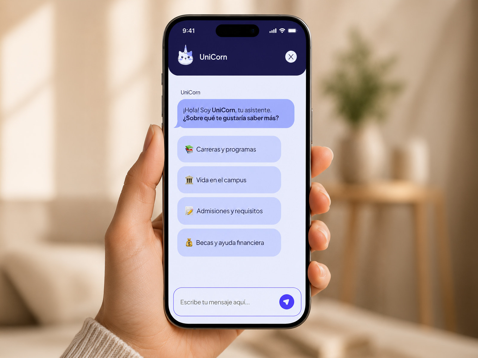
UniCorn open on a phone held in one hand, showing the assistant's greeting in Spanish and four tappable topics: careers and programmes, campus life, admissions and requirements, and scholarships and financial aid.
UniCorn, an assistant that opens with options rather than an empty box.

Overview

Choosing a university, without the maze

Choosing a university is one of the highest stakes decisions a young adult makes. Yet most prospective students meet it through enormous drop down menus, dense PDF course catalogues and admissions language written for the institution rather than the applicant.

UniCorn is an AI guidance platform for Universidad Europea. It replaces static, fragmented navigation with an empathetic assistant built for the phone, carrying a student from the first vague question, what programme actually fits my goals, through to a confident application.

Prototype

Try the conversation

The working prototype, in Spanish. Open it in Figma if the embed does not load.

Problem

Information friction at the point of greatest intent

Traditional higher education portals suffer from choice overload and deep site hierarchies. Students arriving today expect something immediate, personal and conversational.

Faced instead with degree requirements, tuition schedules and campus locations spread across dozens of subpages, they leave. Bounce rates climb and conversion falls, at exactly the moment someone was ready to commit.

Traditional discovery friction

University website

Deep menus and jargon

Overloaded subpages, PDF catalogues and forms written for the institution, not the applicant.

Blank canvas stress

An open text box with no context leaves someone unsure what they are even allowed to ask.

Drop off and abandonment

Cognitive load peaks at exactly the point someone was ready to apply.

The design challenge

  1. Structuring an unstructured conversation

    AI assistants often fail because an open prompt creates blank canvas paralysis. The experience needed clear pathways while still feeling like a conversation rather than a form.

  2. Conversation and rich interface together

    Replies made only of text produce chat fatigue fast. The system needed real interface components, degree cards, location pickers, deadline counters, sitting inside the conversation itself.

  3. An inclusive system by default

    Educational tools have to meet WCAG properly: contrast that holds, touch targets that work, and typography that stays legible across whatever phone a student happens to own.

Strategy

Mapping intent before writing a single reply

To make the conversation feel natural I mapped intent pathways across the discovery milestones, so the assistant could move from an exploratory question to a decision making tool without the student noticing the gear change.

UniCorn intent map

UniCorn assistant

Explore and profile

  • Interactive chips
  • Interest profiling
  • Persona routing

Match and compare

  • Degree comparison
  • Tuition and schedules
  • Career outcomes

Apply and get support

  • Requirement checklist
  • Campus tour booking
  • Direct advisor handoff

Explorations

Three decisions, and what each one cost

Exploration 01

Open text against guided branching

Constraint
Open ended language interfaces hit dead ends when someone asks something vague, such as tell me about design.
Trade off
Locking people into a rigid decision tree turns the assistant into a glorified phone menu, which defeats the point of building one.
Solution
A hybrid model. The assistant opens with quick reply chips that read the context, explore degrees, tuition and financial aid, campus life, narrowing intent step by step while the open text field stays available the whole time.
Exploration 02

Long replies against components inside the chat

Constraint
A full degree description in a mobile chat bubble is a wall of text, and people leave rather than read it.
Trade off
Moving that detail into a modal interrupts the rhythm and cuts the student off from the thread they were following.
Solution
Embedded action cards. Ask about a subject and the assistant returns a compact interactive card with duration, language of instruction, key modules and a compare option, so the conversation stays light and scannable.

Exploration 03

Tone, identity and staying legible

Constraint
An assistant can read as cold and robotic, or as too playful for a decision involving someone's finances and career.
Trade off
Standard university branding tends to be formal and was never drawn for a chat interface on a phone.
Solution
A brand and design system built from scratch. A friendly geometric mark, an energetic palette, high contrast typography, and explicit accessibility rules covering focus rings, a 48px minimum touch target and AA or AAA contrast throughout.

System

A conversational design system, not a screen set

The same components had to survive low fidelity exploration, an interactive prototype and engineering handoff without being redrawn at each stage.

UniCorn design system

Foundational tokens

  • Vibrant palette that still passes AA
  • Typography tuned for small screens
  • Touch target and spacing grid

Conversational components

  • User and bot bubbles
  • Quick reply chips
  • Live typing states
  • System notifications

Rich module cards

  • Academic programme cards
  • Campus location pickers
  • Requirement trackers
  • Application drawers
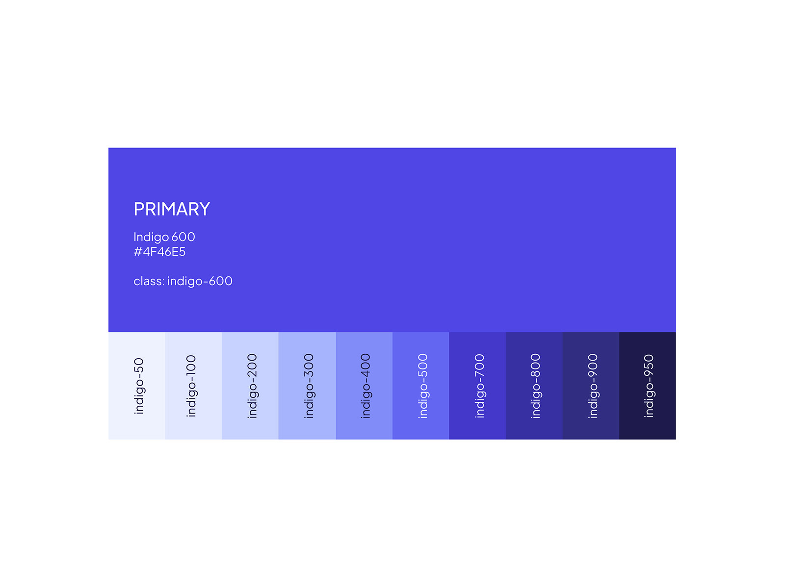
The UniCorn colour system, with Indigo 600 at hex 4F46E5 as the primary and a ten step scale running from indigo 50 through to indigo 950.
Indigo 600 as the primary, with a full tonal scale beneath it.
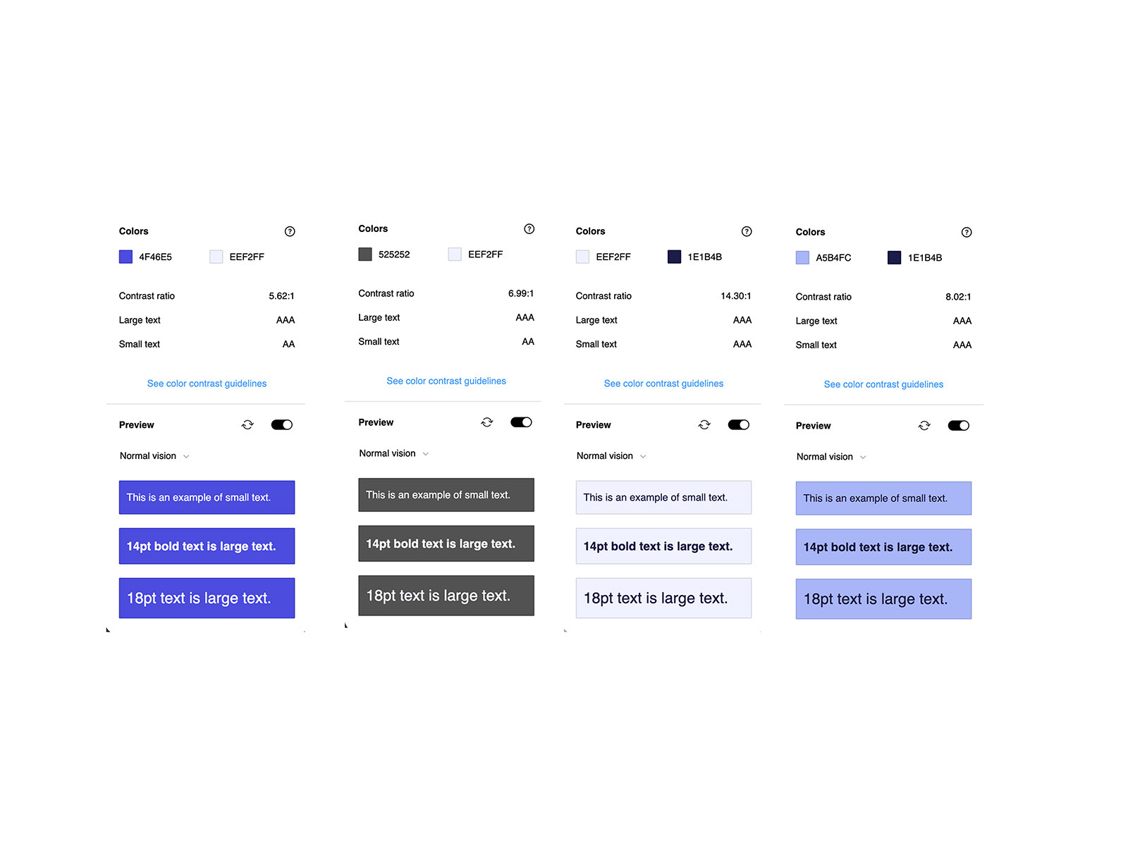
Four contrast checks for UniCorn colour pairings, reporting ratios of 5.62 to 1, 6.99 to 1, 14.30 to 1 and 8.02 to 1, each passing AA or AAA for small and large text.
Every pairing checked rather than assumed. The weakest still clears AA.
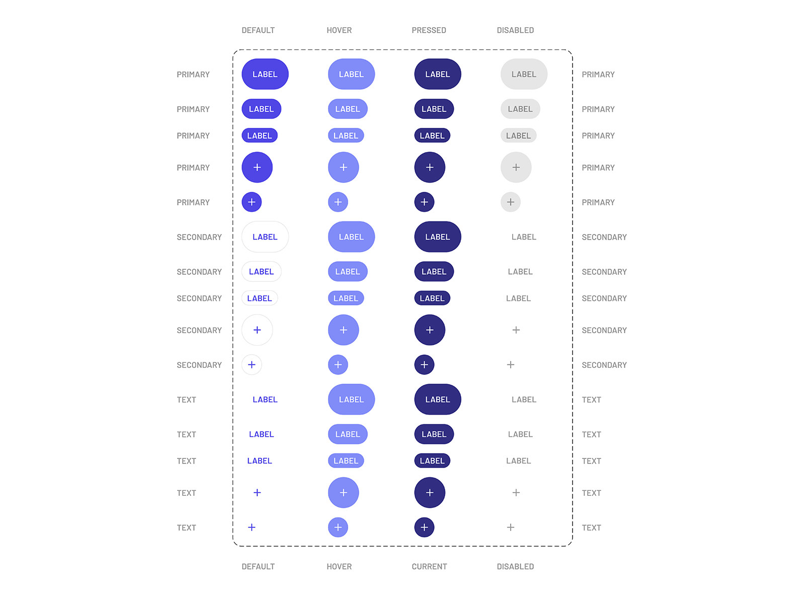
The UniCorn button matrix, showing primary, secondary and text buttons in three sizes plus icon variants, each across default, hover, pressed and disabled states.
Every button, every size, every state, specified once.

Deliverables

Four pieces, end to end

Deliverable 01

Conversational onboarding and intent profiling

Opens with low friction interest cards rather than an empty prompt, tuning what the assistant knows to the student's degree level and subject before the first real question is asked.

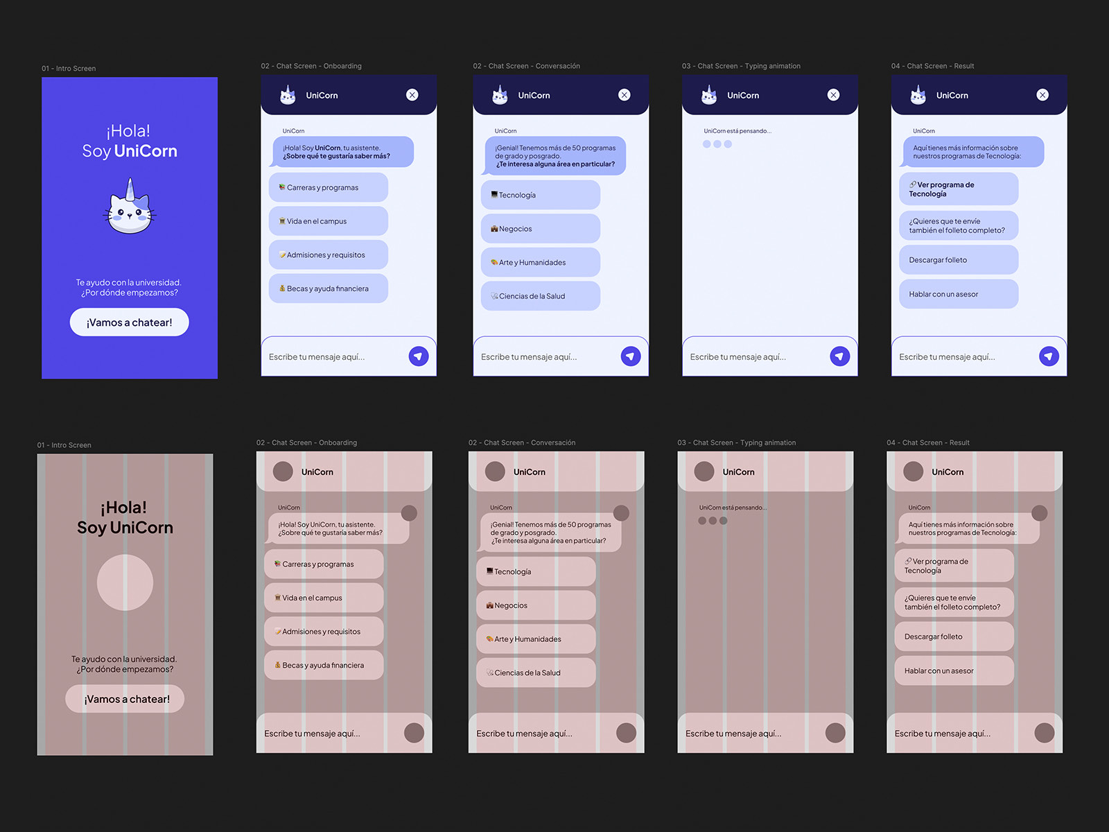
Five UniCorn screens shown twice, once in colour and once with the layout grid overlaid: the intro screen, chat onboarding, a conversation about programme areas, a typing state, and a result screen with follow up actions.
The five core screens, with the layout grid they were built on.

Deliverable 02

Prototype and interaction states

A full set of mobile viewports covering typing indicators, message grouping, inline cards and progressive disclosure, built to keep the thread free of clutter as it grows.

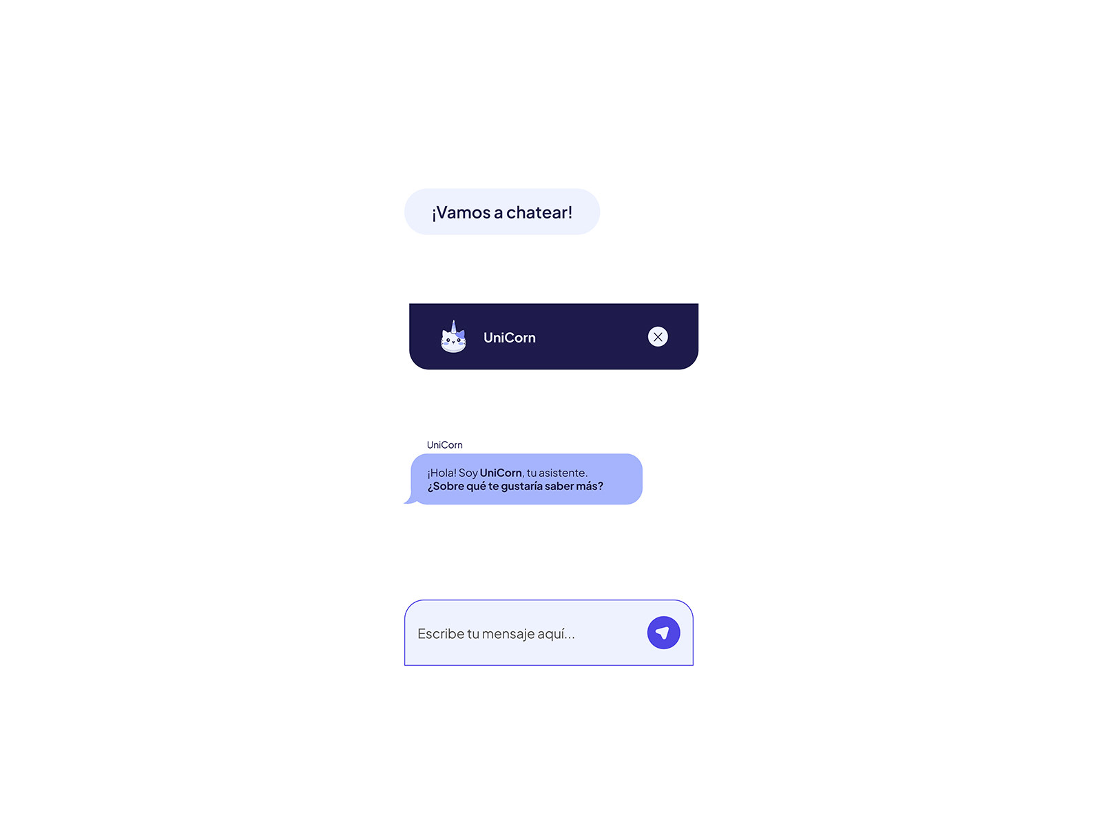
UniCorn conversational components in isolation: a quick reply chip, the dark chat header with the assistant mark and a close control, a bot message bubble, and the message input with a send button.
The conversational parts on their own, before they meet a screen.

Deliverable 03

Visual identity and accessible palette

A brand built around the UniCorn mark, with a colour architecture chosen for legibility across whatever screen and lighting a student happens to be using.

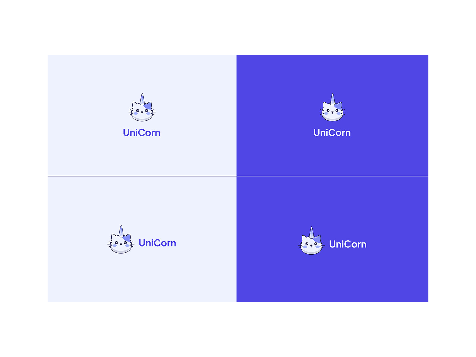
The UniCorn logo in four lockups, stacked and horizontal, each shown on a pale lilac background and on the indigo primary.
The mark, stacked and horizontal, on light and on indigo.

Deliverable 04

Flow architecture and handoff

Architectural maps documenting intent triggers, fallback states, quick reply paths and responsive component behaviour, so engineering had the whole picture rather than a set of screens.

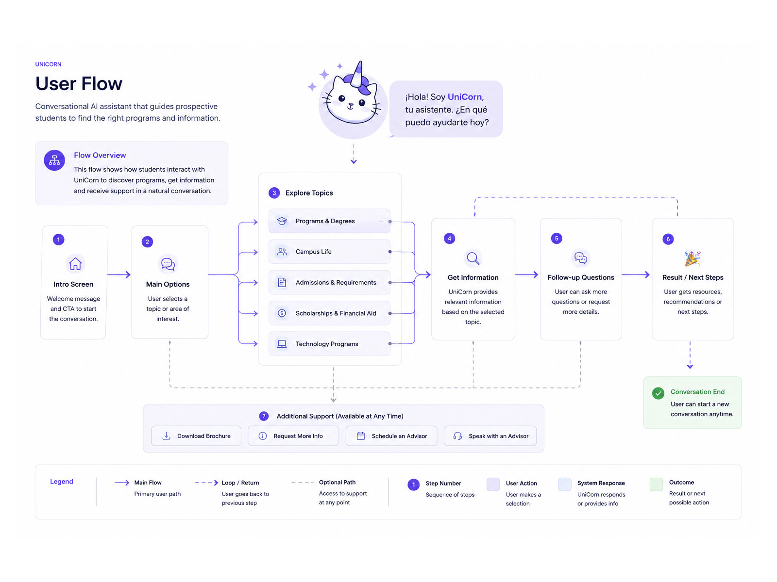
The UniCorn user flow, running in seven numbered steps from intro screen and main options through exploring topics, getting information, follow up questions and next steps, with a persistent support row and a legend explaining main, loop and optional paths.
Main path, loops and escape hatches, with the legend that makes it readable.

Reflection

What I would carry into the next one

  1. 01

    Conversational UX is information architecture in disguise

    A good assistant is not built on prompts alone. Structuring the underlying content into scannable cards and guided paths is what turns a chatbot into something that actually guides.

  2. 02

    Micro interactions are how trust gets built

    Small details, a realistic typing delay, a visible processing state, an explicit confirmation step, set honest expectations about what the assistant can and cannot do.

  3. 03

    Accessibility is not optional in education

    Contrast that holds, generous touch targets and a clear hierarchy for screen readers meant the platform served every prospective student, whatever their ability or device.