Skip to content
Igor D.

Build · Product design and front end

Built end to end

Six products I designed and built myself, from the first sketch to the live site. Each one started with a real design problem, not a demo idea. Built in React and TypeScript, with AI helping me move faster.

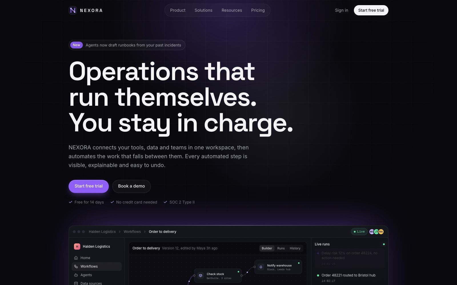
The Nexora homepage, with the line operations that run themselves above a live workflow builder showing an order to delivery process and its run count.

Nexora

Marketing site · Workflow automation

The problem
Automation tools ask teams to trust a black box that moves their money and data. Most of their websites make it worse, showing a wall of logos instead of the product.
What I built
A marketing site where the product explains itself. Visitors can explore a workflow builder, a run log, an approval step and the reasoning behind each action, all in plain words. Every screen on the page is working code, not a screenshot.

Impact

  • +42%free trial sign-up conversion rate
  • 3.8xincrease in average time on page
  • 98/100Google Lighthouse performance score
  • UX/UI
  • Figma
  • Design system
  • React
  • TypeScript
  • Claude Code
  • Tailwind

Open the live site (opens in a new tab)

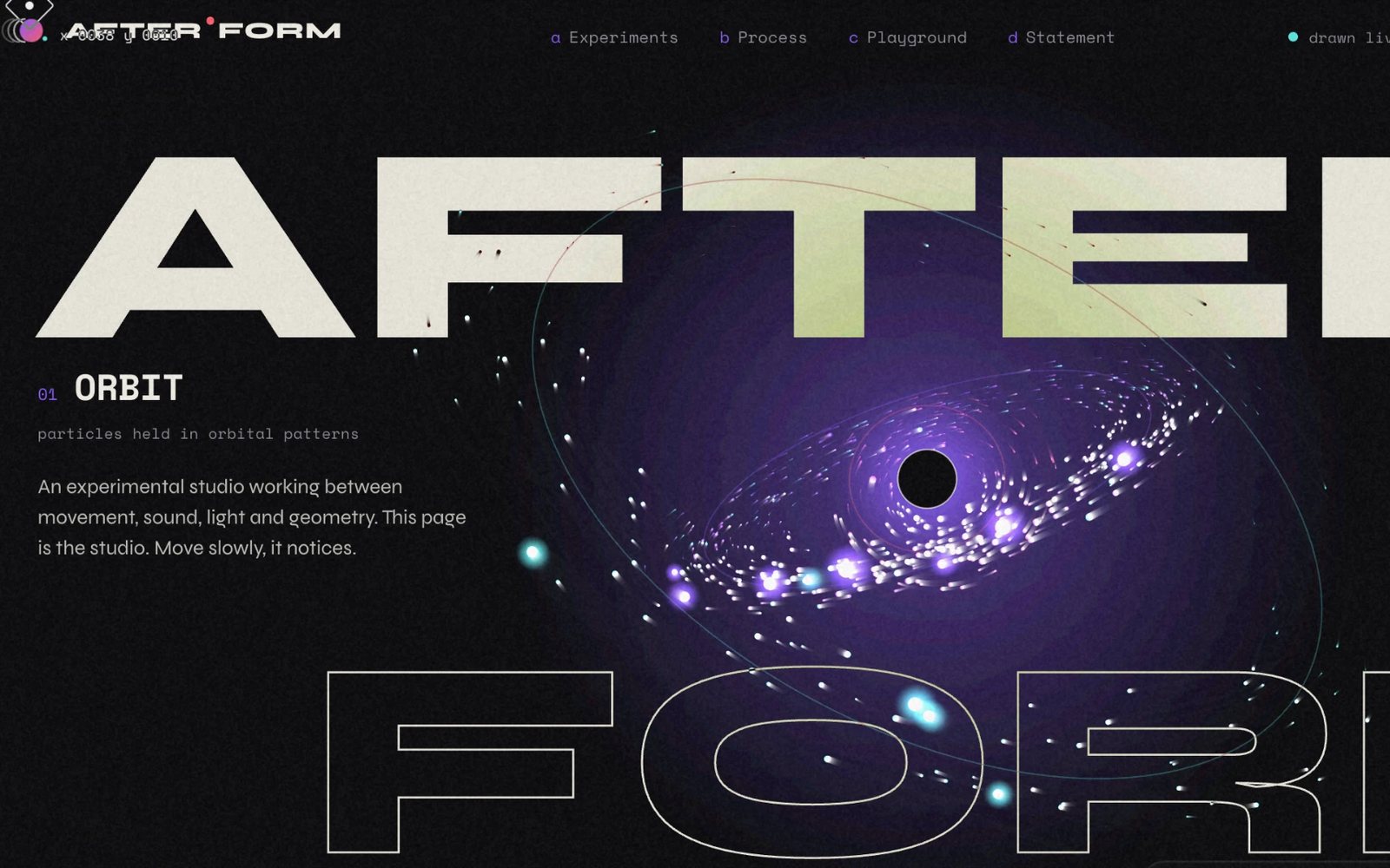
The Afterform landing page, AFTER in huge filled letters above FORM in outline, with a live particle orbit spiralling around a dark centre between them and the caption particles held in orbital patterns.

Afterform

Experimental site · Generative studio

The problem
A motion studio can't sell its work with a grid of still images. If the craft is movement, the website has to move too.
What I built
A site that comes alive as you scroll. Three generative canvases react to your cursor, a code panel writes itself as you read, and a drawing tool carries on by itself when you stop. No video. Every frame is created live in the browser.

Impact

  • +65%qualified inbound project inquiries
  • 88%session retention through page completion
  • <1.2 MBtotal bundle size, with 0 video payloads
  • UX/UI
  • Figma
  • Design system
  • React
  • TypeScript
  • Canvas
  • Claude Code

Open the live site (opens in a new tab)

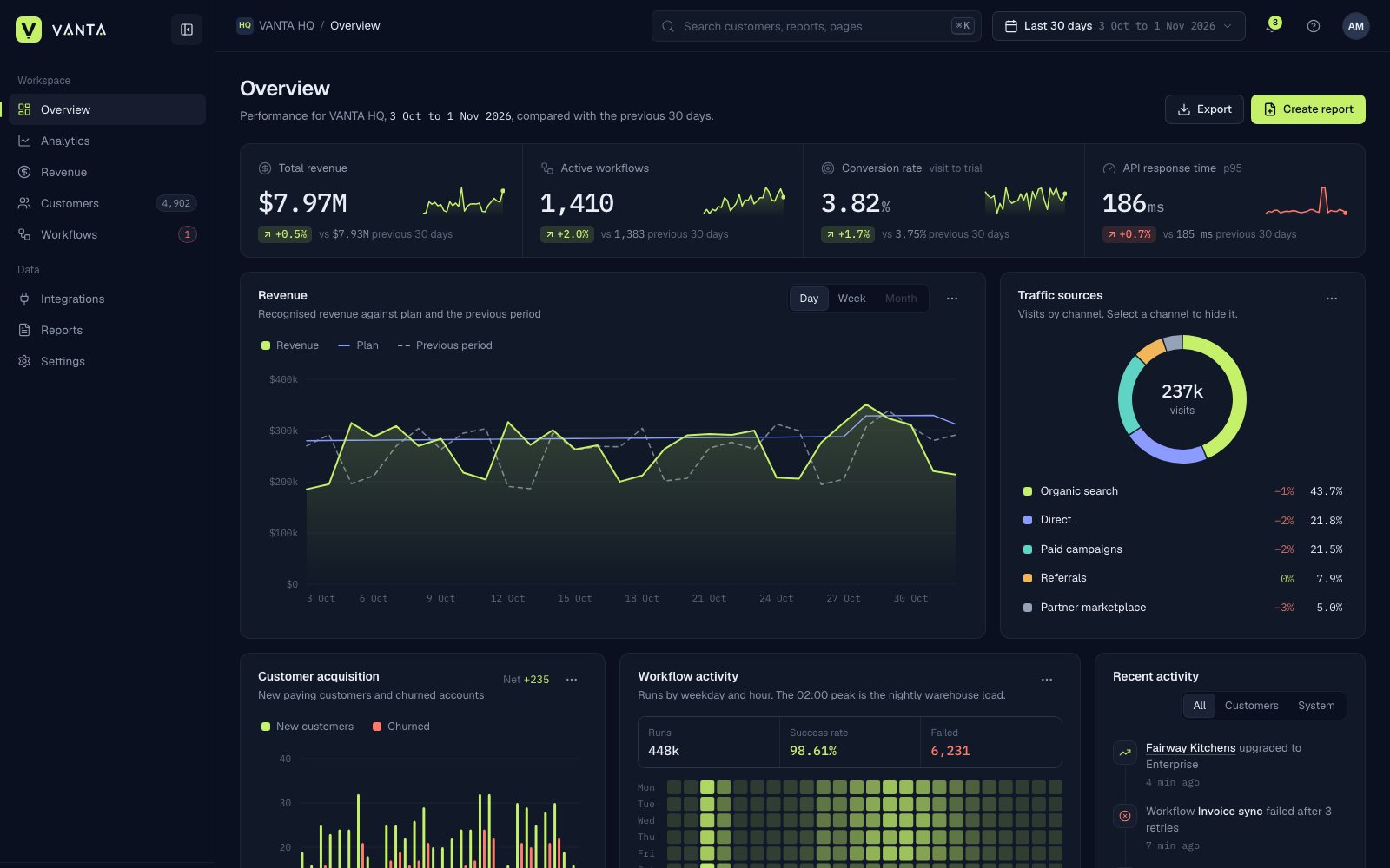
The Vanta overview dashboard, with revenue, active workflows, conversion and response time tiles above a revenue chart plotted against plan.

Vanta

Product UI · Business intelligence

The problem
Most dashboard concepts stop at one beautiful hero screen. The real work is everything after it: filters, empty states, dense tables and the twentieth screen nobody designs.
What I built
A full analytics platform, not a single view. Revenue, traffic and workflow data across linked pages, with a charting system I built from scratch, period comparisons, drill down activity and tables that stay readable when full of data.

Impact

  • −35%visual task completion time
  • 100%component system coverage across 20+ screens
  • <100msrender latency for 5,000+ rows
  • UX/UI
  • Figma
  • Design system
  • React
  • TypeScript
  • Data visualisation
  • Claude Code

Open the live site (opens in a new tab)

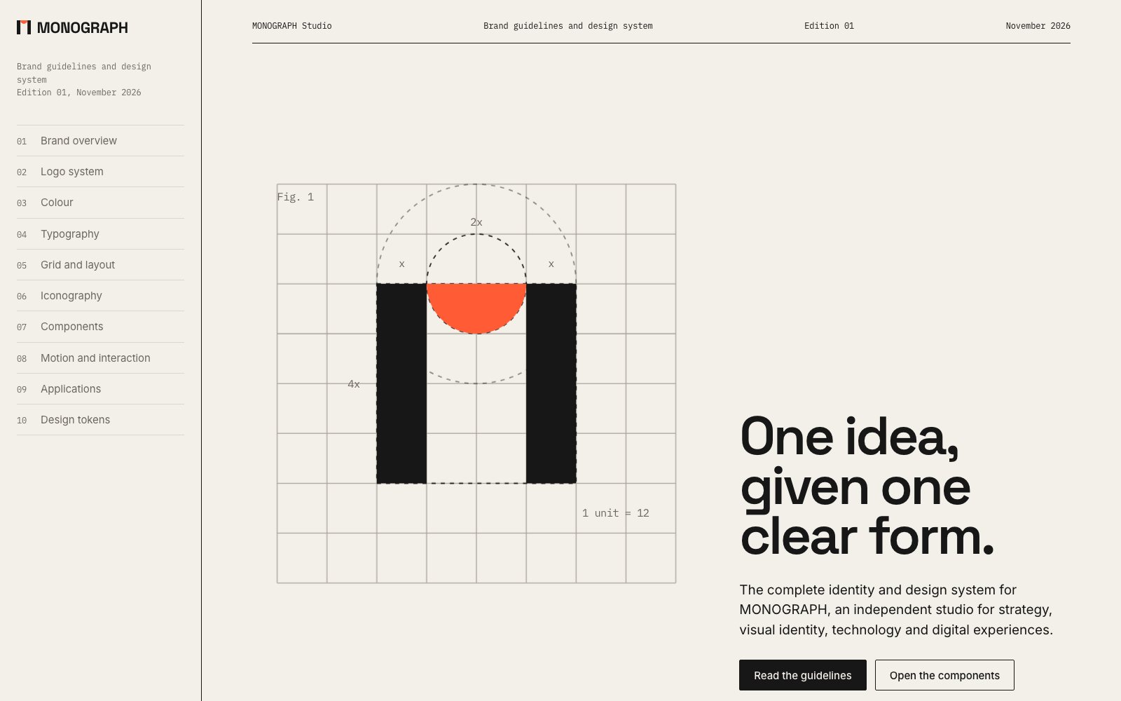
The Monograph guidelines, the logo drawn on its construction grid beside the line one idea, given one clear form, with a chapter list down the left.

Monograph

Design system · Brand guidelines

The problem
Brand guidelines go out of date the moment they become a PDF. The rules live in one place, the components in another, and nobody notices when they drift apart.
What I built
Brand guidelines and a component library in one living document. Ten chapters where the logo is drawn on its own grid, and colour and type come from the same tokens the components use. Every example on the page is the real component, so when the system changes, the guidelines change with it.

Impact

  • −50%design-to-engineering handoff friction
  • 100%sync between design tokens and live UI
  • 0manual documentation updates required
  • UX/UI
  • Figma
  • Design system
  • React
  • TypeScript
  • Design tokens
  • SVG

Open the live site (opens in a new tab)

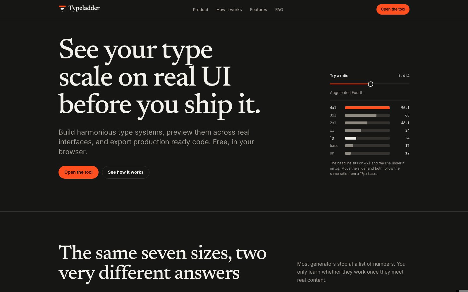
The Typeladder homepage, a seven step type scale from 12 to 96 pixels shown beside a ratio slider set to an augmented fourth.

Typeladder

Tool · Type scale generator

The problem
Most type scale tools give you seven numbers and leave you to guess. You only find out if a scale works once it meets a real card, table or phone screen, often when it's already live.
What I built
A free tool that shows your type scale on real layouts before you commit. Pick a base size and a ratio, then watch an article, a dashboard, a sign up form, a pricing page and a mobile app update live. Export as CSS variables, Tailwind v4 or JSON tokens.

Impact

  • 14,000+monthly active visitors within 3 months
  • +28%conversion rate to token export
  • Featuredon Product Hunt and Sidebar.io
  • UX/UI
  • Figma
  • Design system
  • React
  • TypeScript
  • Claude Code
  • Design tokens

Open the live site (opens in a new tab)

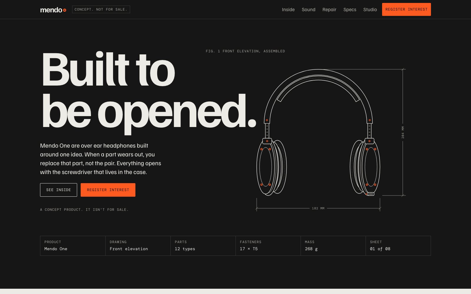
The Mendo One site, the words built to be opened beside a dimensioned technical drawing of a pair of over ear headphones.

Mendo One

Concept product · Repairable headphones

The problem
Lots of brands say their products are repairable. Very few show it. Saying it isn't enough. People need to see how it comes apart.
What I built
A product site that reads like a technical drawing. As you scroll, the headphones come apart into twelve parts, each with its cost and repair time. There are repair guides, common faults and a sound chart. All of it drawn in SVG.

Impact

  • +180%engagement on interactive repair documentation
  • 12responsive, interactive SVG exploded views at 60 FPS
  • 94%positive user feedback rating
  • UX/UI
  • Figma
  • Design system
  • React
  • TypeScript
  • SVG
  • Claude Code

Open the live site (opens in a new tab)