Skip to content
Igor Dinuzzi

01 · Smartness · Hospitality SaaS ecosystem

Designing the future of hospitality

Redefining operational control and visual storytelling for modern hotel management.

Client
Smartness
Scope
Product design, design system, GTM visuals
Year
2024 to 2025
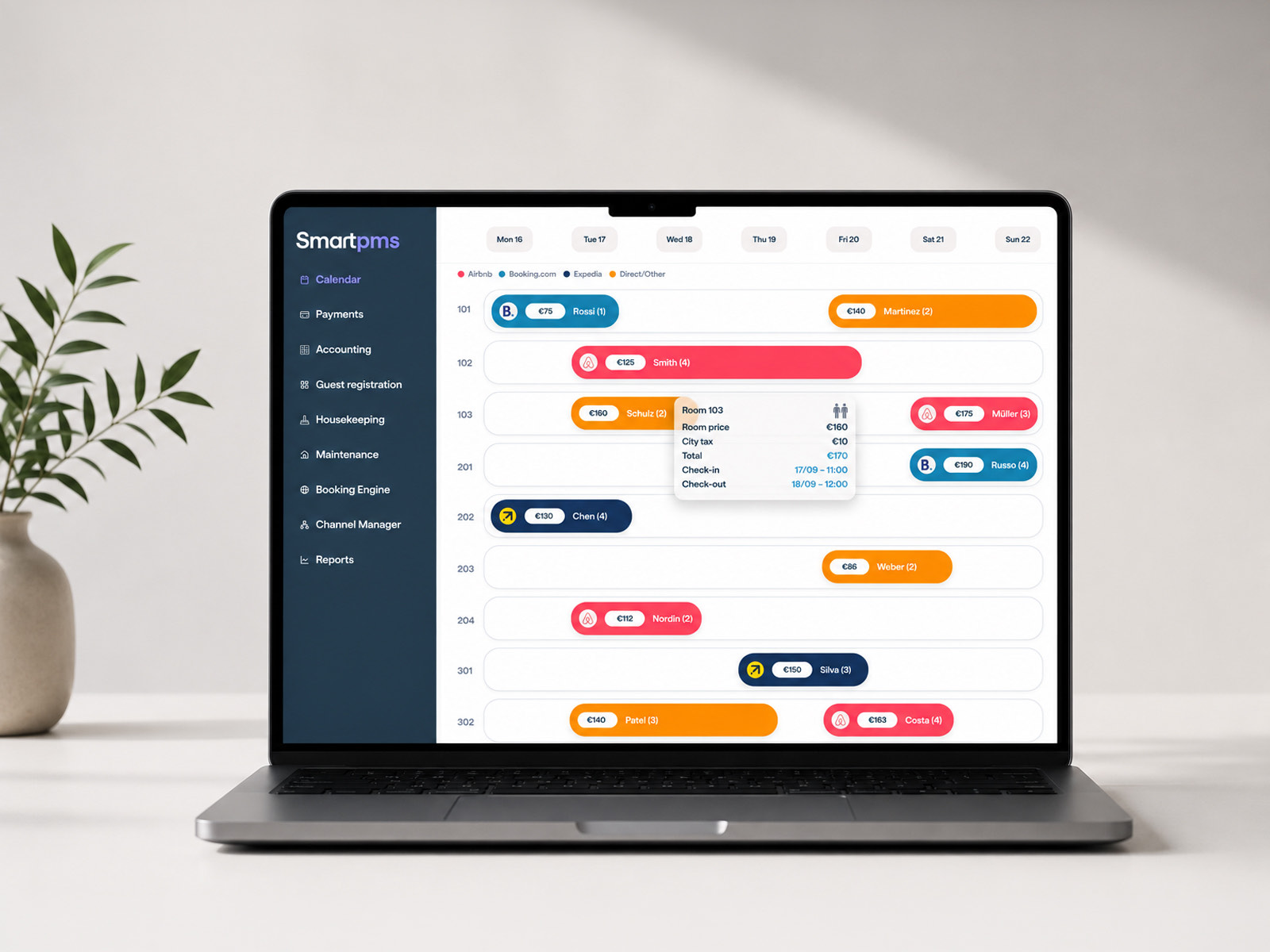
The SmartPMS reservation calendar open on a laptop, showing colour coded bookings across ten rooms for one week.
SmartPMS, the reservation calendar that front desk teams live in.

Overview

A control centre for daily hotel operations

Smartness is a modern hospitality SaaS platform built to run daily hotel operations, from live reservations and revenue analytics to payments, distribution channels and guest CRM.

For hotel operators and property managers the platform is a mission critical control centre. Every second spent hunting for a guest record, decoding a cluttered metric or chasing a failed payment lands directly on guest satisfaction, operational efficiency and revenue velocity.

Problem

The complexity trap in legacy property management

Hospitality platforms are notoriously complex. Operating teams deal with data streams from several properties, rapid guest turnover, fragmented payment channels and fast moving booking distribution.

Legacy systems default to dense tables and disjointed interfaces. The result is operational friction, costly human error and staff onboarding that drags on for weeks.

Operational complexity trail

Legacy property management

Fragmented data

Several properties in one PMS, OTA distribution and channel syncing.

High cognitive load

Dense, noisy tables, deep menu trees and workflows that hide.

Operational slowdown

More room for error, and staff who take longer to get up to speed.

The dual challenge

  1. Friction inside the product

    Hotel staff need to watch property health, take payments and change distribution channels straight away, without digging through deep menu hierarchies or visual noise.

  2. A disconnect outside it

    SaaS products often suffer a gap between how the software looks inside the product and how it is sold outside it. The visual narrative across landing pages and marketing collateral needed to carry the same precision as the dashboard itself.

Strategy

Navigating the mess, with architecture rather than decoration

To bring order to the ecosystem I mapped the operational mental models of the people using it, property managers, front desk operations and financial administrators, then traced the friction points in data ingestion, table scannability and transaction processing.

Smartness platform architecture

Smartness platform

Property and booking

  • Interactive reservation flow
  • Unit inventory
  • Guest CRM records

Payments and distribution

  • Financial dashboards
  • Transaction tracking
  • Live channel sync

Product marketing

  • Scalable landing page assets
  • Feature highlights
  • Visual storytelling

Explorations

Three decisions, and what each one cost

Exploration 01

Dense analytics against information overload

Constraint
Property managers need headline numbers, occupancy, RevPAR, direct bookings, alongside granular operational logs.
Trade off
Traditional dashboards either bury the detail behind modal overlays or flood the screen with unformatted cards.
Solution
A modular card system with a strict visual hierarchy. Primary metrics use progressive disclosure, so a manager can open live transaction logs or filter property views without losing their place.
Exploration 02

Keeping payment and distribution both safe and fast

Constraint
Payment flows and channel management for OTAs such as Booking.com and Expedia carry real business risk. A misstep means a double booking or lost revenue.
Trade off
Multiple confirmation dialogs made the flow safe, but slowed the front desk badly during the check in rush.
Solution
Inline validation, status tags with strong contrast, and payment drawers that guide each step while keeping the surrounding context on screen.

Exploration 03

Making the marketing look like the product

Constraint
Marketing teams often use stylised mockups that do not reflect what the product actually does, which erodes trust on a demo call.
Trade off
Showing raw screenshots on a marketing site can look technical and flat to an executive buyer.
Solution
A suite of marketing visuals built directly from the production Figma components. Isolating real modules, booking calendars and payment logs, and presenting them with considered lighting, elevation and callouts closed the gap between what marketing promises and what the product delivers.

System

The component foundation underneath all of it

Supporting responsive layouts across desktop workstations and tablets meant the system had to be built once and adapt, rather than drawn twice.

Smartness design system

Core tokens

  • Semantic colour
  • Typography
  • Spatial grid
  • Surface depth

UI components

  • Adaptive tables
  • Filter toolbars
  • Status badges
  • Action drawers

Ecosystem patterns

  • Property management flow
  • Payment and checkout engine
  • Booking distribution grid
  • Product marketing visuals
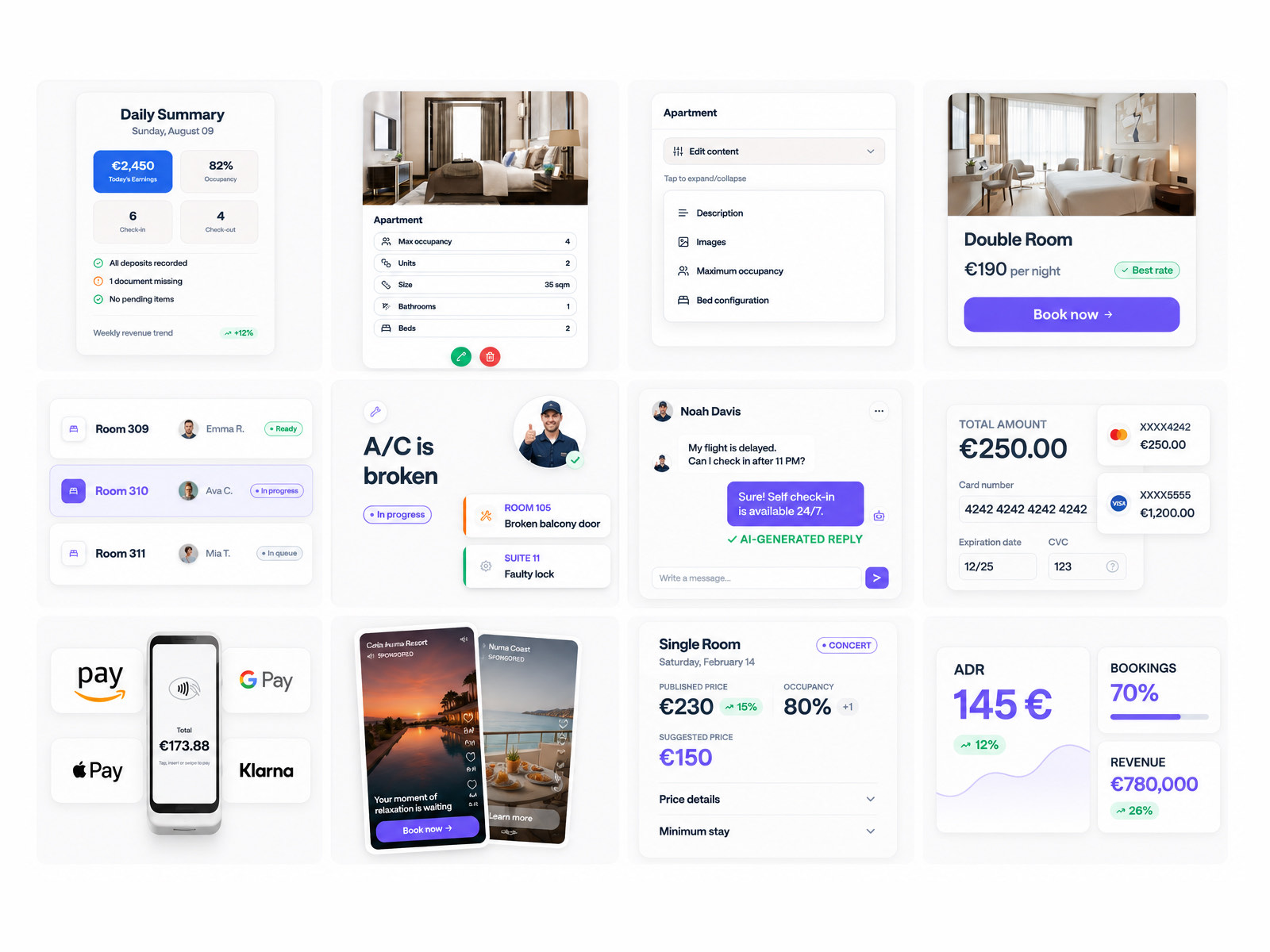
A grid of twelve interface patterns from the Smartness design system, including a daily summary card, room inventory rows, a housekeeping task list, a guest messaging thread, payment method tiles and a revenue analytics panel.
Components in use across operations, housekeeping, messaging, payments and analytics.

Deliverables

Four flows, end to end

Deliverable 01

Property management and operational dashboard

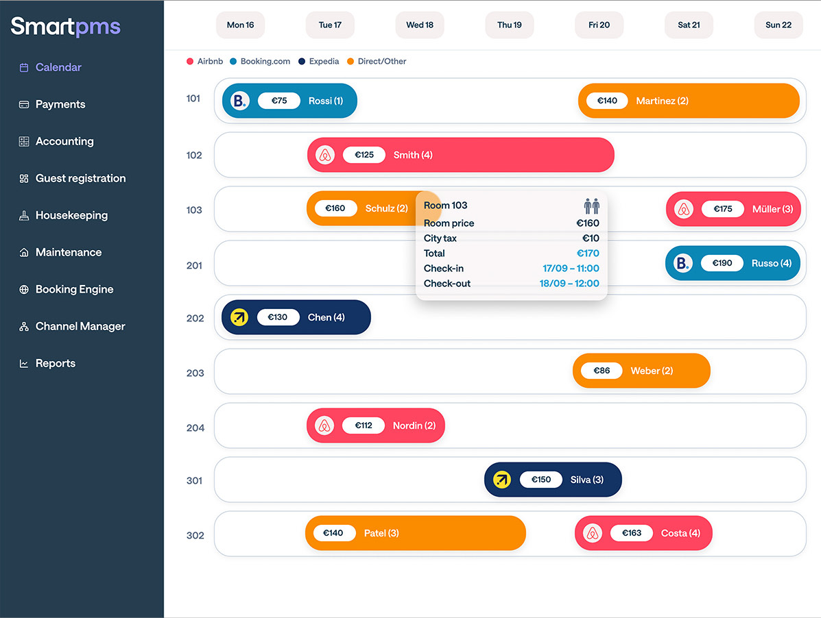
Built for immediate scannability. Interactive grid layouts for room inventory, reservation timelines and guest status that cut the cognitive load on front desk operators.

The SmartPMS calendar, with bookings colour coded by channel across ten rooms and a tooltip showing room price, city tax, total and check in times for room 103.
Bookings colour coded by channel, with rate detail one hover away.
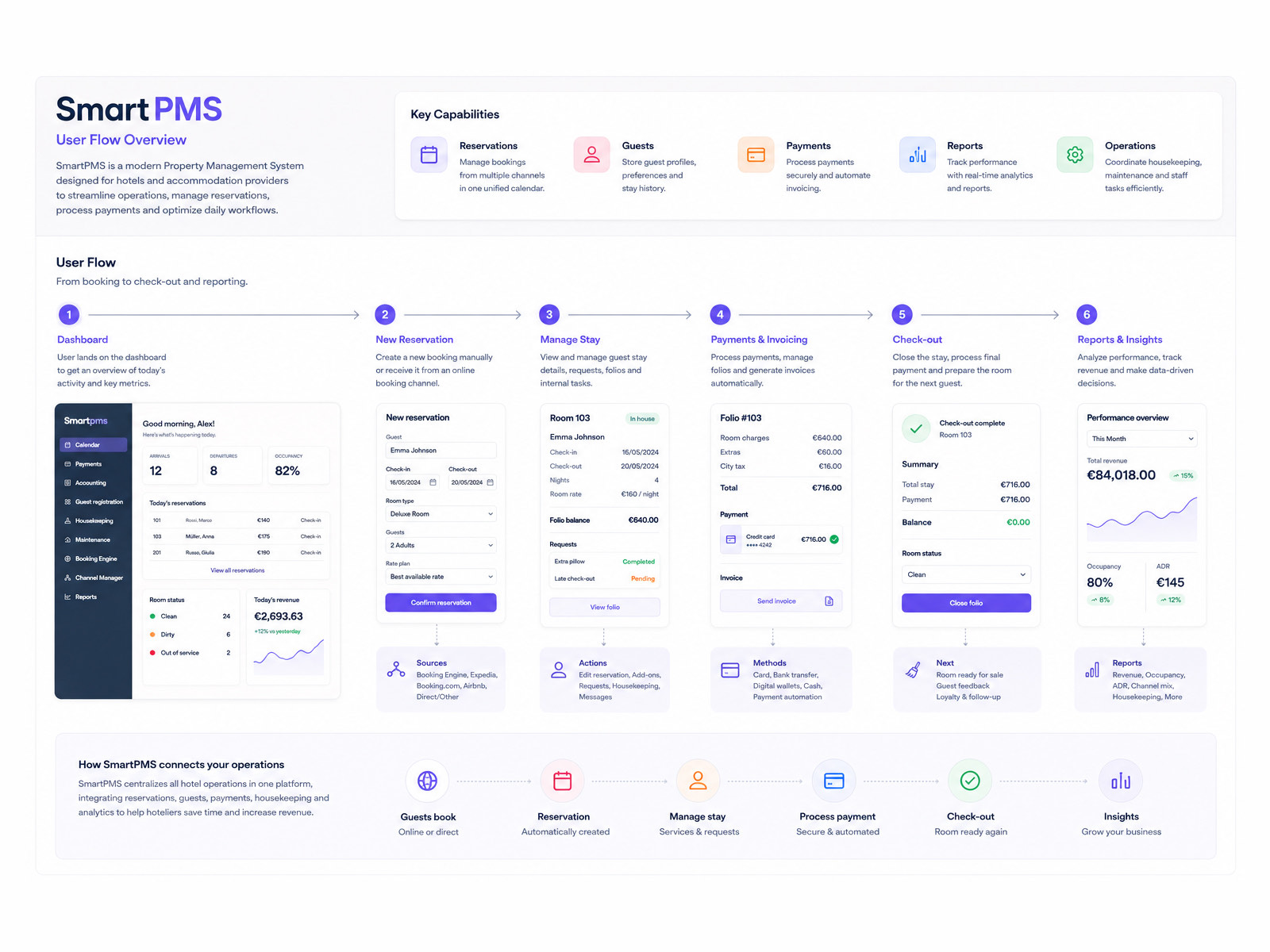
The SmartPMS user flow overview, running in six steps from dashboard through new reservation, manage stay, payments and invoicing, check out and reports.
The full SmartPMS flow, from booking through to reporting.

Deliverable 02

Payment and financial analytics

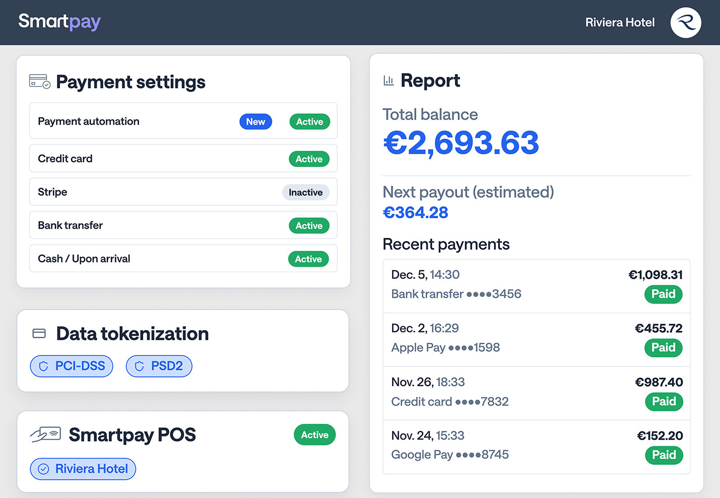
A financial dashboard with live transaction processing, payout status and revenue distribution, built for speed and for auditability.

The SmartPay dashboard, showing payment method settings, data tokenisation badges, a total balance of 2,693.63 euros and a list of recent payments.
SmartPay, where payment settings and live balances sit side by side.
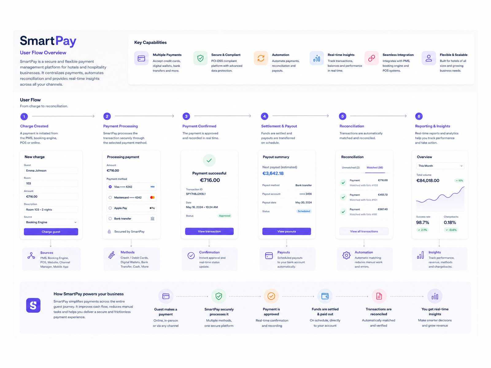
The SmartPay user flow overview, running in six steps from charge created through processing, confirmation, settlement and payout, reconciliation and reporting.
From charge to reconciliation, with the automation called out at each step.

Deliverable 03

Booking and distribution operations

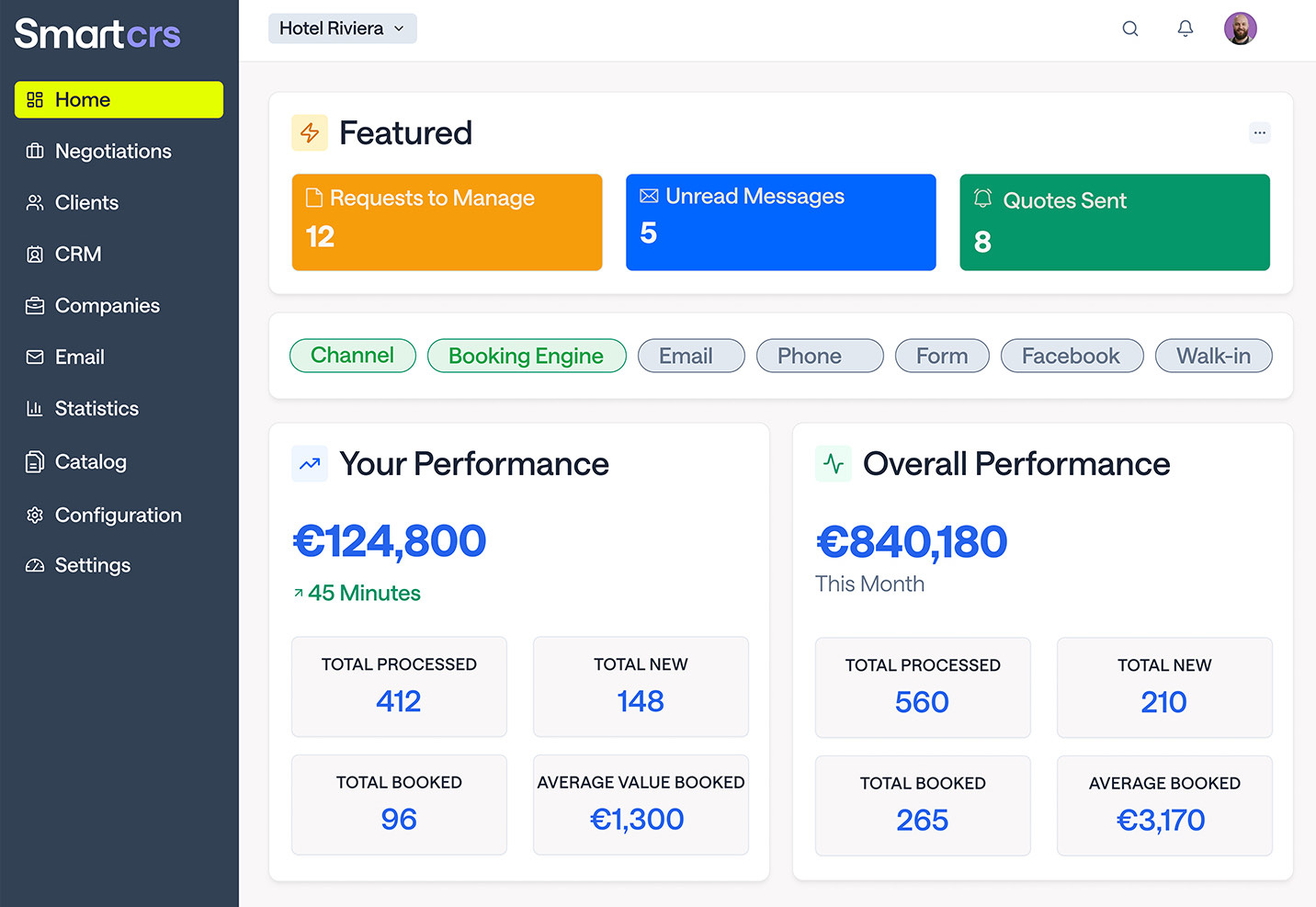
A centralised reservations and CRM surface where commercial teams track leads, negotiate, confirm bookings and watch inventory move across channels.

The SmartCRS home dashboard, showing requests to manage, unread messages, quotes sent, channel filters and performance figures for the month.
SmartCRS, with the day's queue and performance in one view.
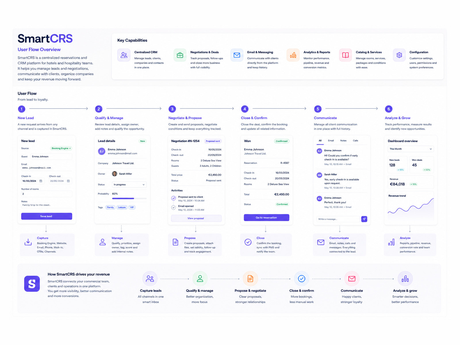
The SmartCRS user flow overview, running in six steps from new lead through qualify, negotiate and propose, close and confirm, communicate and analyse.
From lead to loyalty, with every channel captured in one inbox.

Deliverable 04

Marketing and visual storytelling

A curated visual library for product launches, feature announcements and landing pages, keeping the brand consistent across every marketing touchpoint.

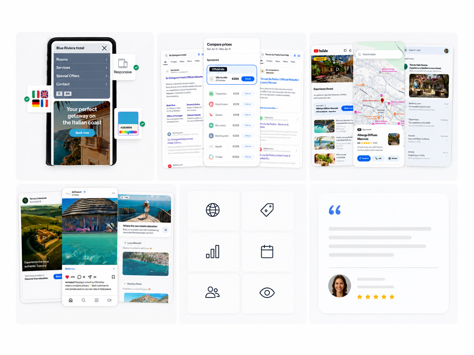
A set of go to market visuals, including a responsive hotel website on a phone, a price comparison panel across booking sites, social and search placements, an icon set and a review card.
Marketing assets drawn from the same components as the product.

Reflection

What I would carry into the next one

  1. 01

    Simplicity is an architectural decision, not a visual layer

    In complex B2B SaaS a clean interface is not enough. Real simplicity comes from considered component architecture, a strict information hierarchy and understanding what someone is trying to do at every step.

  2. 02

    Product and marketing are the same story

    Aligning the design system inside the product with the visuals outside it built trust early in the buyer journey. When a prospect sees collateral that honestly reflects the product, conversion and onboarding both improve.

  3. 03

    Design systems have to scale across contexts

    Modular components that adapt between dense tables on a desktop monitor and larger touch targets on a tablet meant the platform met hotel staff where they actually work.