
06 · Savvi Financial · Rebrand
Making finance feel simpler
A fintech identity that reads as intelligent and trustworthy without turning cold.
- Client
- Savvi Financial
- Role
- Freelance Creative Director and Graphic Designer
- Year
- 2023
- Brand identity
- Fintech
- Creative direction
- Visual language
- Editorial systems
- Typography
- Illustration
- Digital experiences
Overview
Intelligent and trustworthy, without the chill
Savvi Financial needed an identity that could carry authority in a sector built on caution, without inheriting the coldness that usually comes with it.
As freelance creative director and graphic designer I led the full rebrand: the logotype, the typography, the icon system, the co-branding rules and the digital assets.
Direction
Five decisions that set the tone
An italic lowercase logotype
Movement, warmth and approachability in one move, which a capitalised upright wordmark would have given up on immediately.
Light and dark blue together
The light blue carries the optimism, the dark blue carries the authority. Neither works alone in this category.
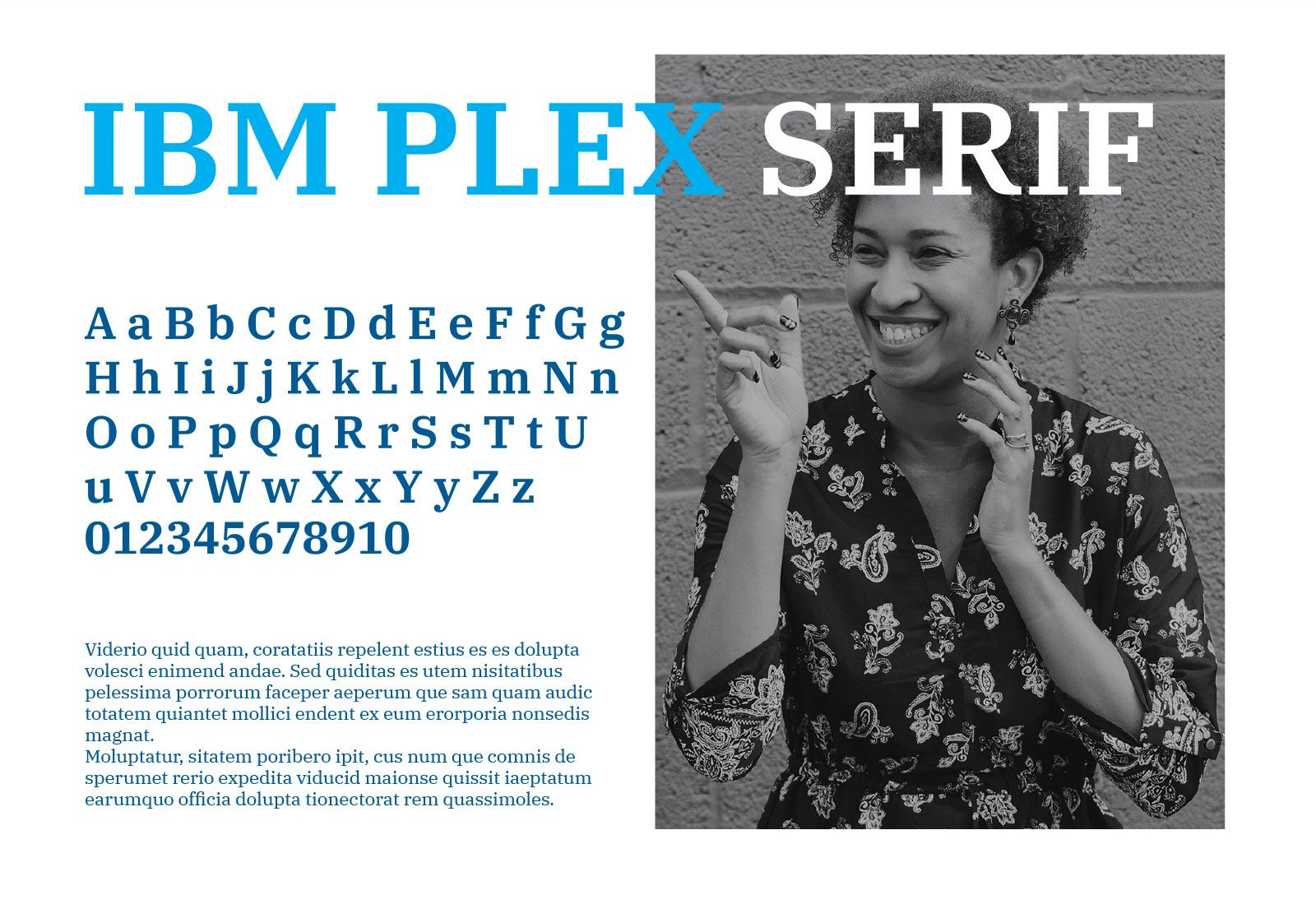
IBM Plex Serif
A serif brings editorial credibility and a slower rhythm, which is the opposite of what most fintech reaches for and exactly the point.
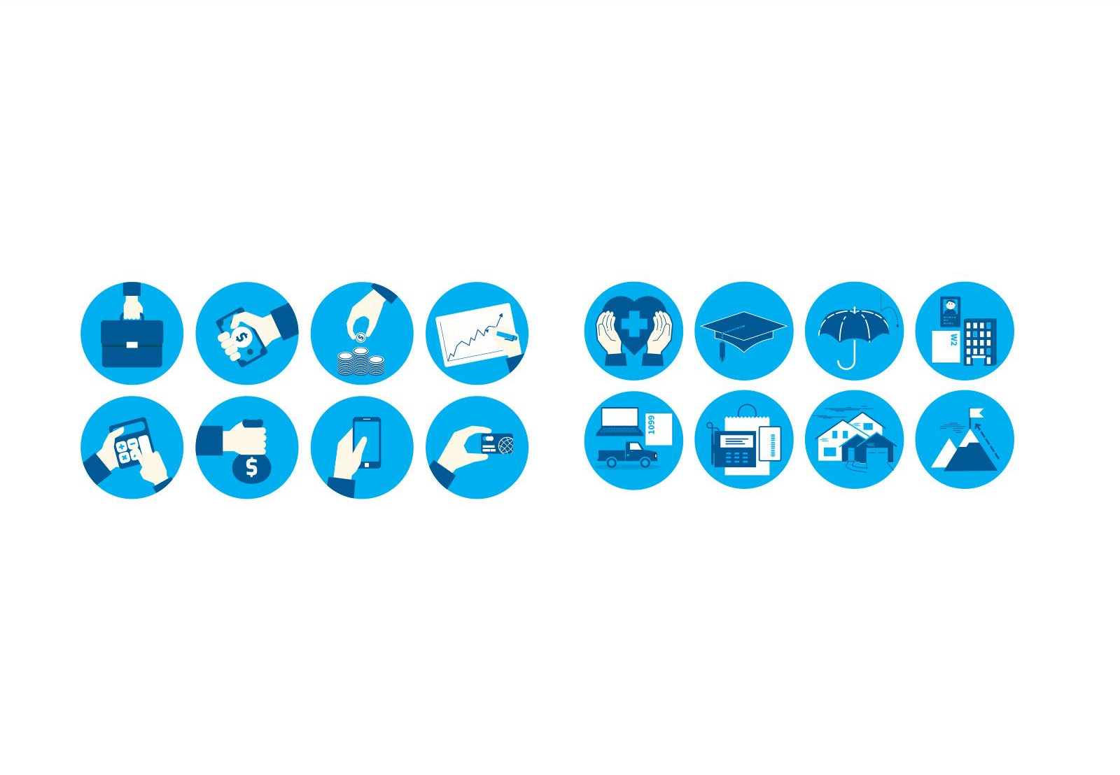
Icons for the whole of financial life
A system covering everything from healthcare and investments through to retirement, so no part of the offer looks improvised.
People, not charts
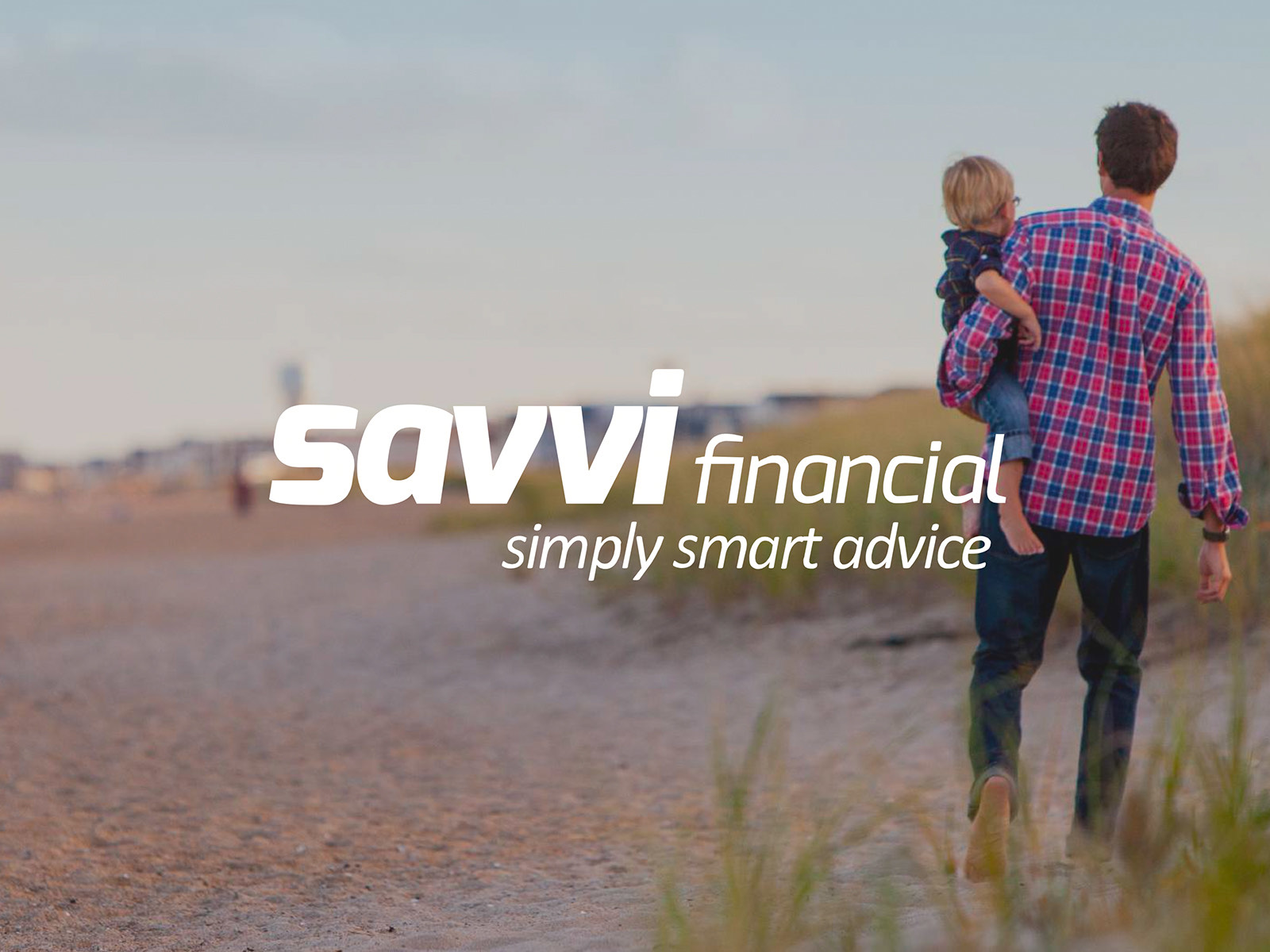
The strongest shift in the project. Away from generic graphs and corporate portraits, towards the people financial planning is actually for.
Process
How it got there
- 01
Stakeholder interviews
Internal teams, clients and end users, to understand the real needs and expectations rather than the stated ones.
- 02
Market research
An audit of fintech branding and direct competitors, looking for where differentiation would actually pay.
- 03
Identity development
Building a visual language around the balance Savvi needed: technical enough to trust, human enough to approach.
- 04
Web and digital assets
A redesigned site and supporting assets, using custom icons and infographics to make complex financial ideas legible.
- 05
Iteration and testing
Refinement through close collaboration with the team and feedback loops, to keep the work aligned with the brand intent.
- 06
Implementation
Rolling the identity out across every platform so the system arrived as one thing rather than in pieces.
Deliverables
The system, part by part
Deliverable 01
Logotype and application
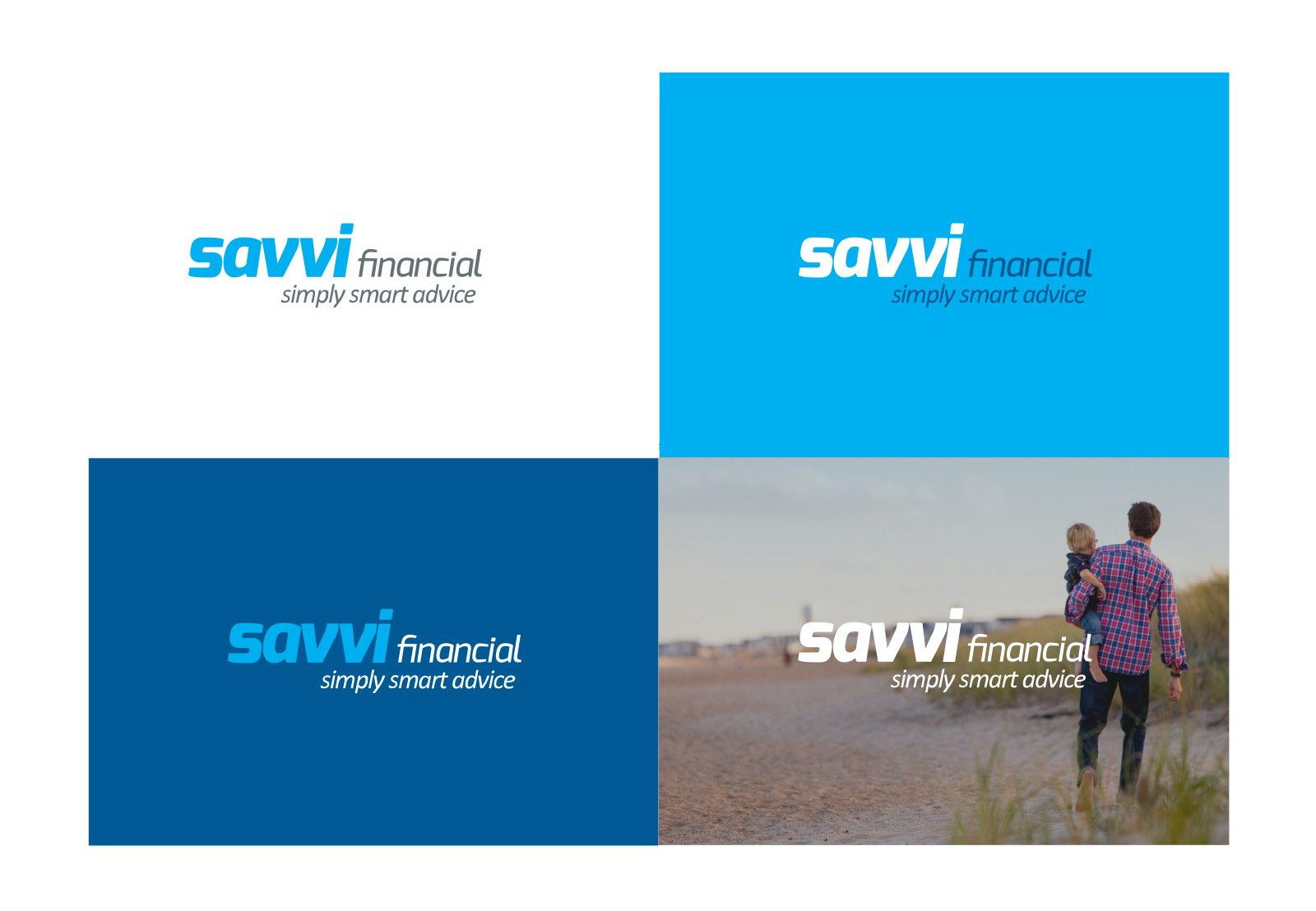
The lockup working across white, light blue, dark blue and photography, which is the real test of whether a wordmark holds.
Deliverable 02
Co-branding
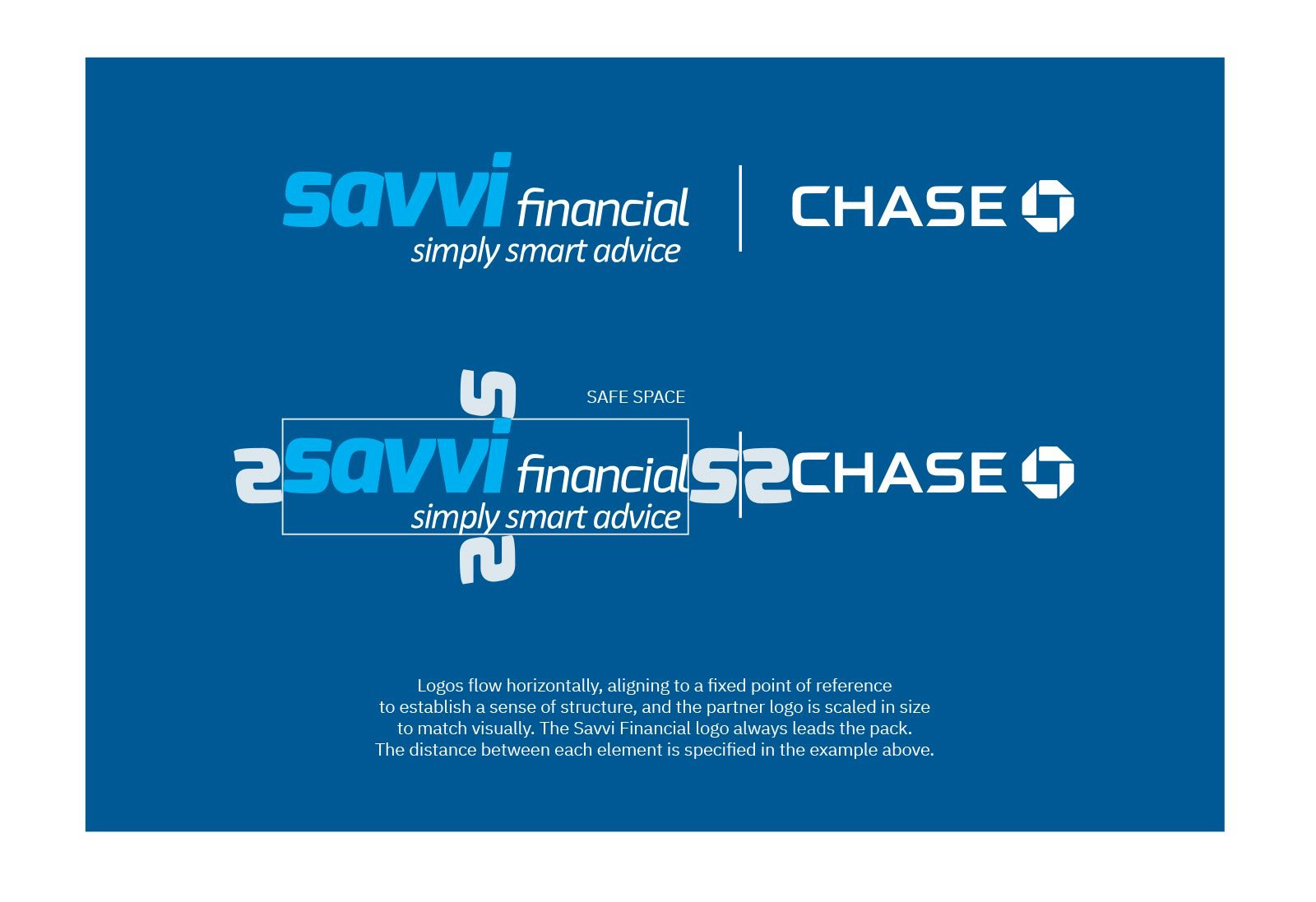
Partner lockups with the spacing specified rather than described, so the rule survives being handed to someone else.
Deliverable 03
Colour
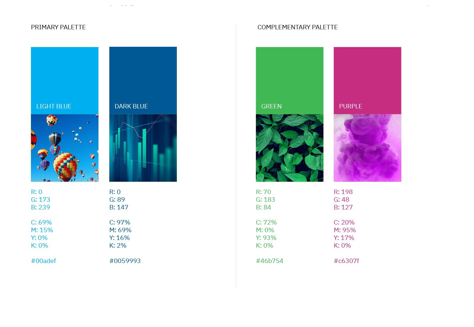
A primary pair doing the heavy lifting, with a green and a magenta held back for moments that need the lift.
Deliverable 04
Typography
IBM Plex Serif as the voice. A serif in fintech is a deliberate break from the category, and it is what gives the communications their editorial weight.
Deliverable 05
Imagery direction
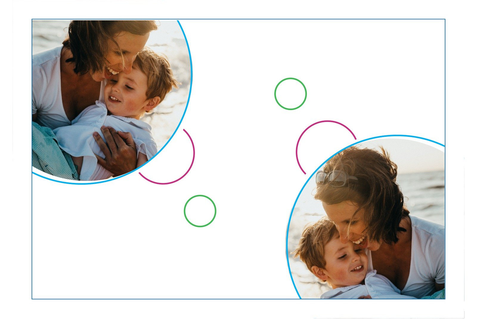
The art direction that carries the whole positioning. Warm light, real moments, and not a single stock boardroom.

Deliverable 06
Shapes and geometry
The circle as the brand's structural device, cropping photography and holding space, so layouts stay recognisable even with the logo removed.
Deliverable 07
Iconography
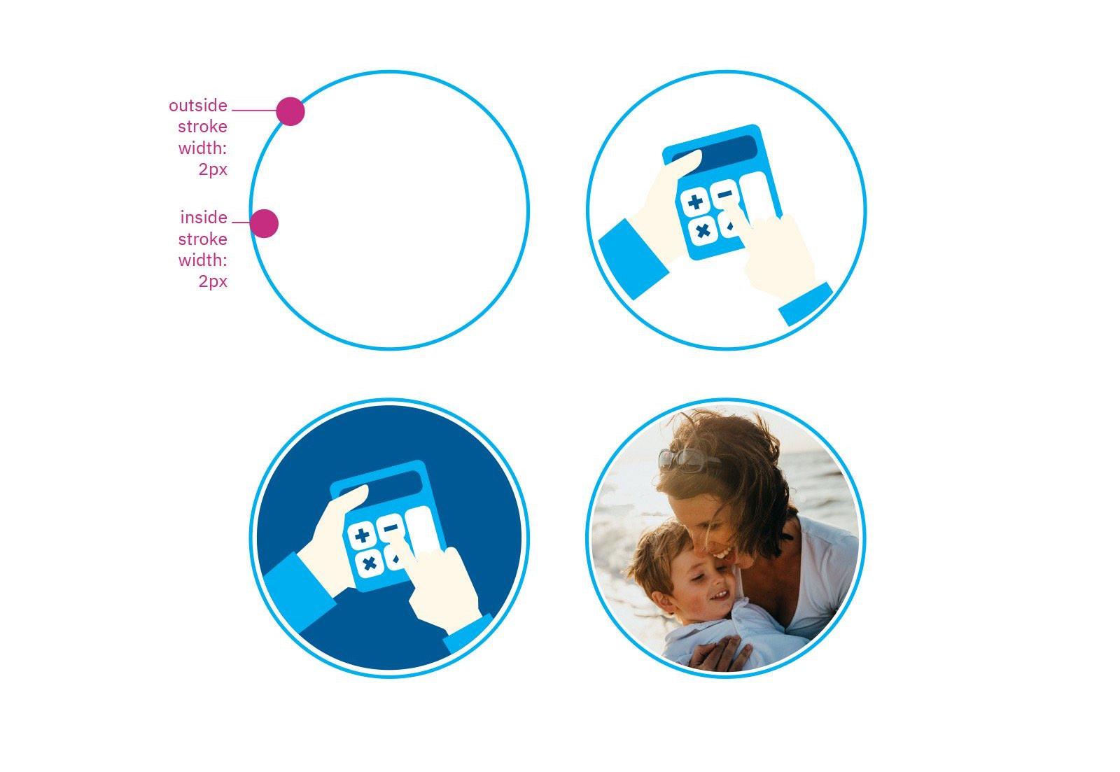
A system drawn to a construction rule first, then extended across the full spread of financial life, from a first pay cheque to retirement.
Impact
Why it mattered
Financial trust starts before someone opens the product. The rebrand positioned Savvi as emotionally approachable without sacrificing intelligence or credibility.
Credits
- Creative direction
- Igor Dinuzzi
- Art direction and graphic design
- Igor Dinuzzi
- Copywriting
- Savvi Financial
- Client
- Savvi Financial