Skip to content
Igor Dinuzzi

03 · Nutribén · E-commerce and design system

Growing a healthier digital experience

Bridging content, community and commerce for one of Spain’s most trusted infant nutrition brands.

Client
Nutribén
Scope
UX, UI, e-commerce design system
Year
2024
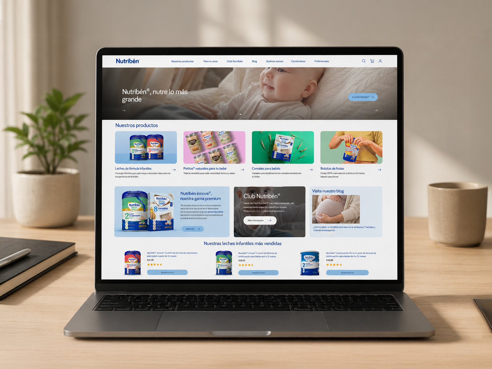
The redesigned Nutribén homepage open on a laptop, showing the hero, four product categories, the innova premium range, the Club Nutribén panel and a row of best selling formulas.
The Nutribén homepage, where guidance and the shop finally sit together.

Overview

Decades of trust, stuck behind a product catalogue

Nutribén is one of Spain’s most established infant nutrition brands, supporting families from pregnancy through early childhood.

The clinical credibility and the shelf presence were already there. The digital side faced a familiar problem: how to move from a static product catalogue to a commerce ecosystem that also carries real content. The work set out to unify direct to consumer shopping, nutritional guidance by stage, editorial written by experts, and the Club Nutribén loyalty programme into one experience.

Problem

The content and commerce paradox

Shopping for infant nutrition is not standard e-commerce. Parents are usually short of sleep and short of time, and they are navigating very specific developmental stages.

They do not browse by category. They search by age milestone, by dietary tolerance, and by whether an expert has said it is safe.

Legacy digital disconnect

The old nutriben.es

A transactional silo

Dense clinical listing pages organised purely around product codes, with no guidance anywhere near them.

An editorial silo

Genuinely useful articles, sitting on their own, disconnected from the thing a parent would actually buy next.

Decision paralysis

Real friction for a parent trying to find the right nutrition for the exact stage their baby is at.

The design challenge

  1. Four intents, one platform

    Parents arrive wanting different things: buying formula, checking a weaning schedule, claiming a Club Nutribén reward, or asking for paediatric advice. All four had to work without cluttering the path to buying.

  2. Needs that change every few months

    Infant nutrition shifts every two to three months. A conventional category menu cannot guide someone through starter formula, follow on milk and cereals as a progression rather than a list.

  3. Designing for real conditions

    Mobile had to work one handed, stay legible at a glance, and let someone finish a task fast, because it is being used at awkward hours with a baby in the other arm.

Strategy

Restructuring around intent, not around departments

To bring content and commerce together I rebuilt the information architecture around what a parent is trying to do, rather than around which part of the business owns which page.

Nutribén ecosystem

Nutribén ecosystem

Commerce by stage

  • Age stage filters
  • Product detail with ingredients
  • Quick add to basket

Club Nutribén

  • Milestone tracking
  • Club pricing
  • Exclusive samples

Editorial and expertise

  • Paediatric articles
  • Weaning guides
  • Products shown in context

Explorations

Three decisions, and what each one cost

Exploration 01

Filtering by stage against the usual category menu

Constraint
A standard shop menu sorts by format, powder, jars, cereals. Parents think in milestones: my baby is six months old.
Trade off
Pushing everyone through a rigid age selector hides whole categories from search engines and from repeat shoppers who already know what they want.
Solution
A dual filter on the listing pages. Someone can narrow by developmental stage, from four months, from six, from twelve, and by product type at the same time, so the reassurance and the full catalogue coexist.
Exploration 02

Editorial in context against friction in the funnel

Constraint
Parents rarely switch formula without first reading the nutritional breakdown or what a paediatrician has to say.
Trade off
Sending that traffic off to long form articles pulls people out of the purchase path and they do not come back.
Solution
Shoppable editorial. Feeding guides and nutritional notes sit inside the product and collection pages, with add to basket built into the card, so someone can buy without leaving what they were reading.

Exploration 03

Club signup against checkout momentum

Constraint
Club Nutribén is where the personalised advice and sample kits live, and it is real business value, but a long signup form in the middle of checkout is where baskets get abandoned.
Trade off
Asking for full registration upfront captures far richer data, at the cost of making a first purchase much harder.
Solution
Progressive profiling. A first time buyer checks out as a guest, with one checkbox to join the club using the details they are already entering. The discount applies immediately and the checkout never stalls.

System

A modular system built for high trust retail

The same components had to hold across Shopify templates, seasonal campaigns and agency handoff without being rebuilt each time.

Nutribén design system

Core tokens

  • A warm, reassuring palette
  • Mobile typography with real contrast
  • Spacing and touch target grid

Commerce components

  • Cards with an age badge
  • Quick buy drawers
  • Ingredient drawers
  • Basket micro states

Editorial and club

  • Article layouts
  • Milestone timeline cards
  • Club benefit banners
  • Interactive feeding tables

Deliverables

Five pieces, end to end

Deliverable 01

Homepage and stage finder

A warm hero followed immediately by the four product worlds, so a parent can narrow the whole ecosystem down to their baby's exact stage within a screen or two.

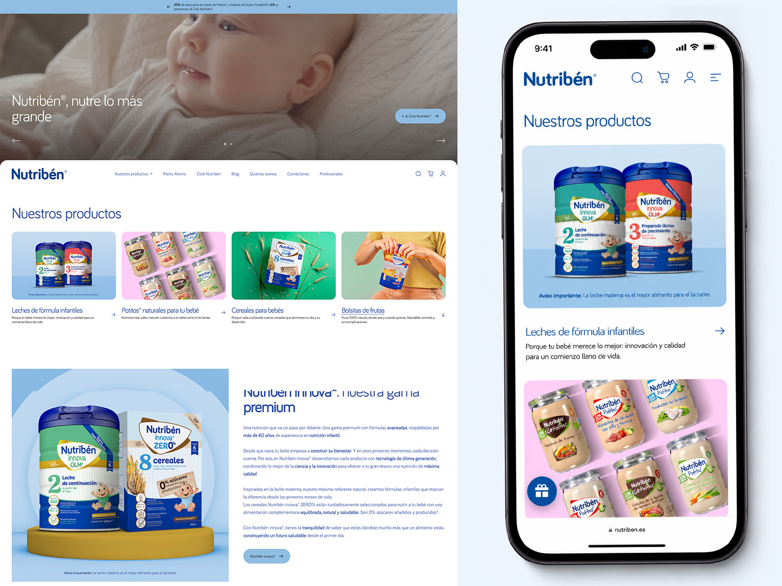
The Nutribén homepage on desktop and mobile, showing the hero, four product categories with photography, the innova premium range section, and the mobile view of the same product grid.
Desktop and mobile, with the same stage first logic on both.

Deliverable 02

Product listing and nutritional guidance

Clear product cards with stage badges, allergen indicators and nutritional callouts, sitting alongside the editorial that answers the question behind the purchase.

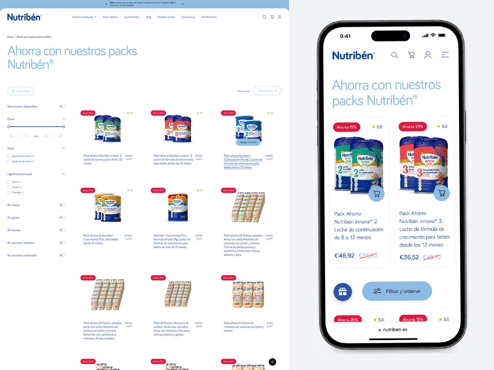
The Nutribén savings packs listing page on desktop and mobile, with filters for price, age, main ingredient and dietary exclusions down the left, and product cards showing discount badges, ratings and crossed out prices.
Filters by age and by ingredient, running at the same time.
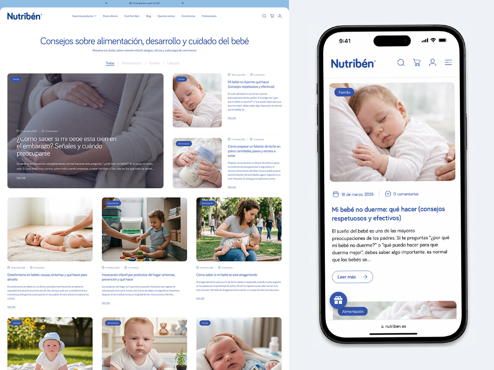
The Nutribén blog on desktop and mobile, with category filters and article cards covering pregnancy, infant sleep, bottle preparation and weaning.
Editorial treated as part of the shop, not a separate website.

Deliverable 03

Club Nutribén loyalty hub

A community space where parents track milestones, claim club rewards and get advice matched to their child's age rather than to a campaign calendar.

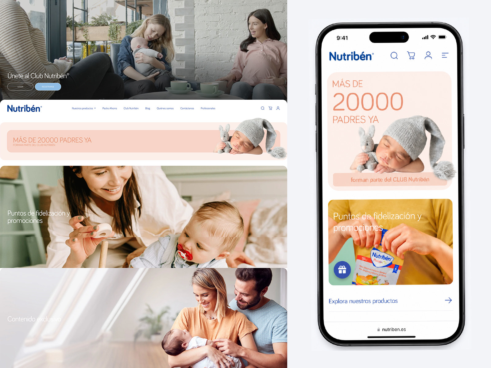
The Club Nutribén pages on desktop and mobile, with a join prompt, a banner reading more than 20,000 parents are already members, loyalty points and promotions, and exclusive content sections.
Membership framed as belonging, with the benefit stated plainly.

Deliverable 04

Cart and checkout

A slide out basket with a visible free shipping threshold, single tap quantity changes and gentle upsells for samples that suit the same stage.

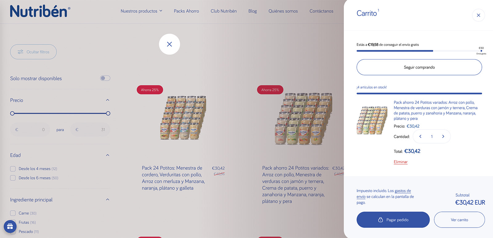
The Nutribén slide out basket over a dimmed listing page, showing progress towards free shipping, a stock indicator, quantity controls, the subtotal and the checkout button.
How far from free shipping, how much is left in stock, and one way forward.

Deliverable 05

Persona mapping and user flows

Blueprints tracing the journey from an organic search for advice, through brand validation and club registration, to a repeat purchase.

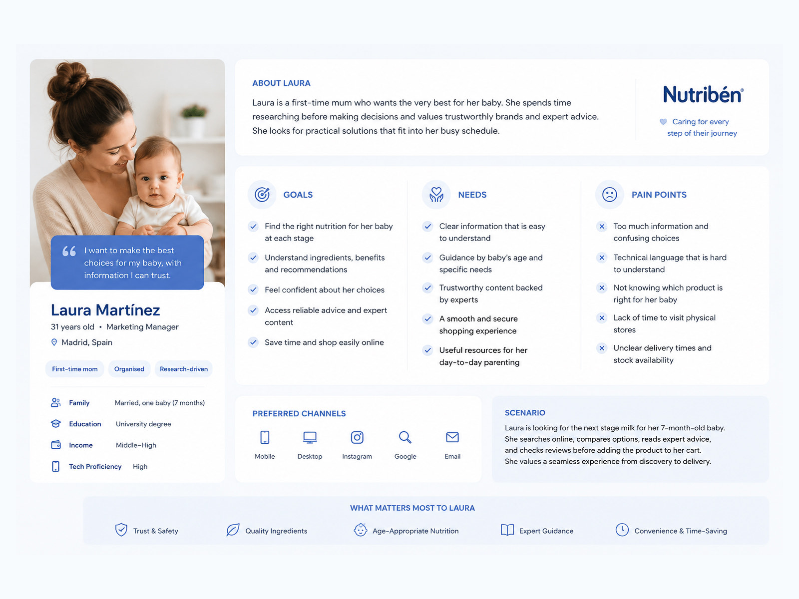
The persona sheet for Laura Martínez, 31, a first time mother in Madrid, listing her goals, needs, pain points, preferred channels and the scenario of finding the next stage milk for her seven month old.
Laura, the parent the whole structure was built around.
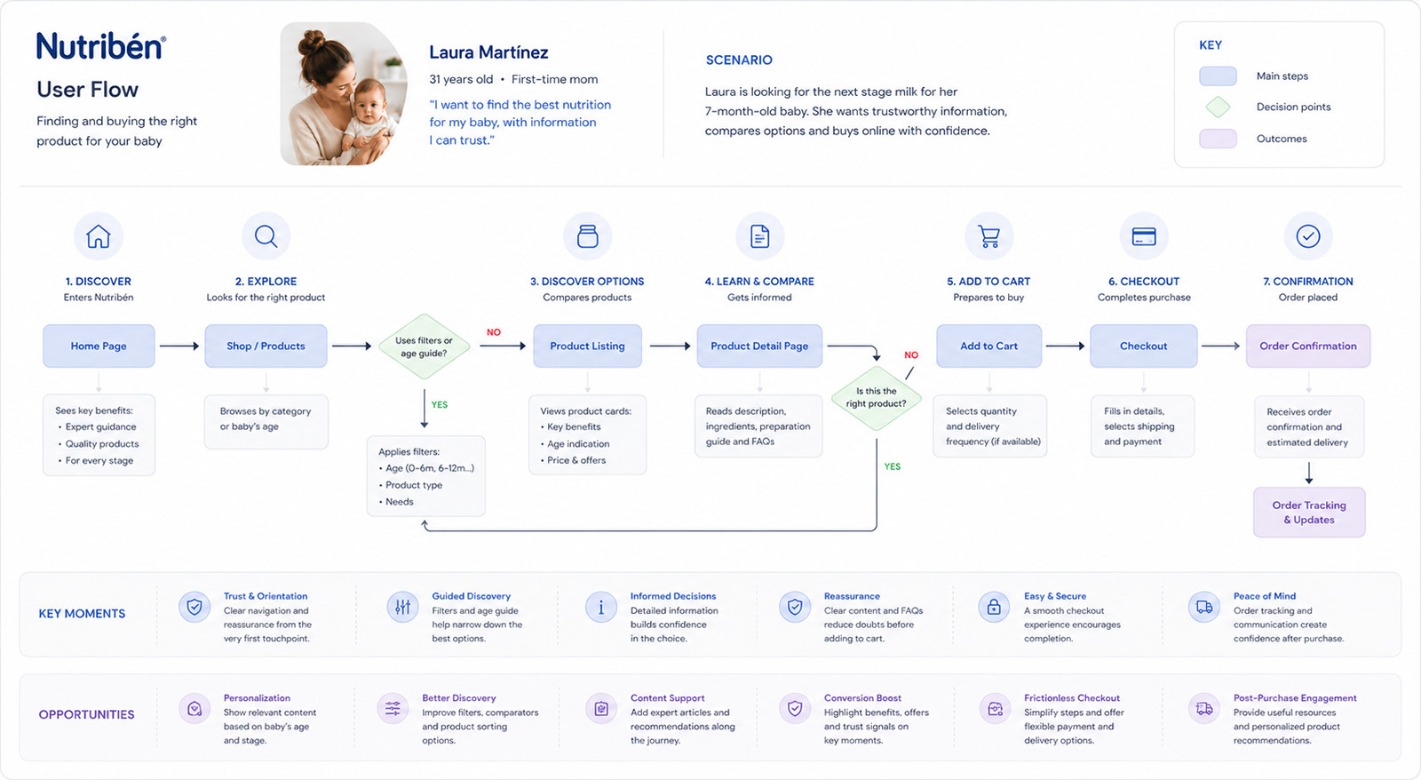
The Nutribén user flow in seven numbered steps from discover and explore through filtering, product listing and detail, add to cart, checkout and confirmation, with two decision points and rows beneath marking key moments and opportunities.
Seven steps, two decision points, and the opportunities at each one.

Reflection

What I would carry into the next one

  1. 01

    High trust retail needs an empathy led architecture

    When the product relates to a child’s health, trust is what converts. Structuring the information around developmental guidance rather than around sales targets moves a brand from supplier to something closer to a partner.

  2. 02

    Micro friction is what kills mobile conversion

    Designing for parents means designing for one hand, broken sleep and constant interruption. Bigger touch targets, fewer input fields and immediate visual feedback did more for checkout speed than any amount of persuasion.

  3. 03

    Modular systems let an agency move

    A proper Figma to Shopify system meant creative directors, copywriters and developers could build a new landing page or a seasonal campaign in a fraction of the time it used to take.