
05 · Momentum · Event branding and experience
Designing the energy of a moment
A flagship event brand for Smartness, built to hold its shape on a stage, a billboard and a lanyard.
- Client
- Smartness
- Role
- Creative direction, brand identity, UI/UX, event design
- Year
- 2026
Overview
An event brand that had to work everywhere at once
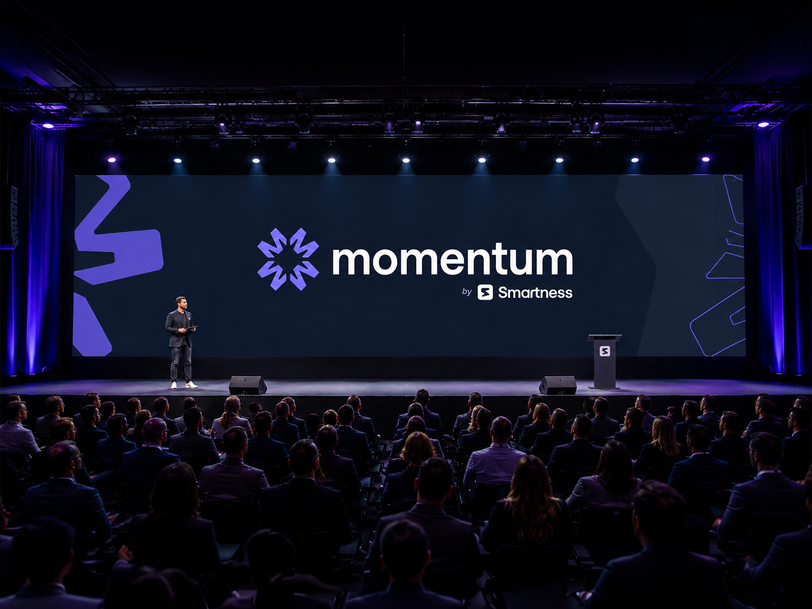
Momentum is a premium branded event for Smartness, built around innovation, hospitality, networking and industry leadership. The project covered a complete visual ecosystem, from the core identity through to the web, the attendee touchpoints, the social launch, the keynote decks and the spaces themselves.
As Lead Designer and Creative Director I took it from concept to execution across every digital and physical surface: the logo system, the interface, the launch campaign, the badges, the keynote templates and the large format graphics.
The goal was an identity with enough energy to stand as a flagship brand of its own, while staying unmistakably part of the Smartness ecosystem. It had to read as modern and premium on a screen, in print and in a room.
Tools: Figma, Illustrator, Canva, Claude, ChatGPT, Nano Banano.
Concept
Movement, acceleration, connection
The system rests on three ideas that are easy to say and hard to hold across forty different surfaces.
The symbol
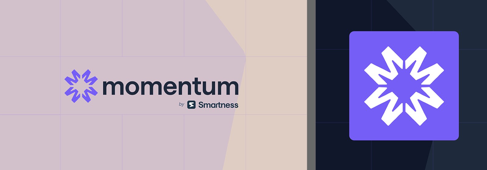
A radial mark engineered to read as kinetic energy, paired with a clean lowercase wordmark that stays quiet next to it.
Colour and tone
A deep dark ground throughout, which gives the accent its charge and keeps contrast high wherever the brand lands.
Modularity
Typography hierarchy, contrast and grid built to translate between large format signage and an interactive screen without being redrawn.
Room to grow
Modular components and flexible logo variations, so future editions and spin off formats inherit the system rather than restart it.
Deliverables
Three groups, one system
Deliverable 01
Identity and logo system
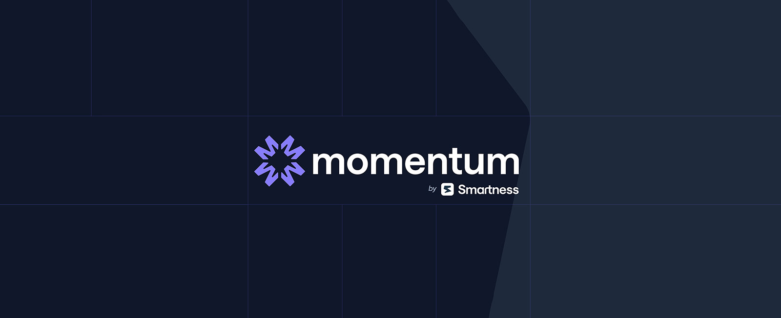
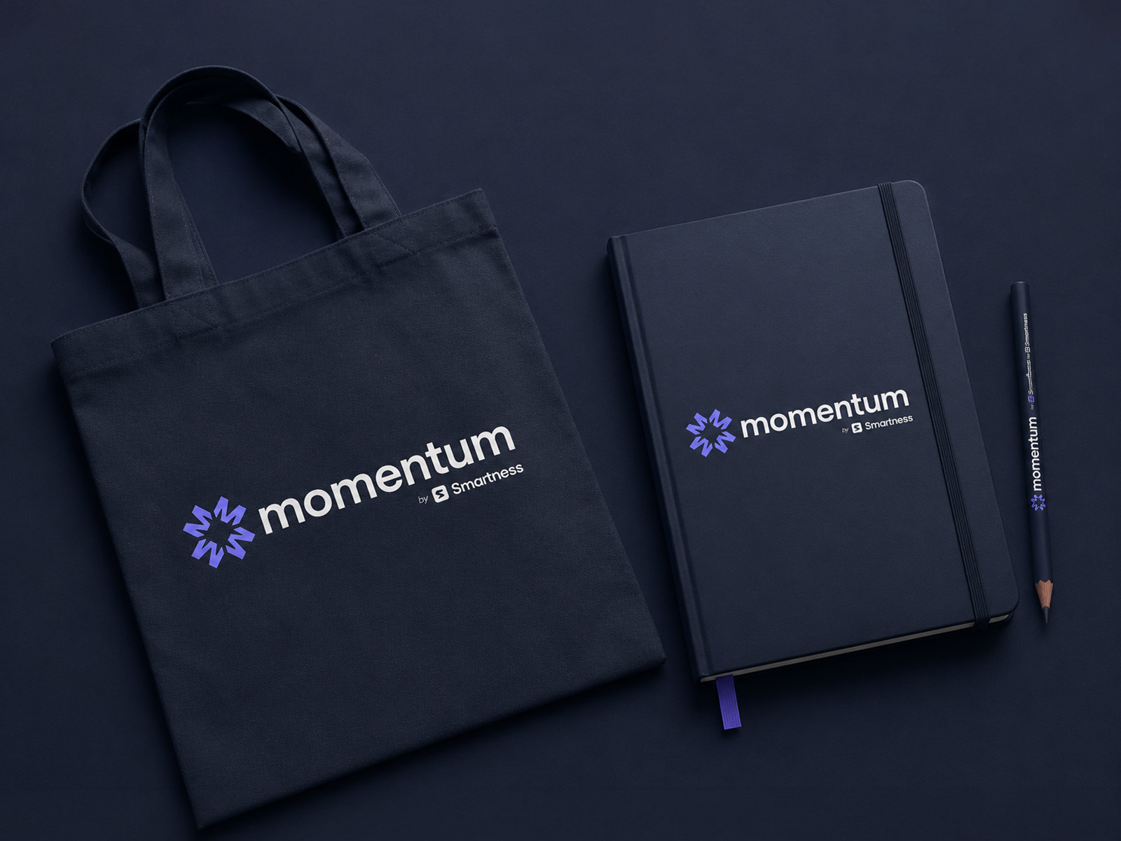
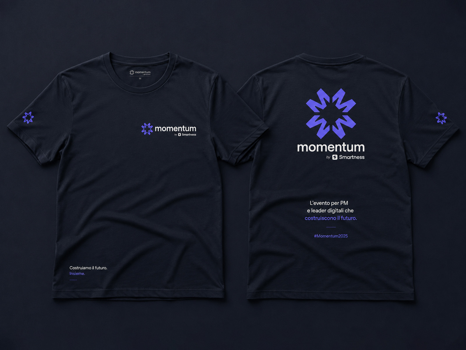
The radial mark and lowercase wordmark, with the Smartness endorsement locked underneath, working positive and inverted on light and on dark.
Deliverable 02
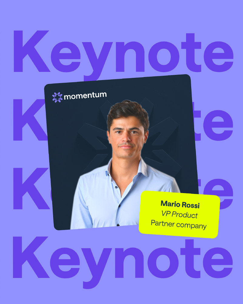
Digital and social
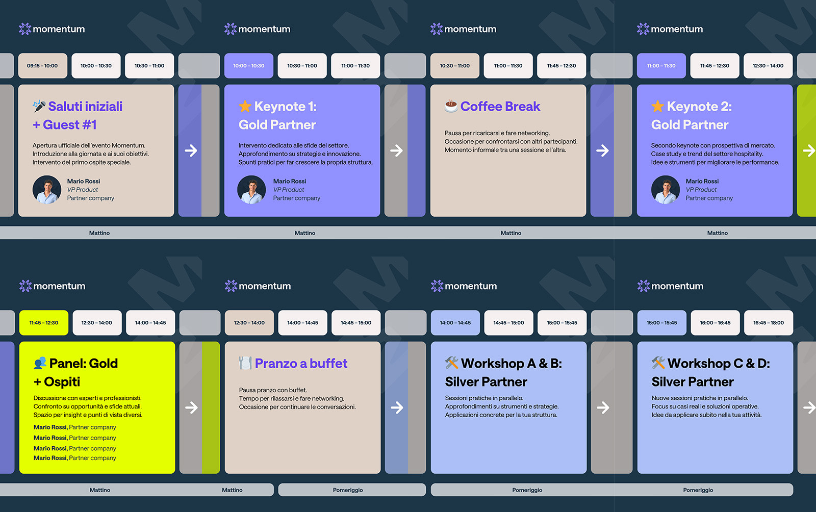
Schedule cards, campaign graphics and keynote templates, built so a programme change is a content edit rather than a redesign.
Deliverable 03
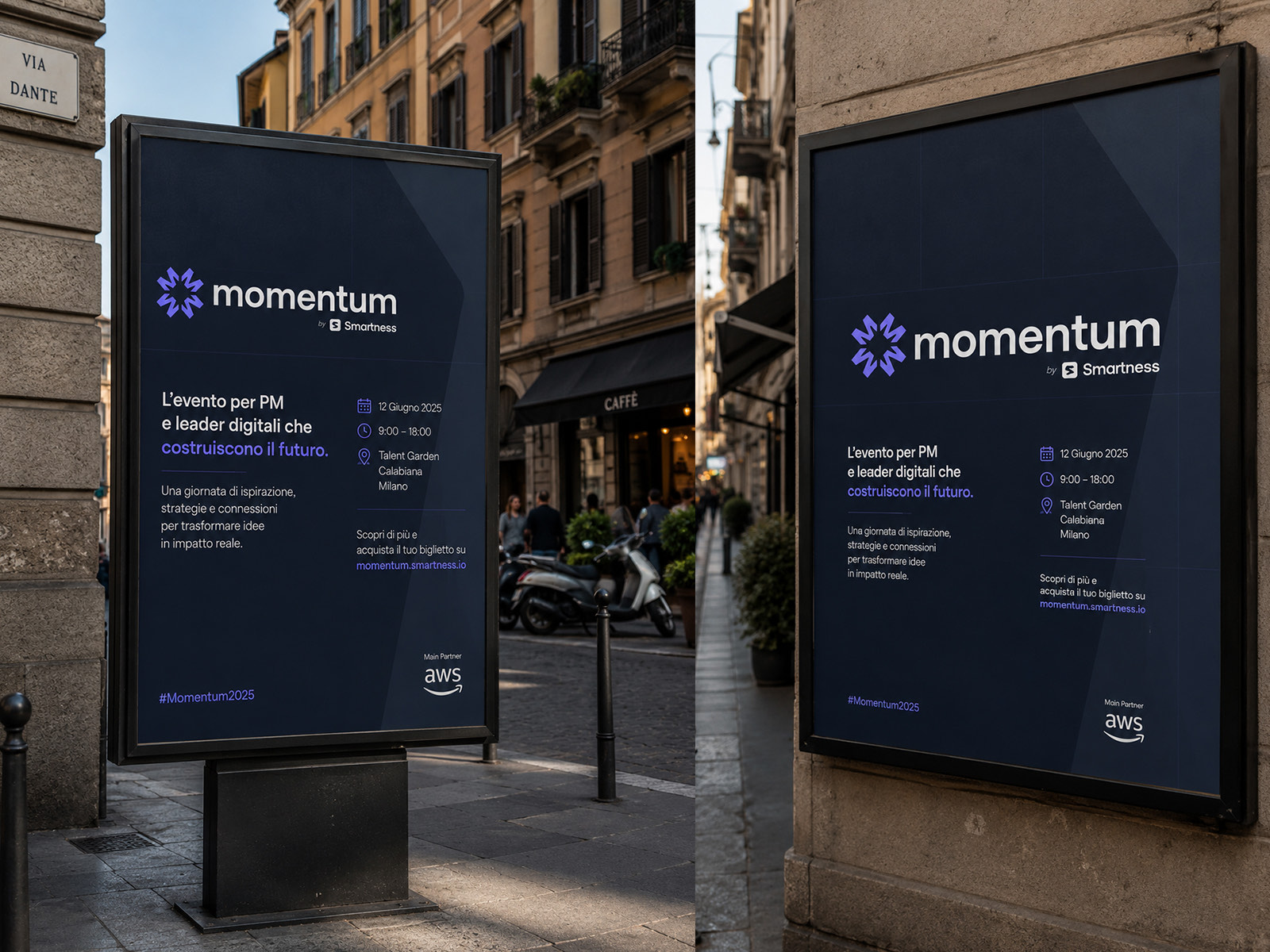
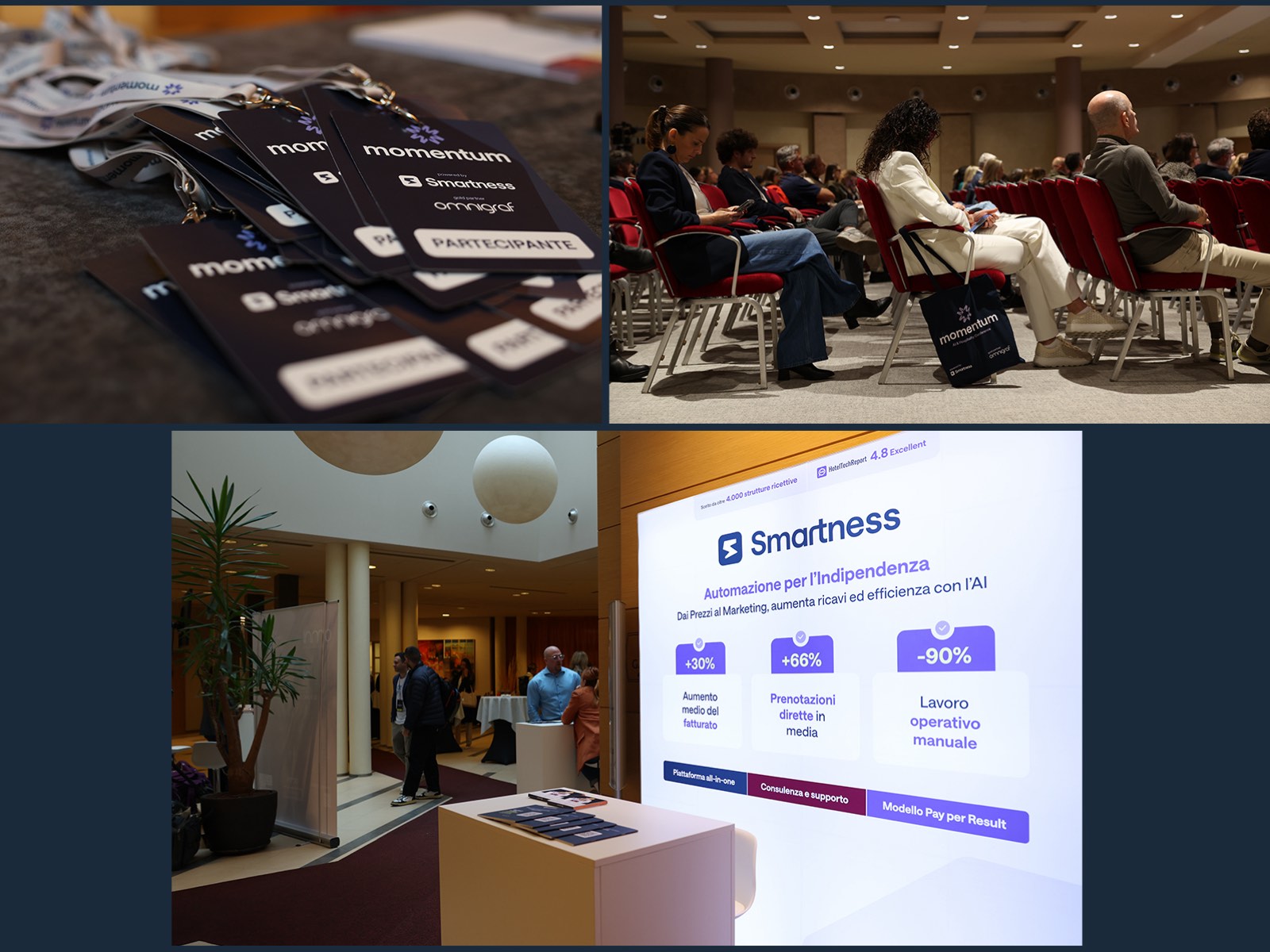
Physical experience and environmental graphics
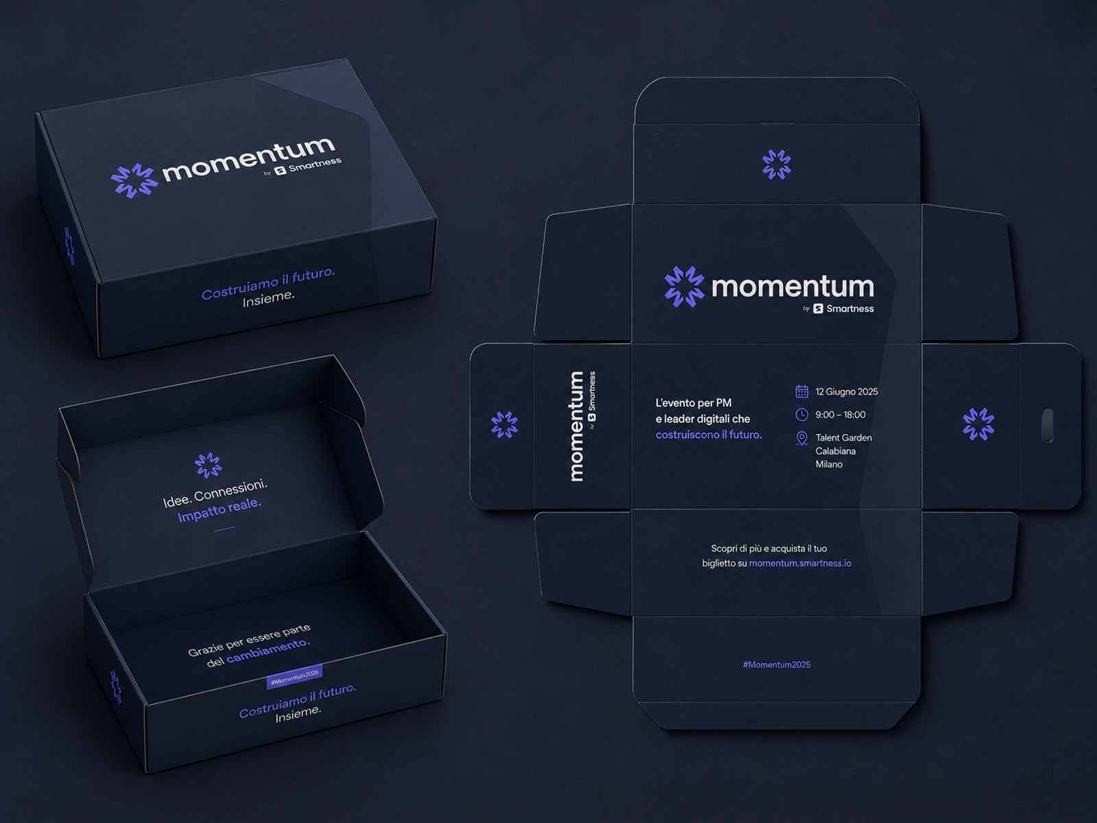
Badges, lanyards, merchandise, packaging, apparel and signage. The parts of an event brand people actually hold, and the ones that give the whole thing away if the system does not hold.
Impact
Why it mattered
Momentum shows how a single visual identity lifts an event from a gathering into something closer to a brand in its own right.
Holding the same system across web, social, print and physical space gave the event real recall, made the day itself feel considered rather than assembled, and left Smartness with a framework the next edition can inherit instead of rebuild.
Credits
- Client
- Smartness
- Creative direction, brand identity, UI and event design
- Igor Dinuzzi
- Website, social assets and environmental graphics
- Igor Dinuzzi
- Event strategy and copywriting
- Smartness