Skip to content
Igor Dinuzzi

04 · Designlab · Brand, motion and growth

Making learning more visual

A scalable visual identity, an instructional motion engine and a campaign that shows what students actually walk away with.

Client
Designlab
Role
Creative Director and Lead Designer
Year
2023 to 2024
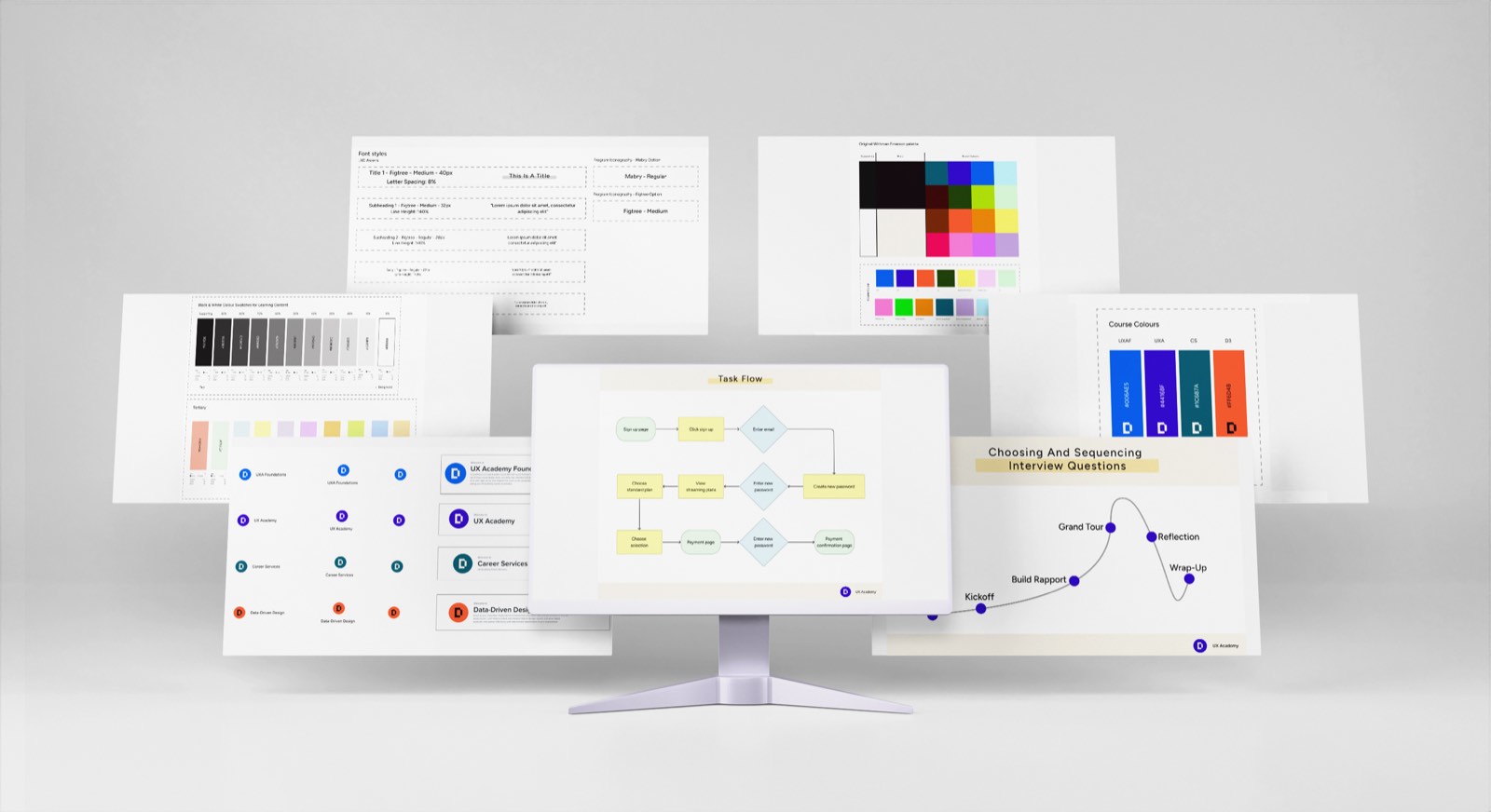
A monitor surrounded by floating boards from the Designlab brand system: font styles, the greyscale and tertiary colour swatches, the course colour taxonomy, the sub brand logos, a task flow diagram and the interview sequencing curve.
One system, feeding the curriculum and the marketing from the same place.

Overview

Three problems that turned out to be one

Designlab teaches thousands of aspiring UX designers through its UX Academy and a set of specialised courses. Rapid growth exposed something systemic: the brand had no unified design system, the harder UX concepts could not be taught through static content, and the social marketing lacked narrative momentum.

As Creative Director and Lead Designer I led the work across three pillars, which turned out to be the same problem wearing three different coats.

  1. 01

    Brand and system architecture

    A scalable visual system, sub brand identities for each course, and a Figma component engine big enough to hold all of it.

  2. 02

    Instructional motion curriculum

    Directing and animating more than 30 educational videos that turn abstract UX methodology into something a student can picture.

  3. 03

    Campaign for enrolment

    A social first video campaign built around real student outcomes rather than claims about them.

Problem

The design school paradox

A design school’s own systems have to demonstrate the exact rigour, accessibility and visual authority it teaches. If the brand cannot hold a grid, why would anyone trust it to teach one.

Three ecosystem bottlenecks

The design school paradox

System fragmentation

Disjointed courses, icons drawn to no standard, and one off templates that could not scale with the catalogue.

A teaching blind spot

Synthesis, research and testing are invisible processes. Static text cannot show how they actually work.

A narrative gap

Social marketing could not convey outcome and authority quickly enough without becoming cluttered.

The strategic challenge

  1. Scale without losing coherence

    The brand had to carry several distinct educational tracks while staying one instantly recognisable visual grammar.

  2. Teach without overloading

    Explaining process heavy, invisible concepts needs visual storytelling that clarifies the thinking rather than adding to the load.

  3. Earn attention with the sound off

    Someone scrolling a feed had to grasp the value, the mentorship and the career outcome in seconds, with no audio.

Strategy

One flywheel instead of three workstreams

Rather than solving the three in parallel, I built a loop. The brand tokens and components fed the curriculum, the curriculum produced the proof, and the proof became the campaign.

The integrated Designlab engine

Brand system

Foundational UI, icons and templates.

Instructional motion

More than 30 curriculum videos.

Visual tokens flow one way, a shared visual language flows back the other

Campaign for enrolment

Production grade assets and real outcomes, turned into social first storytelling.

Explorations

Three decisions, and what each one cost

Exploration 01

Course colour taxonomy against brand recognition

Constraint
Designlab runs distinct specialisation tracks. One rigid palette made every course feel identical, and total freedom would have dismantled the brand.
Trade off
Sub brand palettes dilute recognition unless something systemic holds them together.
Solution
A course colour taxonomy. Each track gets one signature accent, anchored by a shared typography grid, a universal layout structure and a single icon library spanning research, e-commerce and interaction design.
Exploration 02

Restraint in motion, because the subject is already hard

Constraint
Double Diamond research, affinity mapping and usability testing are conceptually demanding before any animation is involved.
Trade off
High energy motion is more fun to make and actively competes with the thing the student is meant to be learning.
Solution
A restrained visual language for learning. Electric blue grounds, clean white line art, and amber used sparingly to point at the one thing that matters in a given frame. Kinetic typography and deliberate icon reveals, so the motion carries the explanation rather than decorating it.

Exploration 03

Outcomes against hype in the campaign

Constraint
Changing career is a high friction decision, and an entire bootcamp will not fit into thirty seconds without overwhelming someone.
Trade off
Pure hype converts briefly and loses credibility with adult learners who are weighing real money and real time.
Solution
A humanised outcome narrative. Tangible student milestones, actual mentorship moments, and typography built to be read instantly on a muted mobile feed.

System

The infrastructure underneath all three pillars

Design, marketing, content and engineering all had to pull from the same place, or the coherence would have lasted exactly one quarter.

Designlab system architecture

Brand UI system

  • Course colour taxonomy
  • Typography grids
  • Infographic templates

Iconography engine

  • Hundreds of Figma components
  • Research, UI and e-commerce sets
  • Matrix and framework templates

Motion guidelines

  • Electric blue canvas
  • White line with amber focus
  • Kinetic type rules
  • Pacing standards for sound off

Deliverables

Three pillars, built out

Deliverable 01

Brand identity, audit and Figma system

A rebranding audit that positioned Designlab for growth, course level identities that stay under one umbrella, modular templates for matrices and UX deliverables, and an icon library deep enough to cover the whole curriculum.

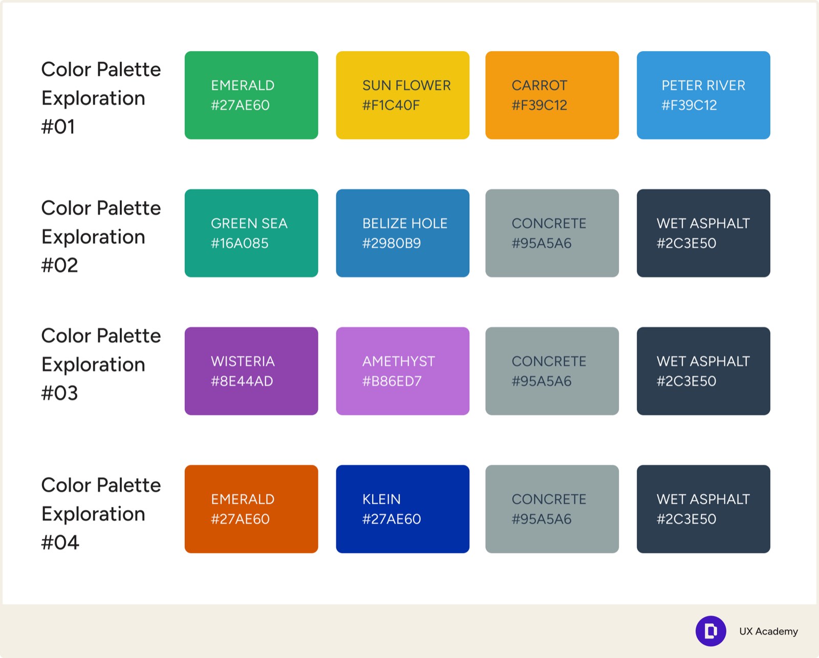
Four colour palette explorations for Designlab, each a row of four named swatches with hex values, running through greens and yellows, teals and blues, purples, and an orange with deep blue.
Palette routes, before the taxonomy settled.
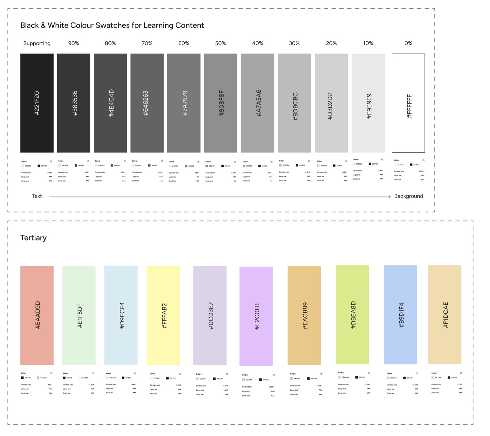
The Designlab learning content palette: a greyscale ramp from near black to white in ten steps, each labelled with its hex value and contrast ratio, above a row of ten pastel tertiary colours with their own contrast checks.
Every step checked for contrast, text through to background.
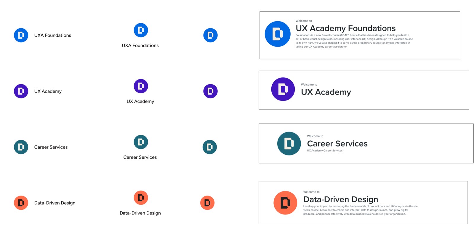
The four Designlab course identities, each a D monogram in its own accent colour: UXA Foundations in blue, UX Academy in purple, Career Services in teal and Data Driven Design in orange, shown as marks and as welcome banners.
One monogram, four accents, four courses that still read as one school.
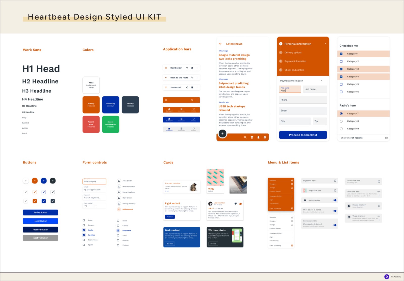
The Heartbeat Design styled UI kit, showing the Work Sans type scale, primary, secondary and accent colours, application bars, buttons, form controls, cards and list items.
A full UI kit, built so course projects start from something real.
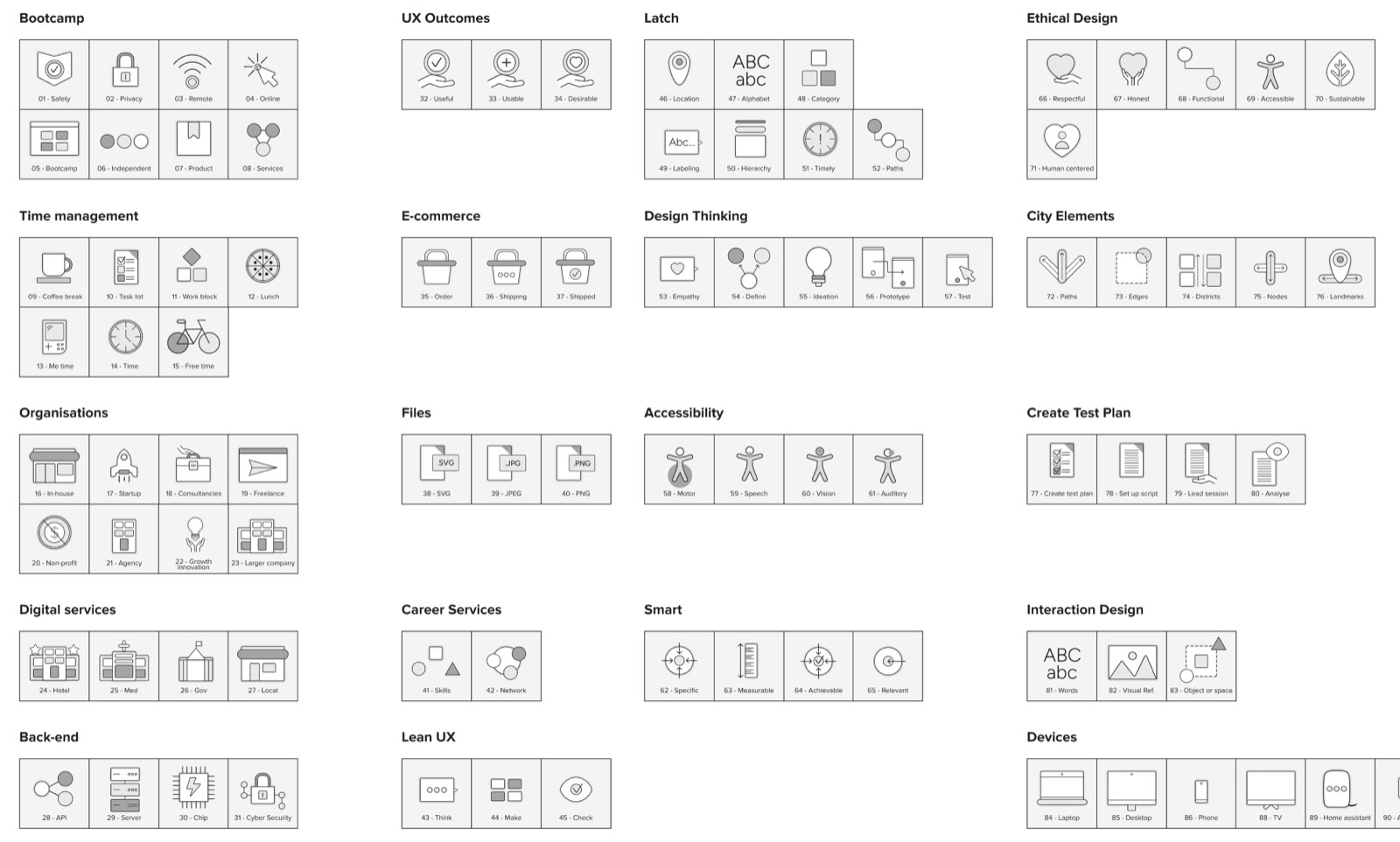
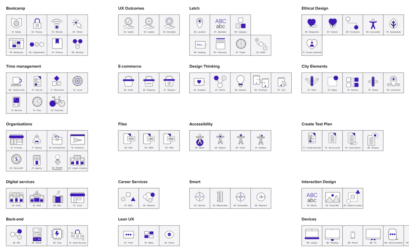
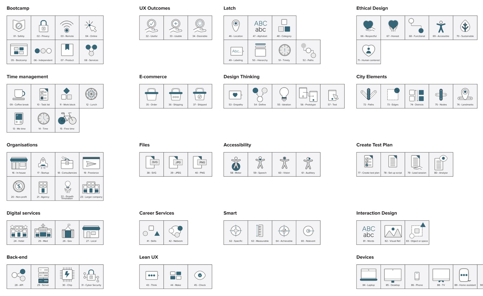
The Designlab icon library in monochrome, organised into sets covering bootcamp, time management, organisations, digital services, back end, UX outcomes, e-commerce, files, career services, Lean UX, LATCH, design thinking, accessibility, ethical design, city elements and devices.
The base library, drawn once.
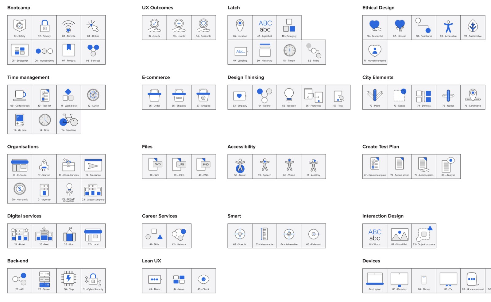
The same Designlab icon library with blue accents applied, the UXA Foundations course colour.
UXA Foundations blue.
The same Designlab icon library with purple accents applied, the UX Academy course colour.
UX Academy purple.
The same Designlab icon library with teal accents applied, the Career Services course colour.
Career Services teal.

Deliverable 02

Instructional motion curriculum, 30 videos and counting

Storyboard systems and motion graphics for the concepts that resist explanation: research synthesis, information architecture, interaction design. Pacing tuned for comprehension rather than for pace, and shipped straight into the live learning platform.

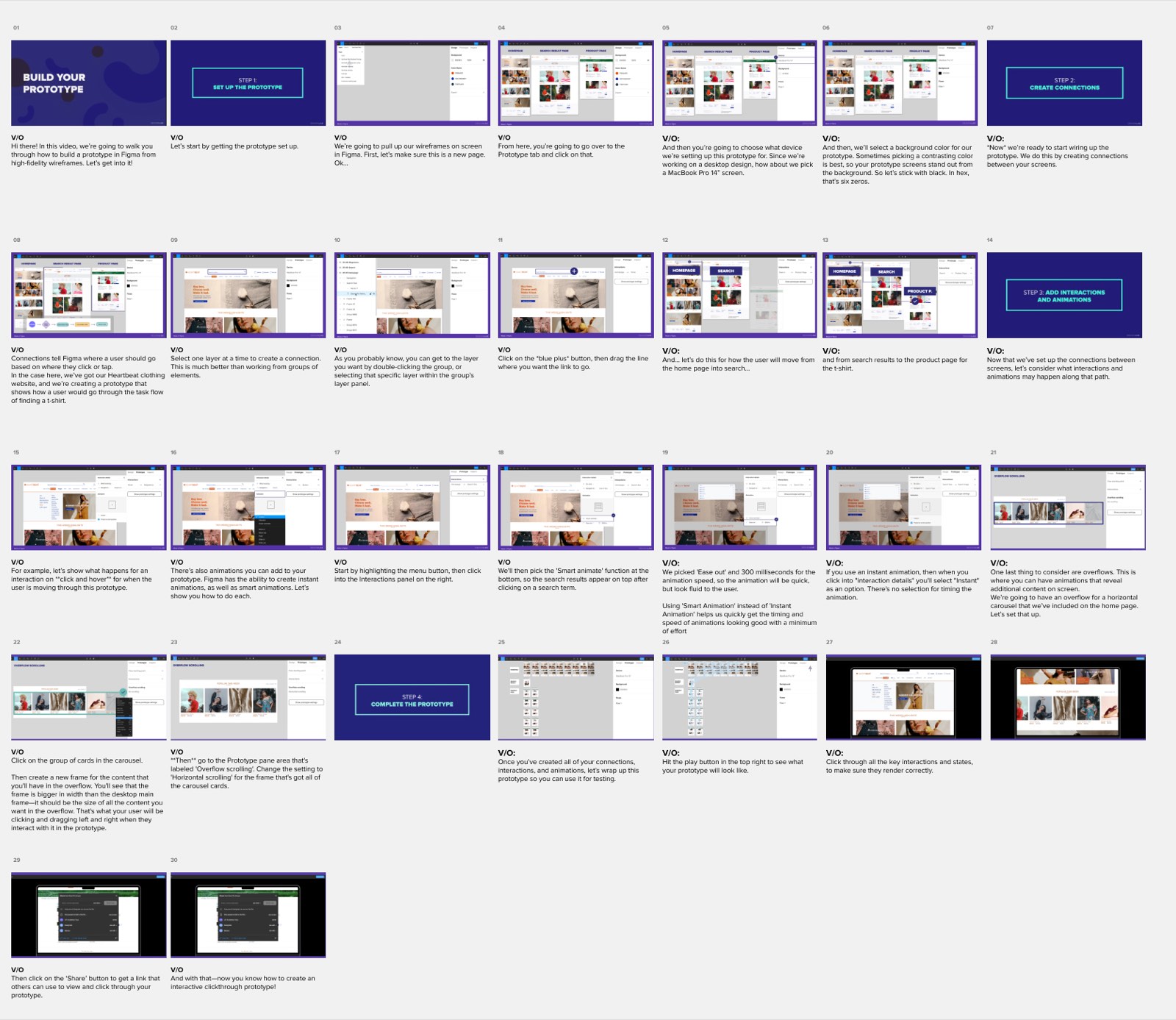
A thirty frame storyboard for the Build Your Prototype video, each frame paired with its voiceover script, walking through setting up a Figma prototype, creating connections, adding interactions and animations, and sharing the result.
Thirty frames and the voiceover beneath each one, before a single keyframe.
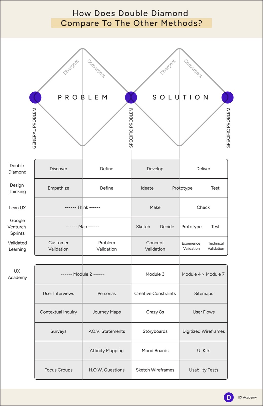
A teaching frame comparing the Double Diamond to other design methods, mapping discover, define, develop and deliver against Design Thinking, Lean UX, Google Venture sprints and validated learning, then against the UX Academy module structure.
One framework, mapped against every other one a student will meet.
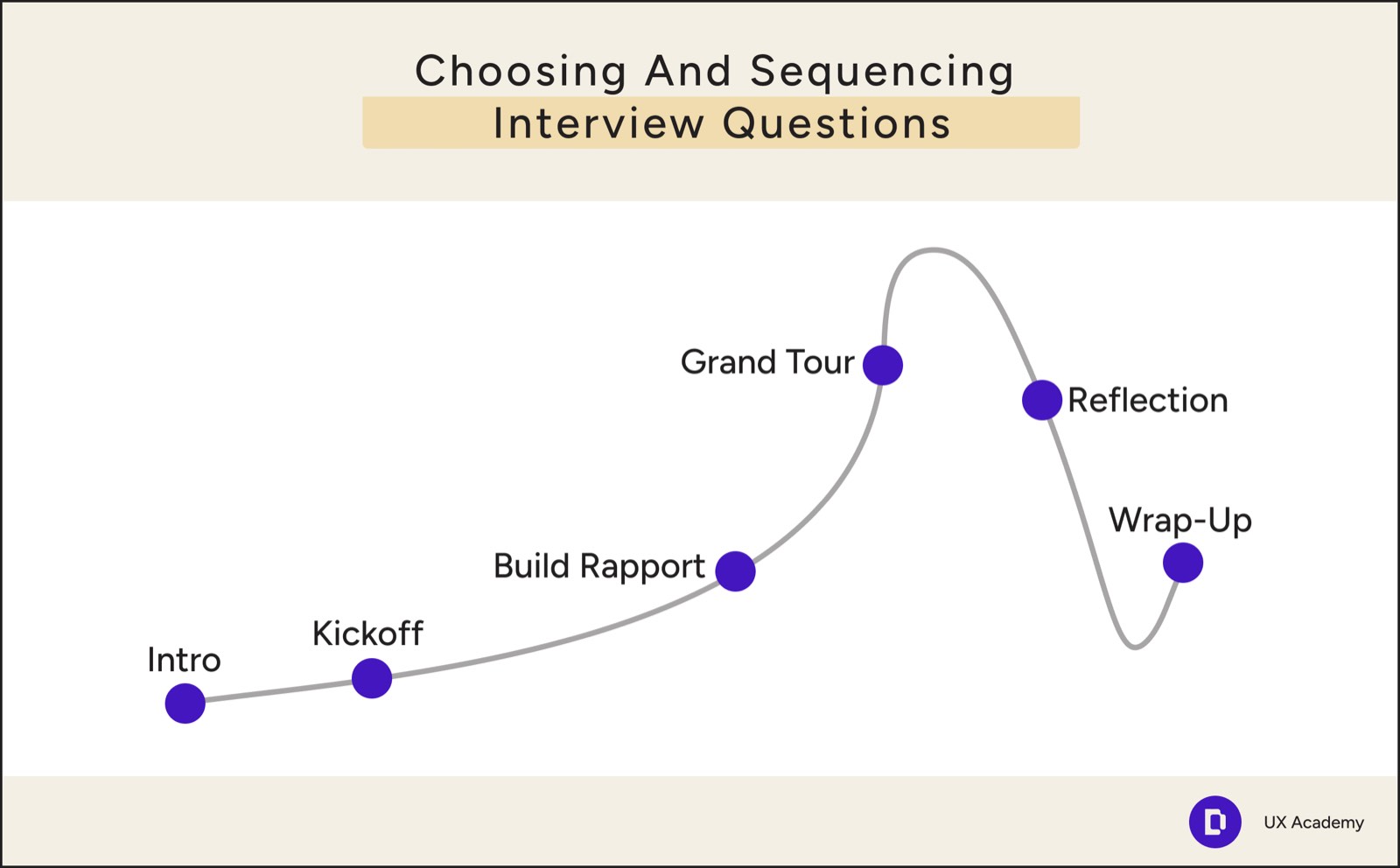
A teaching frame on choosing and sequencing interview questions, plotting intro, kickoff, build rapport, grand tour, reflection and wrap up along a rising and falling curve.
Interview structure, drawn as the arc it actually is.
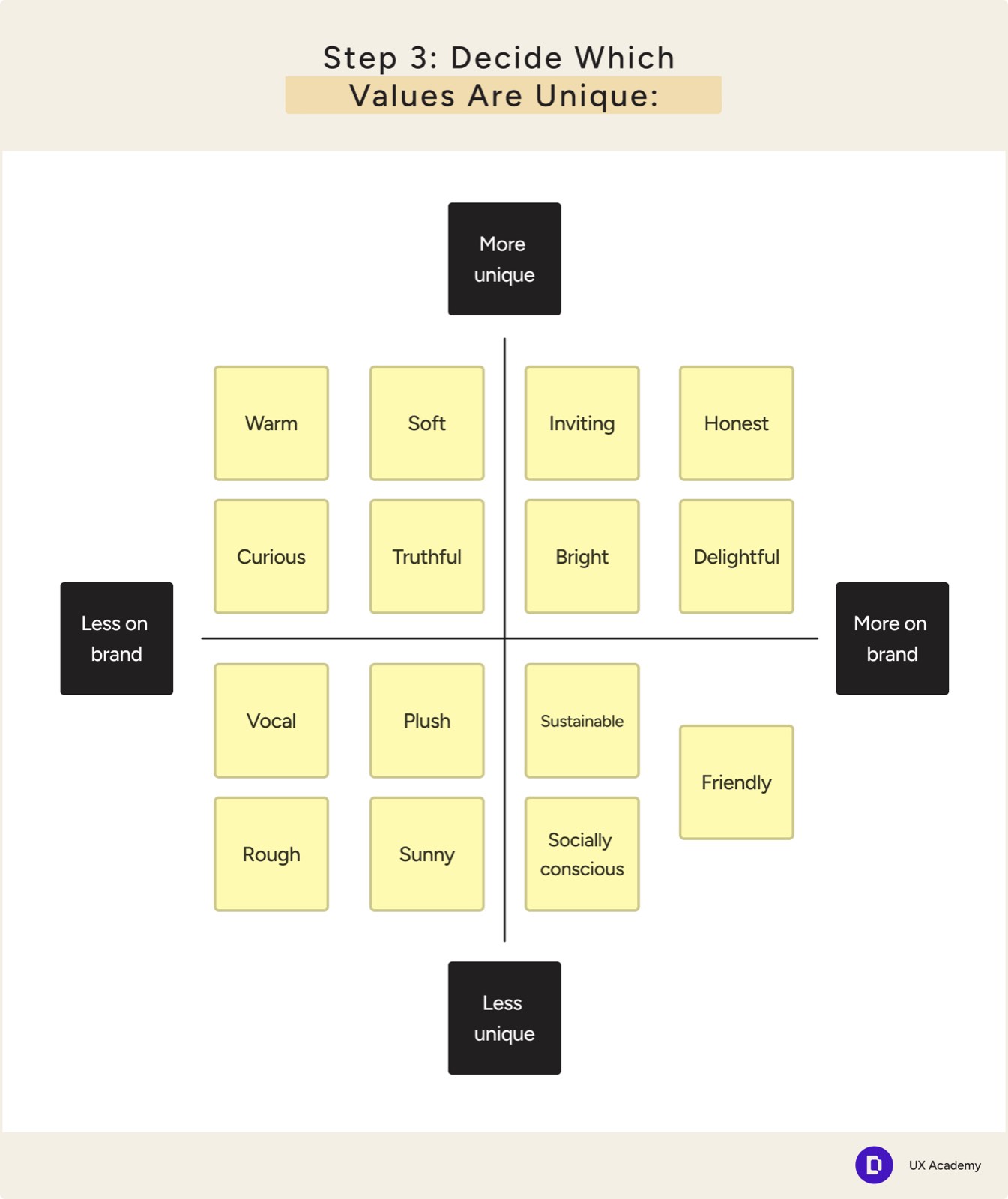
A teaching frame on deciding which brand values are unique, with value cards plotted on axes running from less to more unique and less to more on brand.
A two by two that students fill in themselves.
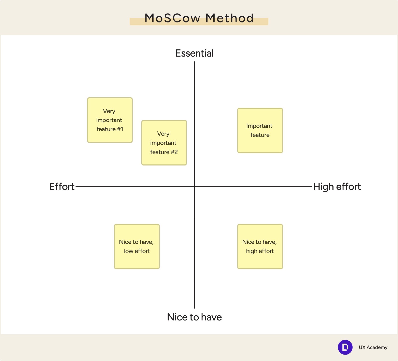
A teaching frame on the MoSCoW method, plotting feature cards on axes of essential to nice to have and low to high effort.
Prioritisation, with the trade off made visible.
Creating personas. Watch on Vimeo if the player does not load.
Blocking out design elements. Watch on Vimeo if the player does not load.
Elements in a sign up flow. Watch on Vimeo if the player does not load.

Deliverable 03

UX Academy campaign

Short form video built for the feed, balancing the inspirational side of a career change against the concrete detail of the programme, using real student work and real mentorship rather than stock optimism.

The campaign cut, built to work with the sound off. Watch on Vimeo if the player does not load.

Reflection

What I would carry into the next one

  1. 01

    Practise what you teach

    A design school’s internal systems are its most convincing marketing. Grid discipline, real accessibility and modular practice across Designlab’s own brand bought trust with prospective students before a single claim was made.

  2. 02

    Motion is information architecture

    Applied to difficult teaching material, motion is not decoration. Deliberate pacing, one focal accent and kinetic text turn an abstract mental model into something a student can hold.

  3. 03

    Coherence end to end is what converts

    When the identity, the course and the advertising speak the same visual language, the friction disappears. The first ad impression and the daily learning platform feel like one continuous thing.