Skip to content
Igor Dinuzzi

08 · Smartness · Design system and UX ecosystem

Designing systems that scale

One visual language, one token architecture and one navigation model, across a hospitality platform that kept growing underneath them.

Client
Smartness
Role
Lead Product Designer, Art Director and UX Architect
Year
2025
  • Design systems
  • SaaS ecosystems
  • Responsive UX
  • Product discovery
  • Interaction design
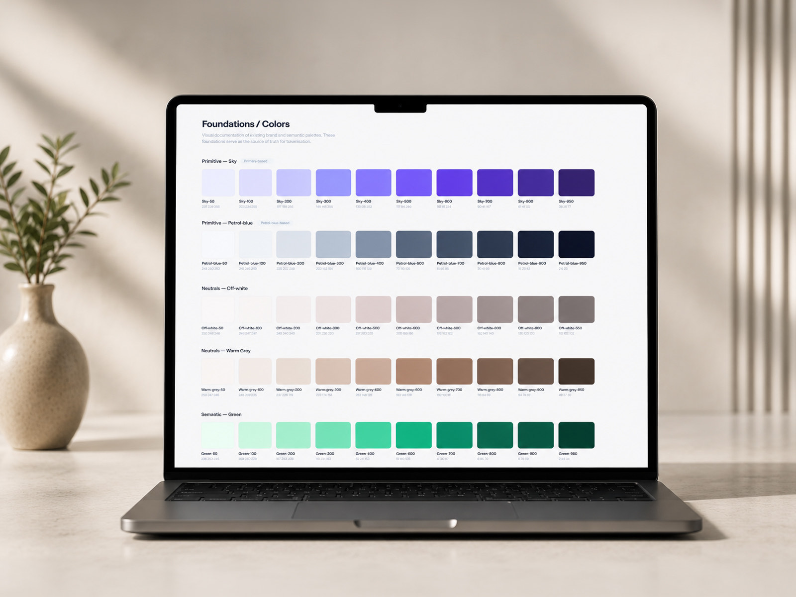
A laptop on a desk showing the Smartness foundations colour page, a full grid of primitive and semantic colour swatches with their hex values.
The foundations, which everything else in this case study is built on.

Overview

What happens when a platform grows faster than its system

Smartness is building a connected ecosystem for hospitality, pulling revenue management, property operations, guest communication, marketing and automated payments into one platform.

Scale brought the familiar problems. The visual language had fragmented, UI components had drifted apart, navigation had grown past what a menu could hold, onboarding was losing people, and the pricing had become genuinely hard to read.

Rather than patch each one, I designed across all five: an illustration system, a token architecture, a navigation model, a demo booking flow and a modular pricing slice.

Problem

Five friction points, one root cause

  1. 01

    Brand and marketing drift

    Inconsistent illustration and scattered visual assets were blurring what the product actually does across every marketing touchpoint.

  2. 02

    UI fragmentation

    With no tokenised foundation, the property management and payments dashboards had quietly diverged from each other.

  3. 03

    Navigation past its limit

    An expanding product suite had outgrown the menu holding it, and discovery suffered on desktop and badly on mobile.

  4. 04

    Friction in the demo flow

    Complex property qualification sat in static forms, and people were dropping out partway through.

  5. 05

    Pricing that needed decoding

    Several products across several tiers, presented at once, which is cognitive overload at exactly the wrong moment.

The work

Five phases

Phase 01

Brand language and illustration

A scalable illustration system and a category based colour framework, so someone can orient themselves inside a large content environment before reading a word.
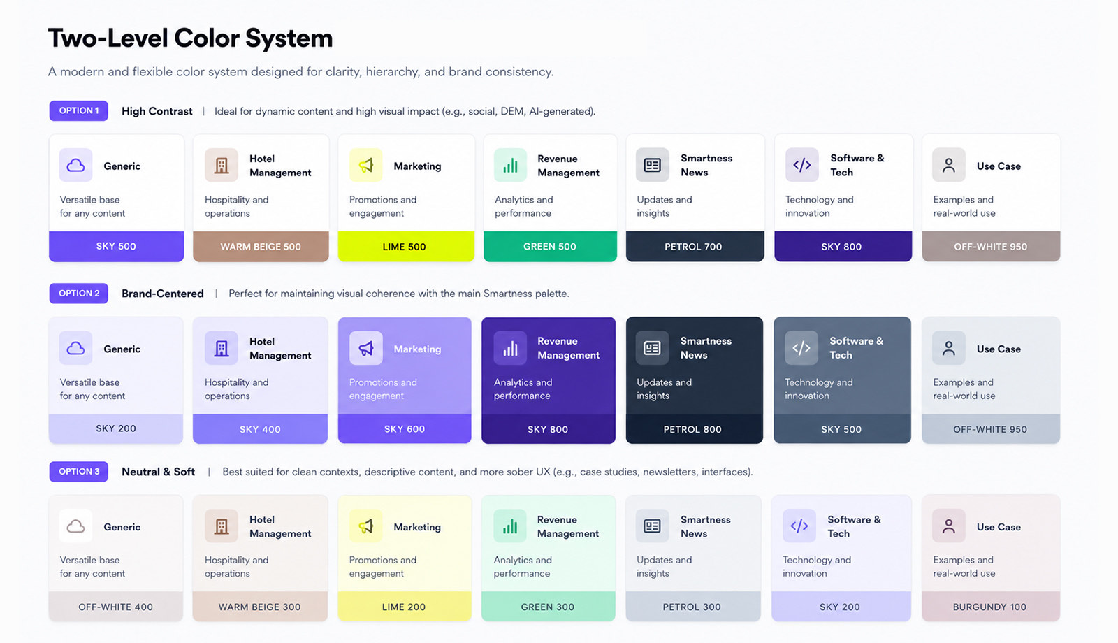
The two level colour system, showing three options, high contrast, brand centred and neutral and soft, each applying a different palette across seven content categories from generic and hotel management through to use case.
One category set, three palettes, chosen by context rather than by taste.

Two directions, kept deliberately separate
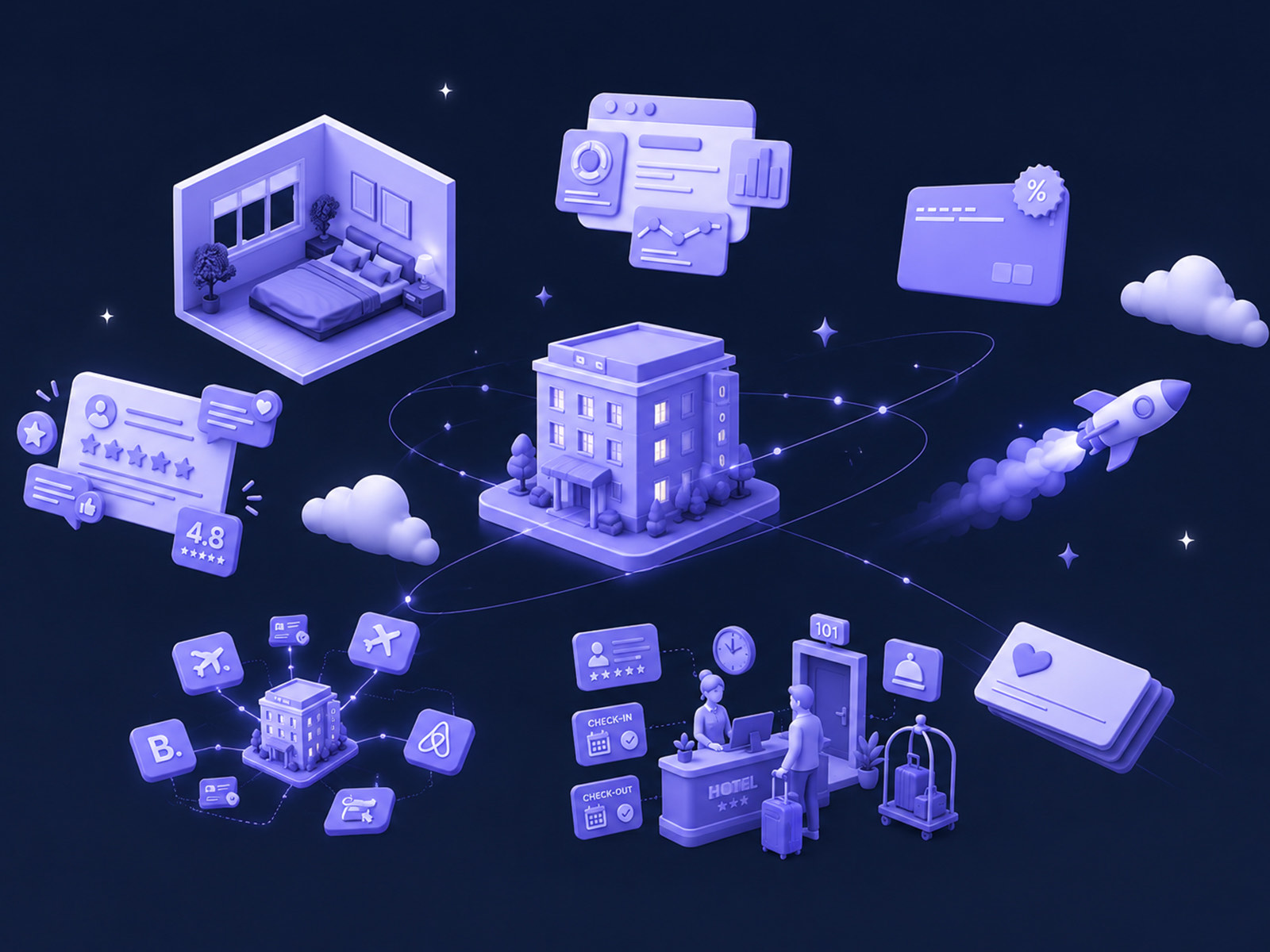
The soft 3D illustration system, a cluster of isometric lilac objects including buildings, a calendar, charts, cubes and connectors, floating on a pale background.
Soft 3D, for marketing and product announcements.
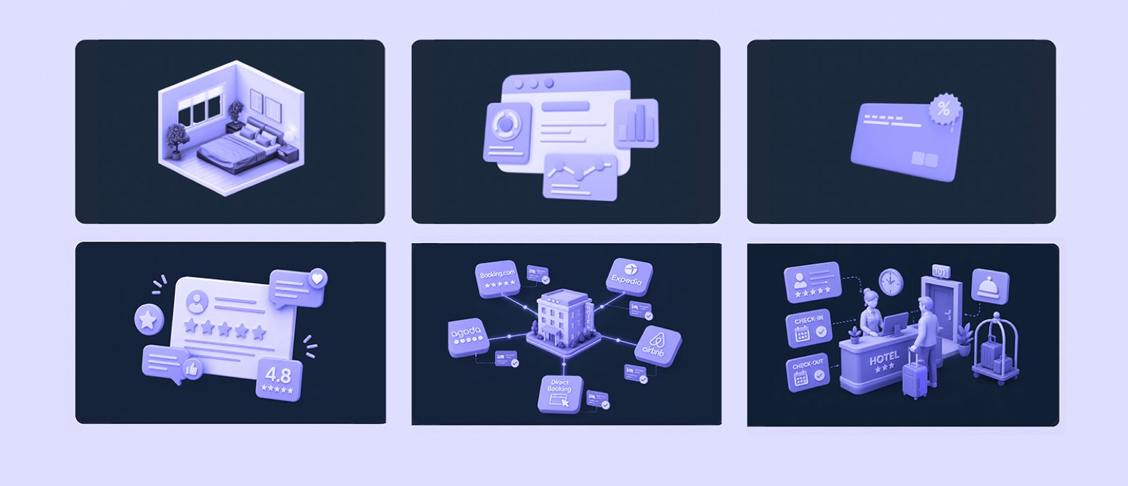
Six isometric lilac illustrations on a dark navy ground, covering a building, a document, a card, connected nodes, charts and a cluster of people.
The same objects on dark, so campaigns can go either way.

The system doing a real job, twice

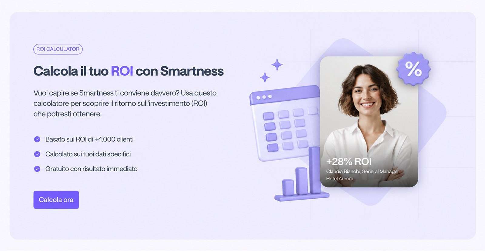
An Italian language ROI calculator module, with a headline about calculating return with Smartness, three benefit ticks, a call to action, and a 3D scene pairing a calendar and bar chart with a photograph of a hotel general manager showing plus 28 per cent ROI.
ROI calculator, one execution.
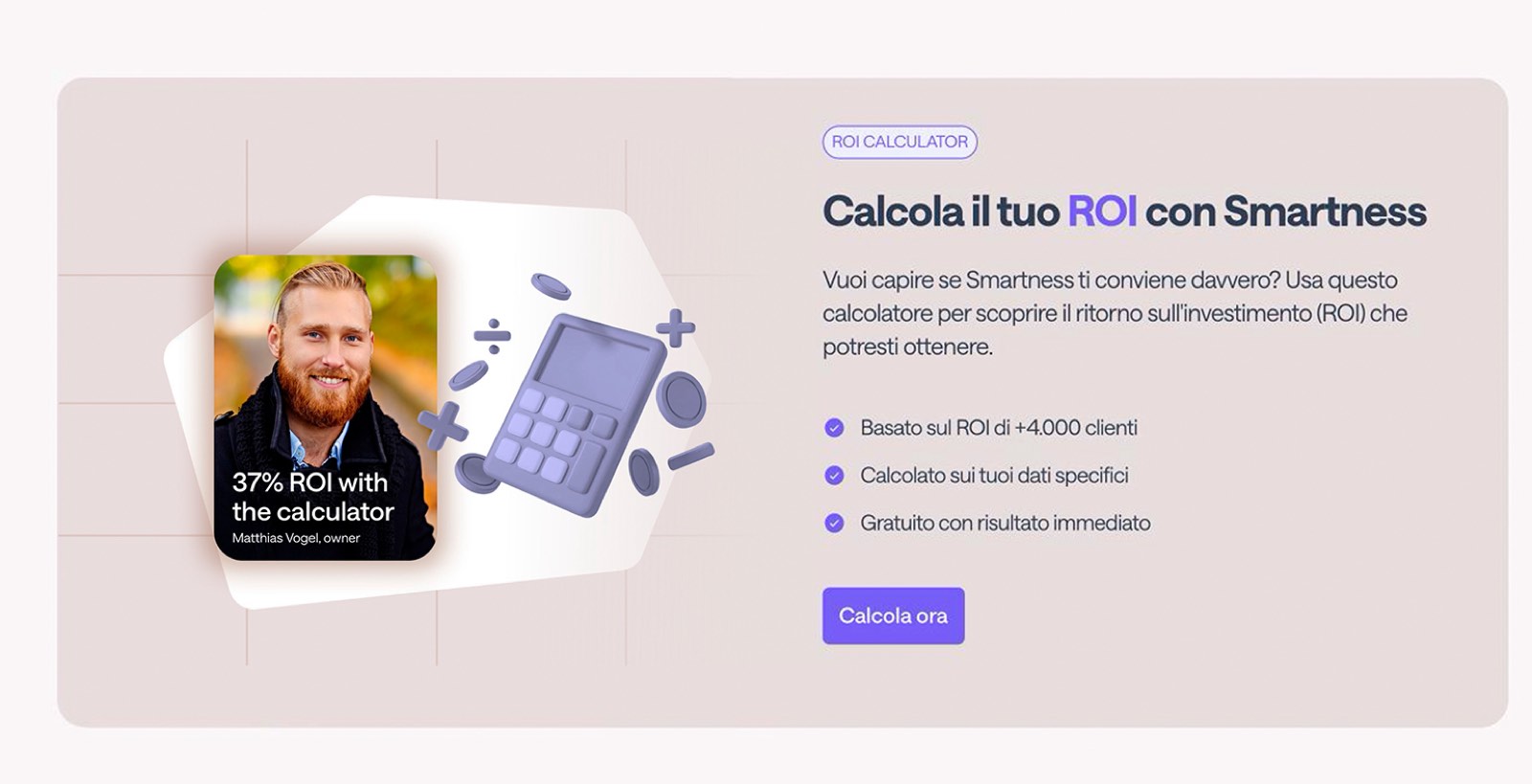
A second version of the same ROI calculator module, with a different 3D scene built from a donut chart, a rising graph, coins and a target, and a different hotel director showing plus 42 per cent ROI.
Same module, different scene. The system does the work.

Phase 02

Design system and token architecture

Three layers, so the marketing site and the dashboards could stop drifting apart: raw primitives, semantic tokens that carry intent, and components with dark mode and responsive behaviour already built in.

Token hierarchy

Primitives

  • Raw colour ramps
  • A 4px and 8px spacing grid
  • Type scale, radii and aspect ratios
  • Opacity, z-index and motion curves

Semantic tokens

  • surface-primary
  • text-interactive-hover
  • border-danger-subtle
  • Intent, not appearance

Component primitives

  • Dark mode built in
  • Responsive reflow rules
  • Every interaction state
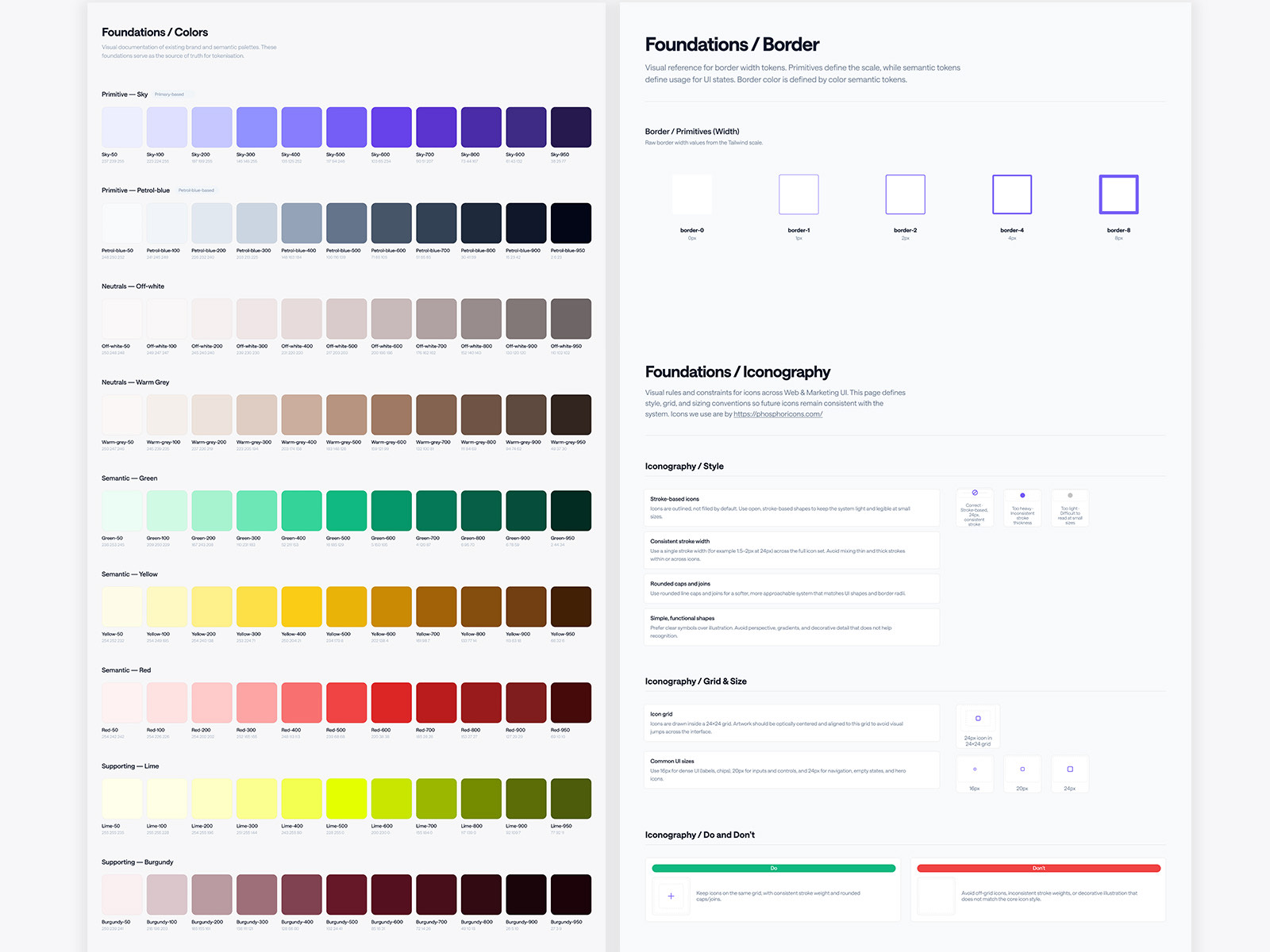
Two foundations pages side by side: the colour documentation with primitive sky and petrol blue ramps, neutrals, semantic green, yellow and red and supporting lime and burgundy, each in ten steps with RGB values, and the border and iconography page specifying stroke widths, a 24px icon grid and do and do not examples.
Colour, border and iconography, specified rather than described.
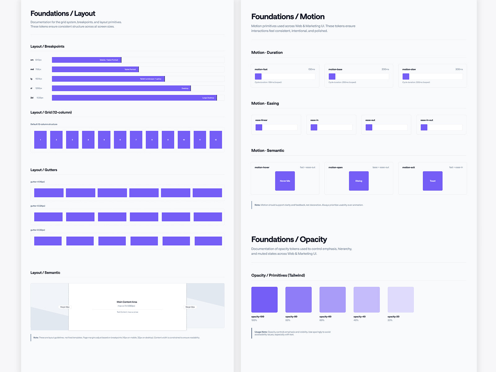
The foundations layout page documenting five breakpoints from 640px to 1536px, a twelve column grid and gutter options, beside the motion page defining durations of 150, 200 and 300 milliseconds, four easing curves and semantic hover, open and exit tokens.
Layout and motion.
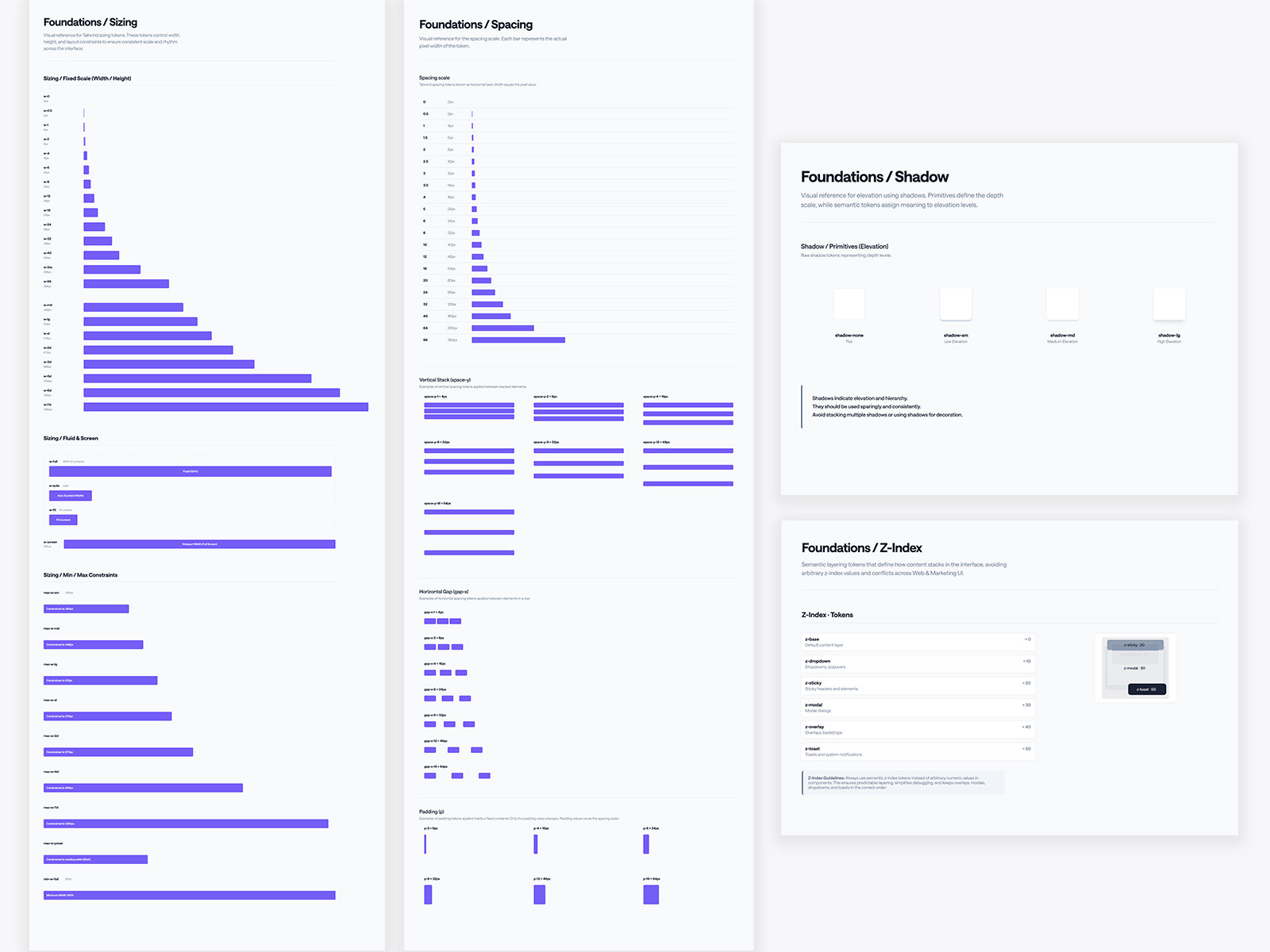
The foundations sizing and spacing pages showing the fixed width scale, fluid and screen sizes, minimum and maximum constraints, the full spacing scale as horizontal bars, and vertical stack, gap and padding examples, beside the shadow elevation scale and the z-index token list from base through dropdown, sticky, modal, overlay and toast.
Sizing, spacing, elevation and a z-index scale that stops the arguments.
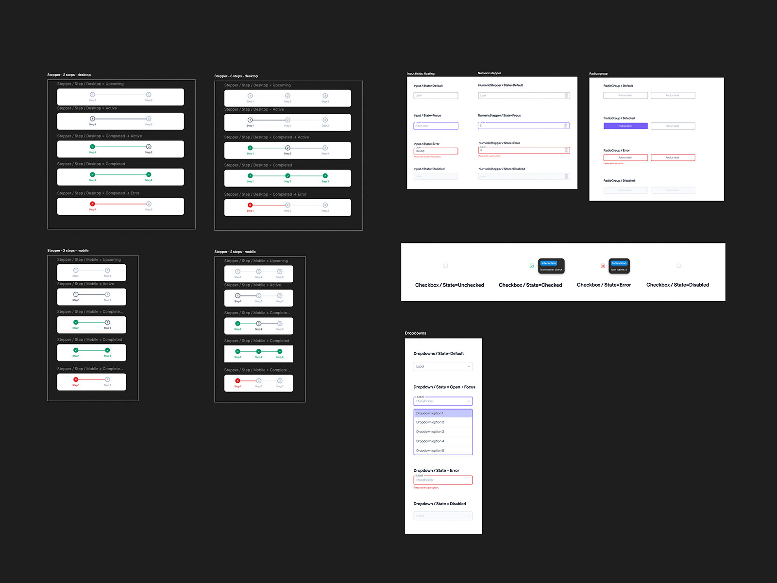
Component primitives rendered in dark mode, showing paired form fields, buttons, selection controls, tables and cards on a near black ground.
Dark mode is a token swap, not a second design.

Phase 03

Information architecture and navigation

An audit first, then a rebuild. Deep nested menus, inconsistent dropdown behaviour and real mobile degradation on sub pages, replaced with a modular mega menu and a progressive mobile drawer.
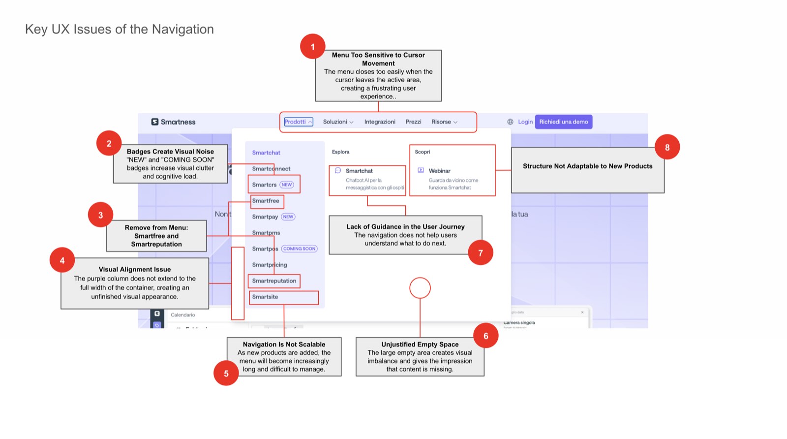
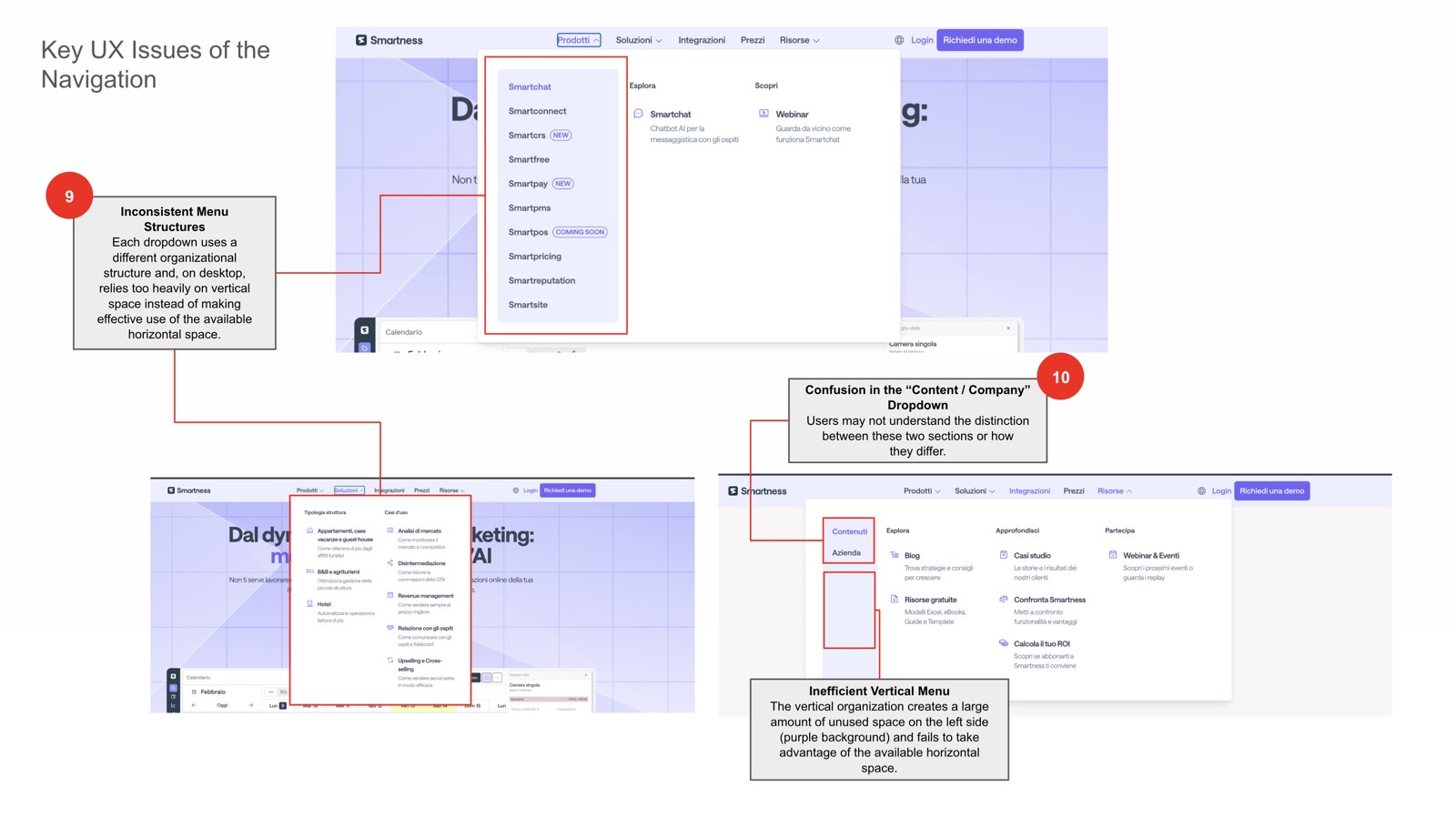
A navigation UX audit board, screenshots of the existing menu annotated with numbered red markers pointing at specific usability problems.
The audit, with every problem numbered.
A second navigation audit board, annotating the mobile menu and sub page behaviour with numbered red markers.
And the same treatment on mobile.
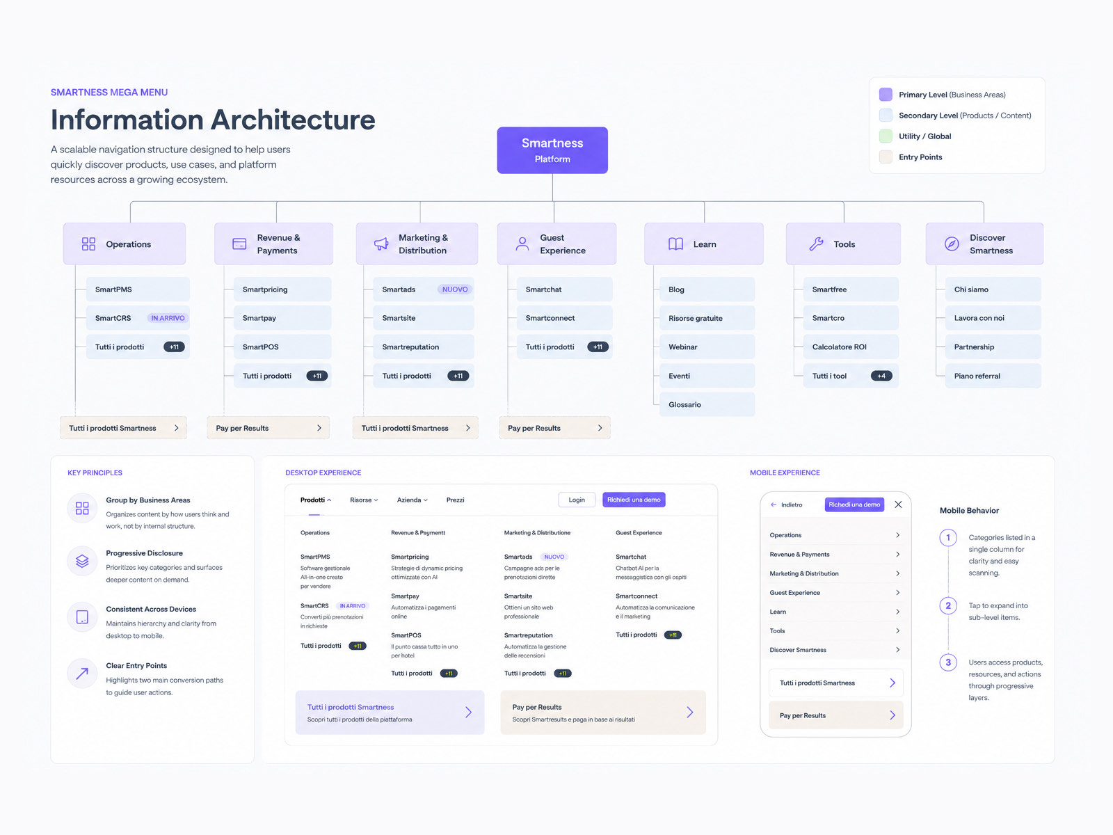
The information architecture map for the Smartness site, laying out the full page structure in grouped columns.
The architecture, before any menu was drawn.
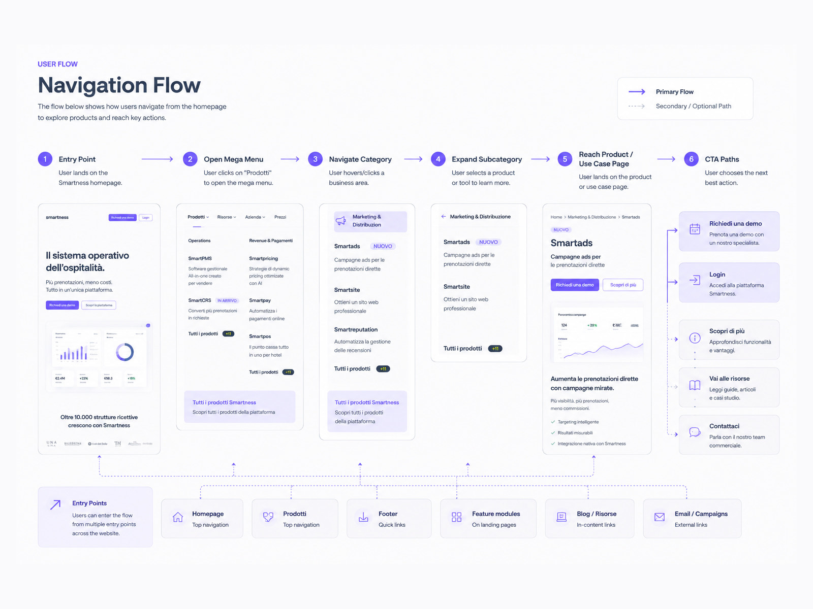
The navigation flow diagram, tracing how someone moves between product groupings, sub pages and entry points.
How someone actually moves through it.
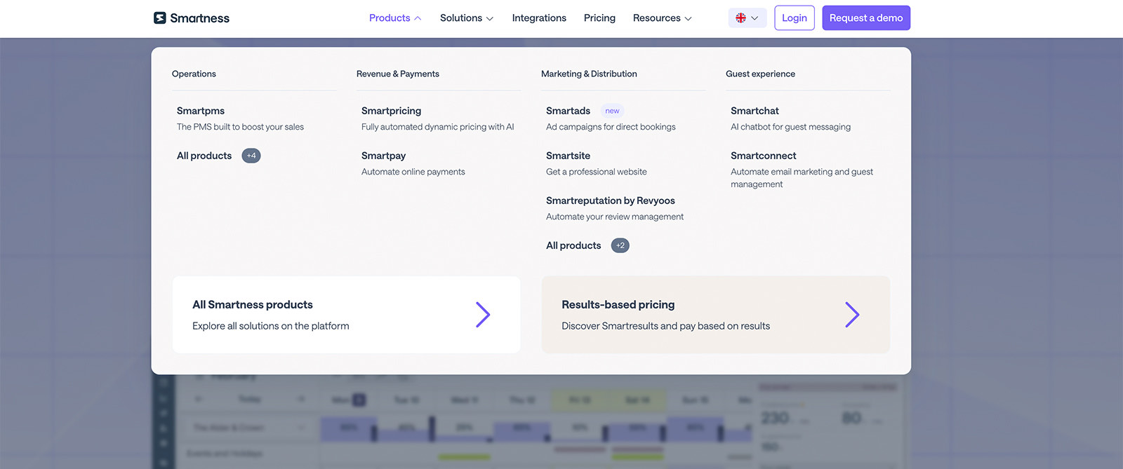
The desktop mega menu open on Products, laid out in four business area columns, operations, revenue and payments, marketing and distribution, and guest experience, each listing products with one line descriptions, plus two promotional panels along the bottom.
Four business areas, descriptions on every item, two ways out.
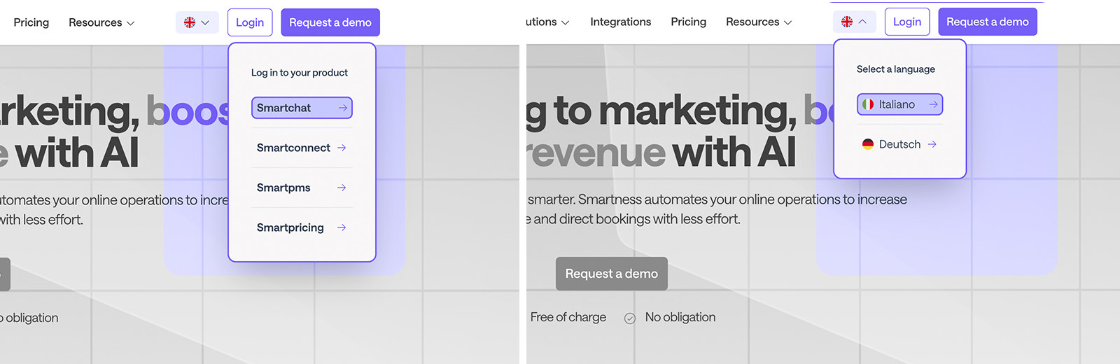
Two smaller navigation dropdowns, one listing product logins and one offering Italian and German language options with flags.
The smaller menus, held to the same rules.
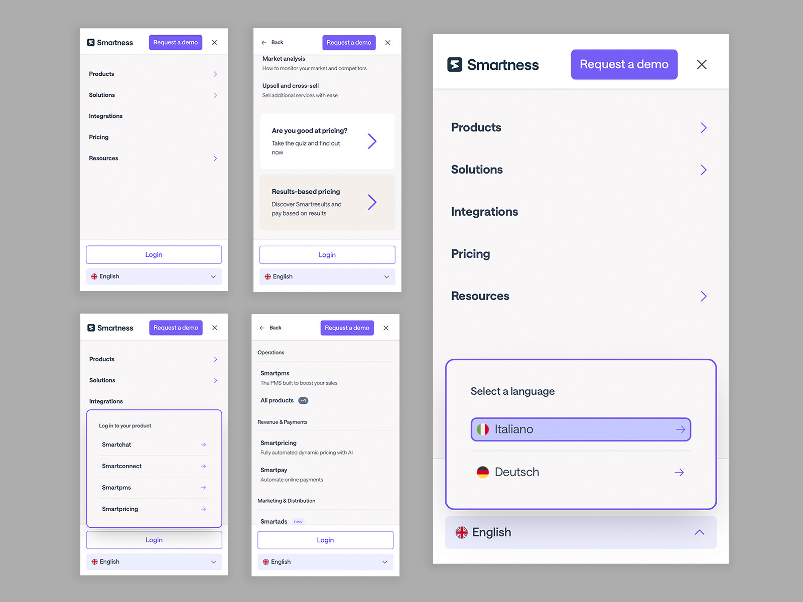
Five mobile navigation screens showing progressive drawer layers, the top level menu, a product category layer with a back control, the login panel and the language selector expanded.
Mobile as layers, revealed one at a time.
The mega menu, working. Open it in Figma if the embed does not load.

Phase 04

Demo booking flow

The main gate for qualified leads, so it has to qualify properly and still feel effortless. Property profile first, then current tooling and pain points through conditional logic, then scheduling against real sales availability.
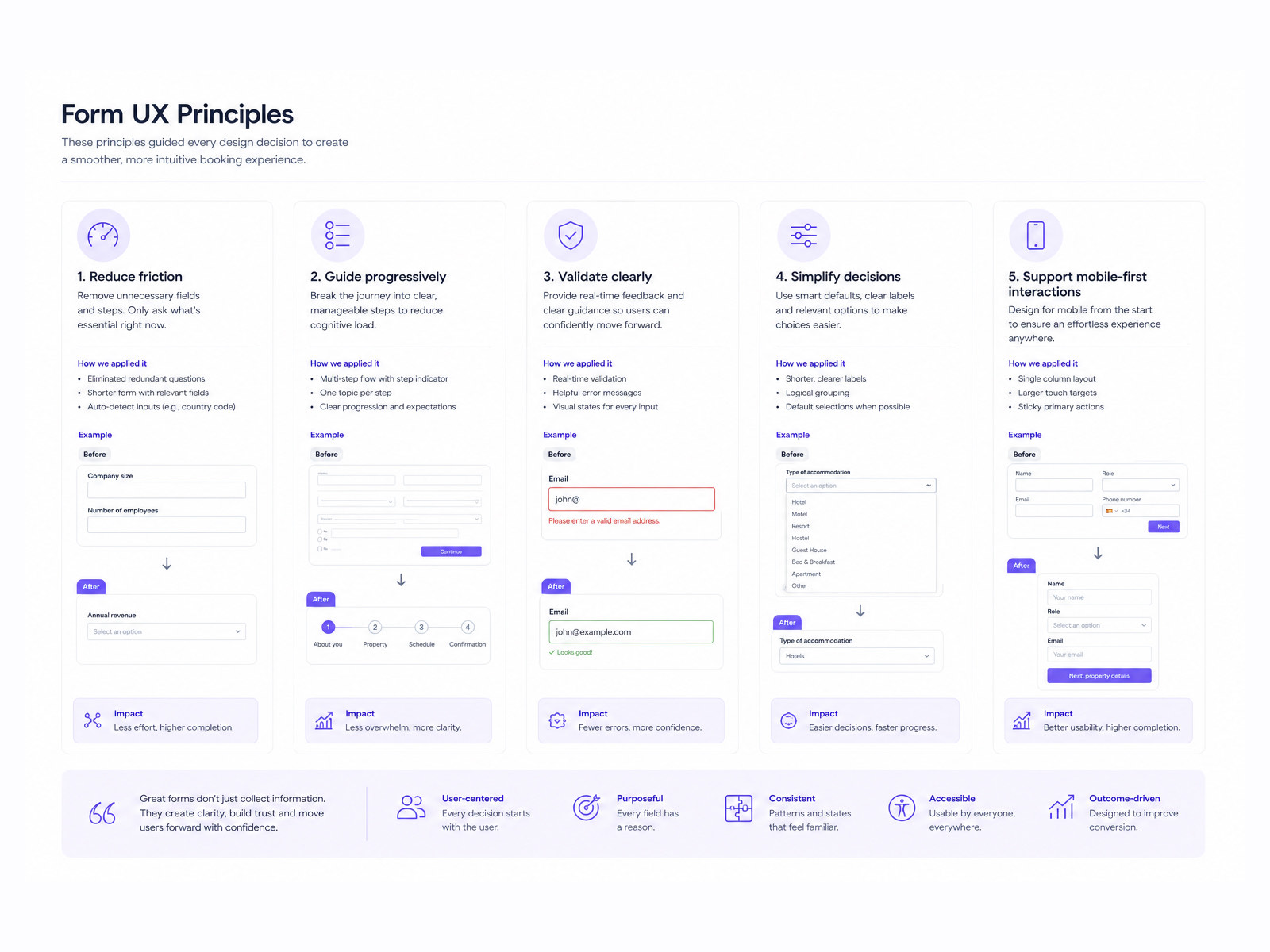
A board setting out form UX principles, each with a short rationale and a small supporting interface example.
The principles, agreed before anything was drawn.
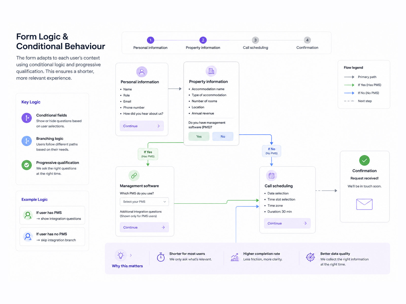
A diagram of the form logic and conditional behaviour, mapping which answers reveal which later fields.
Conditional logic, mapped rather than discovered in build.
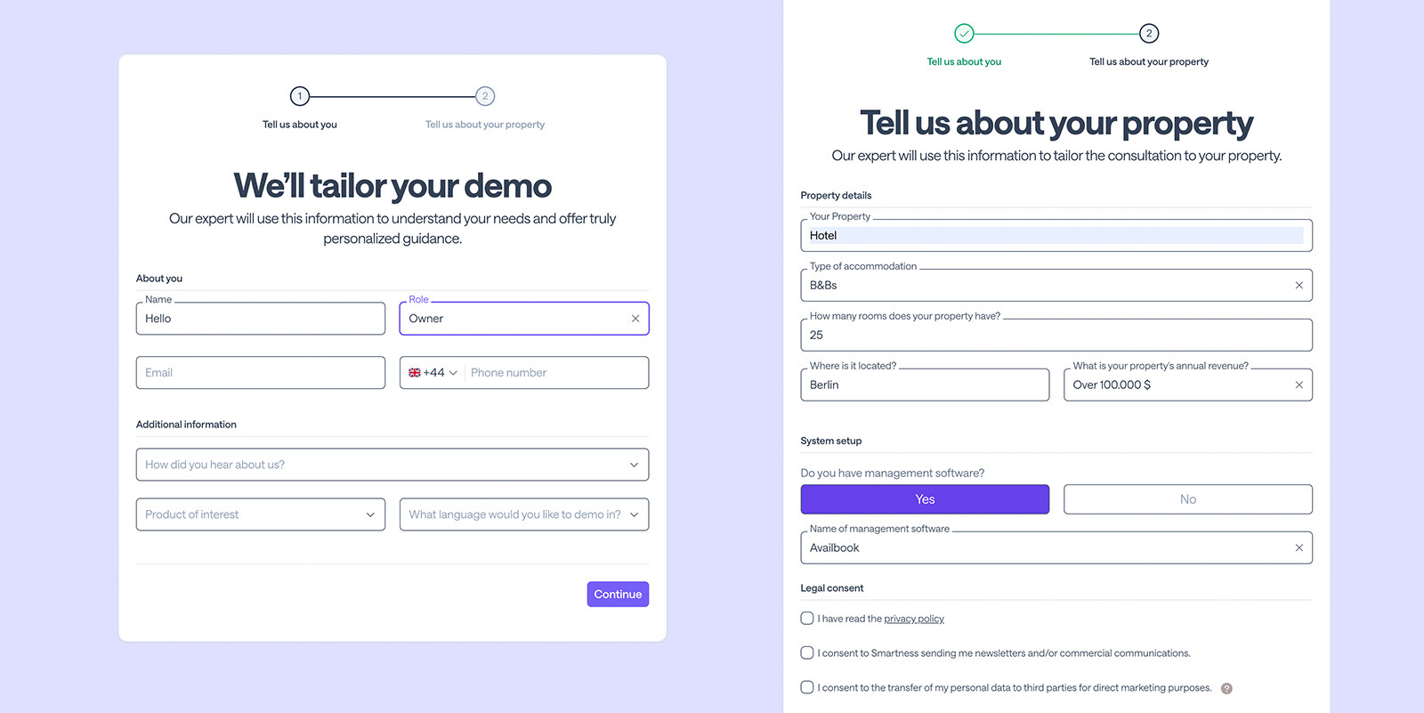
The demo booking form in two states, step one capturing name, role, email and phone with a two step progress indicator, and step two capturing property type, accommodation, room count, location, revenue, existing management software and the legal consents.
Two steps, with the stepper saying how much is left.
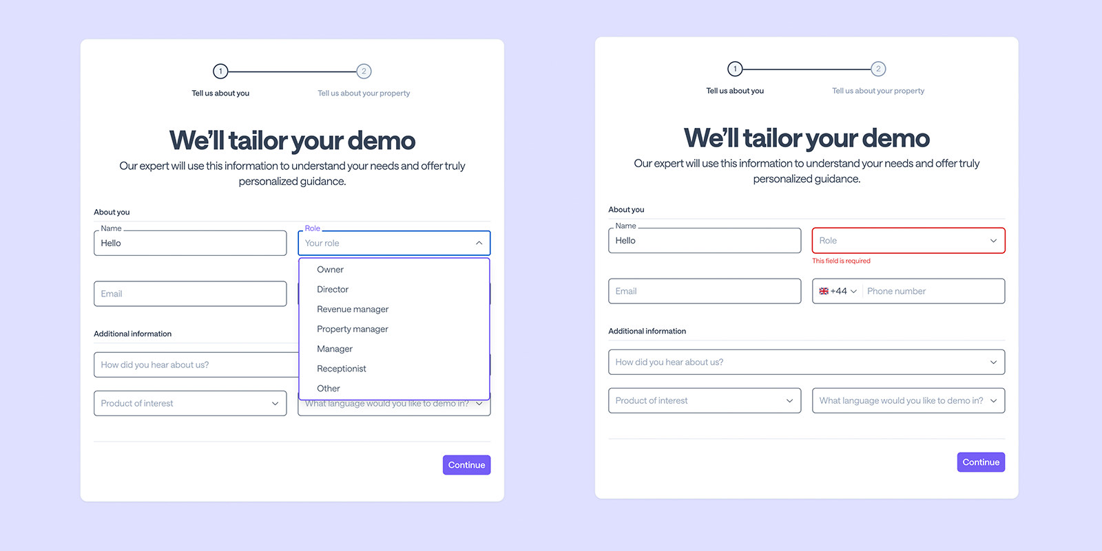
The same form in two interaction states, one with the role dropdown open listing owner, director, revenue manager, property manager, manager, receptionist and other, and one showing the role field in a red error state reading this field is required.
The open state and the error state, specified together.
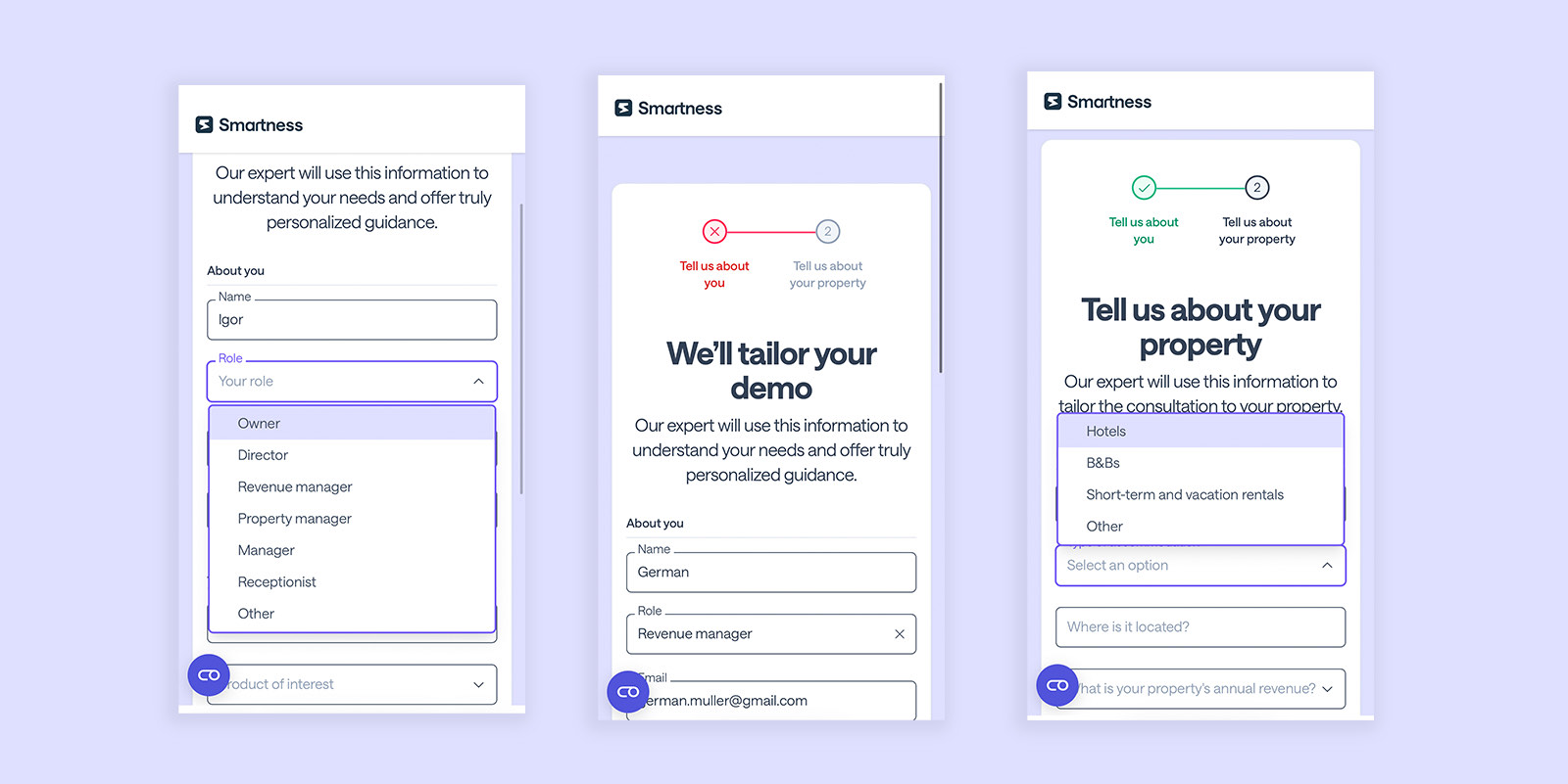
Three mobile views of the demo booking form, a role dropdown open over the field, a step one error state with a red cross in the progress indicator, and step two with the accommodation type dropdown open.
Mobile, laid out for thumbs rather than for cursors.
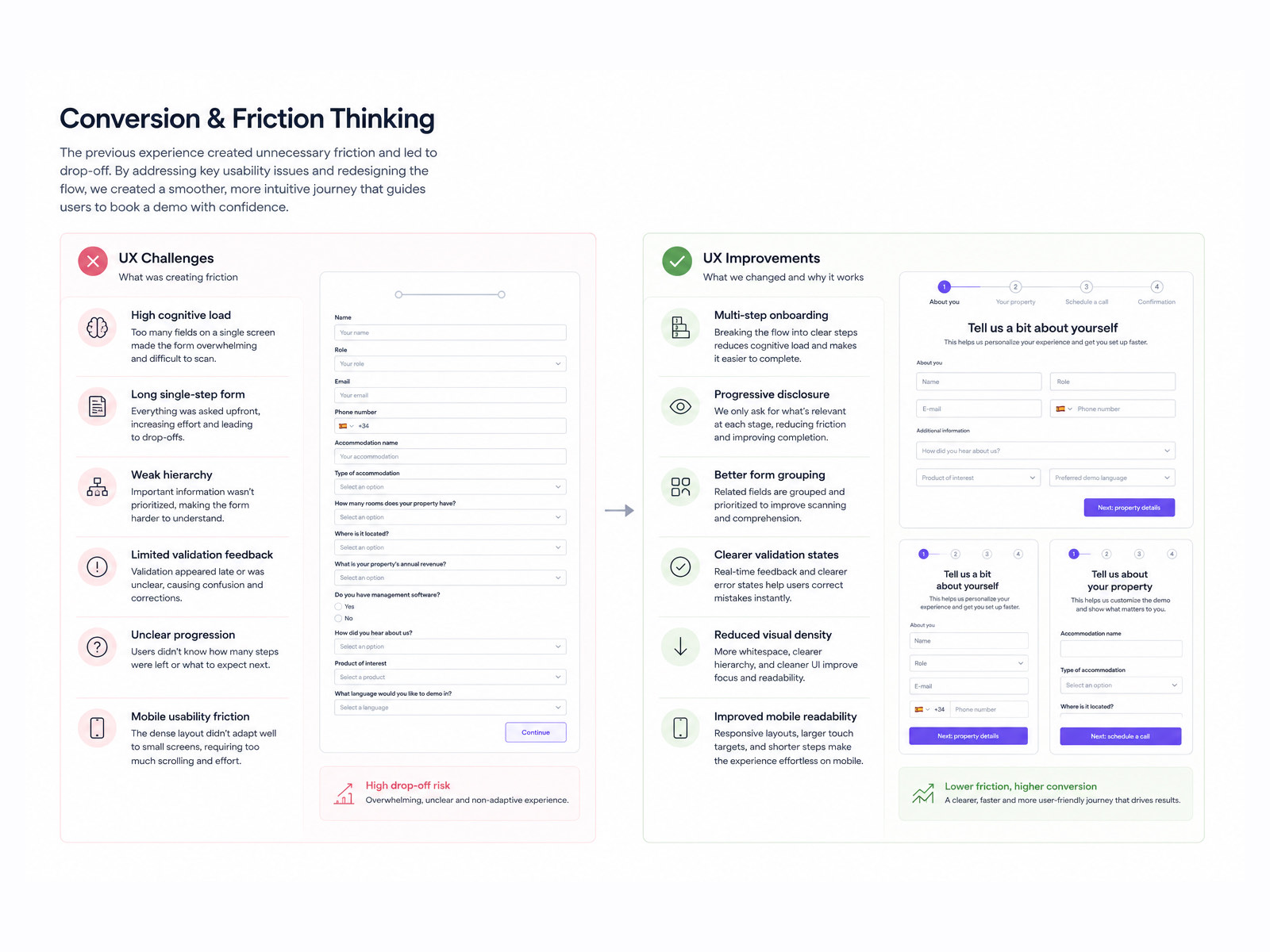
A board on conversion and friction thinking, contrasting patterns that add friction with patterns that remove it, each illustrated with an interface example.
Where friction earns its place, and where it does not.
The booking flow, working. Open it in Figma if the embed does not load.

Phase 05

Modular pricing

A pricing slice built once and reused, for marketing pages and for localised self serve checkout. Billing and currency toggles, a property scale slider that recalculates live, and a comparison table that becomes an accordion on a phone.
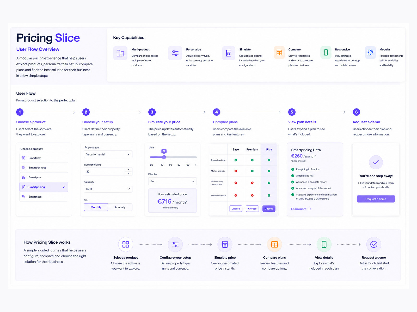
The pricing slice user flow overview, listing six key capabilities then tracing six steps from choosing a product, through setup, price simulation, plan comparison and plan detail, to requesting a demo, each step shown with its interface.
Six steps, from product choice to a booked conversation.
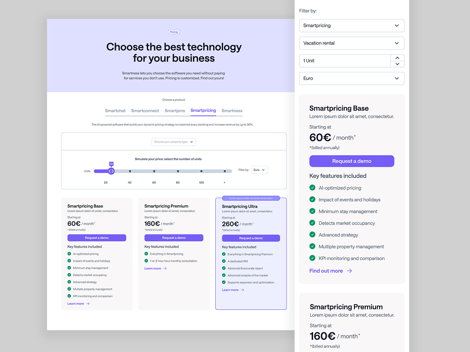
The pricing page on desktop with a product tab bar, a unit slider and three plan cards for Smartpricing Base, Premium and Ultra, beside the mobile view where the same filters stack and the plans become full width cards.
Desktop and mobile, same slice, different arrangement.
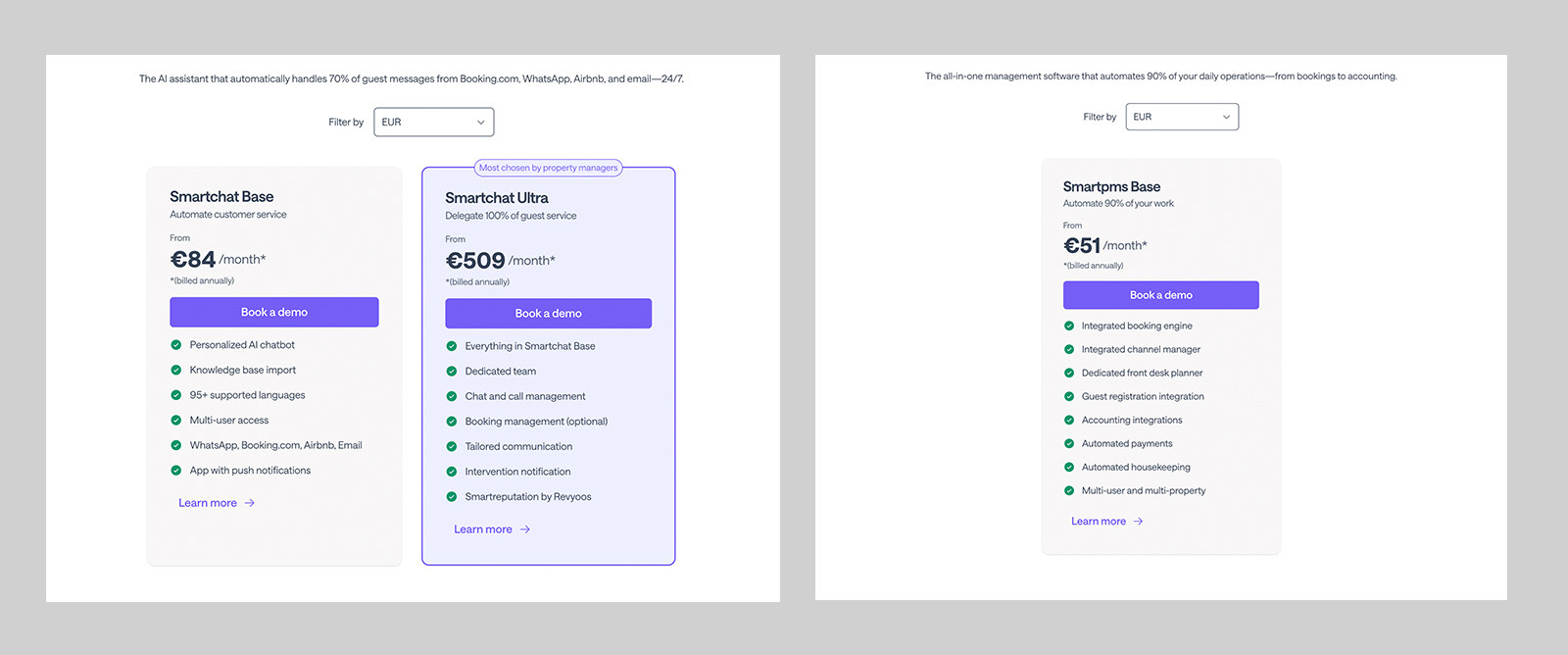
Two pricing panels, one comparing Smartchat Base and Smartchat Ultra with a most chosen by property managers label, the other showing a single Smartpms Base plan, each with a currency filter and a feature list.
Two products, one card. Two plans or one, it still holds.
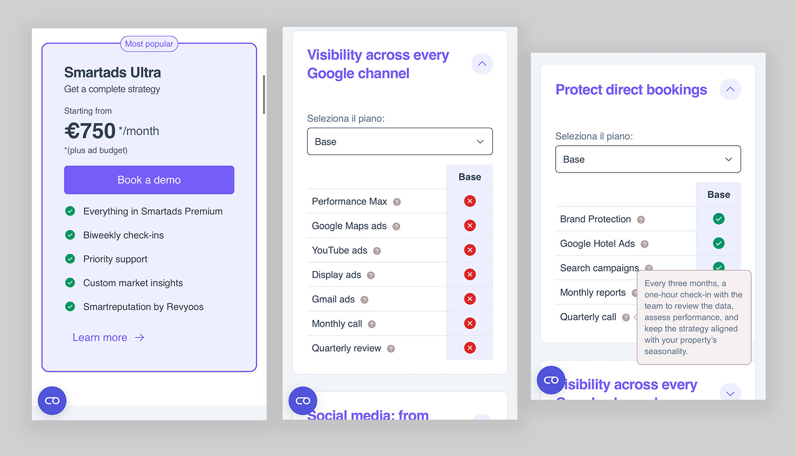
The Smartresults Ultra plan card beside two supporting panels covering visibility across every Google channel and protecting direct bookings, each with a feature comparison list.
The same parts, carrying a results based product.

Impact

What pulling it together produced

One system, five outcomes

One connected system

Brand

  • Marketing and product look like one thing
  • Illustration scales to new campaigns

Build

  • Tokens cut UI assembly time
  • Dark mode and responsive come free

Conversion

  • Better discovery of new modules
  • Fewer drop offs, better qualified leads
  • Shorter sales cycles on self serve

Credits

Client
Smartness
UX, UI and product design
Igor Dinuzzi
Brand identity and illustration
Igor Dinuzzi
Design system and tokens
Igor Dinuzzi
Interaction design and prototyping
Igor Dinuzzi
Copywriting and strategy
Smartness internal team